

A New Direction for Corners
For over a decade, border-radius has been the only practical option for shaping element corners. Designers and developers who needed anything beyond uniform rounding resorted to clip-path, SVG masks, or other workarounds. Those approaches have real limitations: borders fail to follow clipped contours, box shadows get clipped away, and the code becomes fragile when dimensions shift. The new corner-shape property directly addresses an entire category of visual treatments without trotting out those hacks.
The Property's Basics
corner-shape does not replace border-radius; it modifies how that rounding is expressed. Without a border-radius value, corner-shape has no visible effect. Together, they provide the following options:
round: the default behavior, matching standardborder-radiussquircle: a superellipse curve, similar to modern app icon geometrybevel: a straight cut directly between the radius endpointsscoop: an inverted curve that creates a concave cornernotch: a sharp inward cutsquare: removes the rounded effect by overridingborder-radius
As with border-radius, different values can be assigned to each corner:
*corner-shape: bevel round scoop squircle;
/* top-left, top-right, bottom-right, bottom-left */
For finer control over the curve itself, the superellipse() function accepts a numeric parameter. This property name may surprise some developers expecting “border-shape.” The name choice is deliberate: corner-shape applies to backgrounds, box shadows, and outlines — not just borders. That reach is where clip-path falls short.
.element {
  border-radius: 25px;
  corner-shape: superellipse(0); /* equal to 'bevel' */
}
Progressive Enhancement Approach
As of March 2026, corner-shape is available in Chrome 139 and other Chromium-based browsers only. The recommended strategy resembles how border-radius itself was adopted over a decade ago: build a robust baseline that works everywhere, then add an upgraded experience for supporting browsers. Demos built around corner-shape implement that principle with two structure layers:
@layer base, presentation, demo;
The outer presentation layer holds standard UI through proven CSS methods. The inner demo layer is wrapped in an @supports rule to gate advanced shapes:
@layer demo {
  @supports (corner-shape: bevel) {
    /* upgrade styles here */
  }
}
These patterns deliver solid design in every case and avoid displaying warning banners. When capabilities exist, a more refined treatment appears.
Product Cards and Badges
E-commerce components frequently include badges that sit on card corners, often achieved with clip-path polygons or rotated pseudo-elements. Those techniques fragment when whitespace changes.
In the baseline, a simple pill with rounded corners conveys the same information properly:
.product__badge {
  border-radius: 0 4px 4px 0;
  background-color: var(--badge-bg);
}
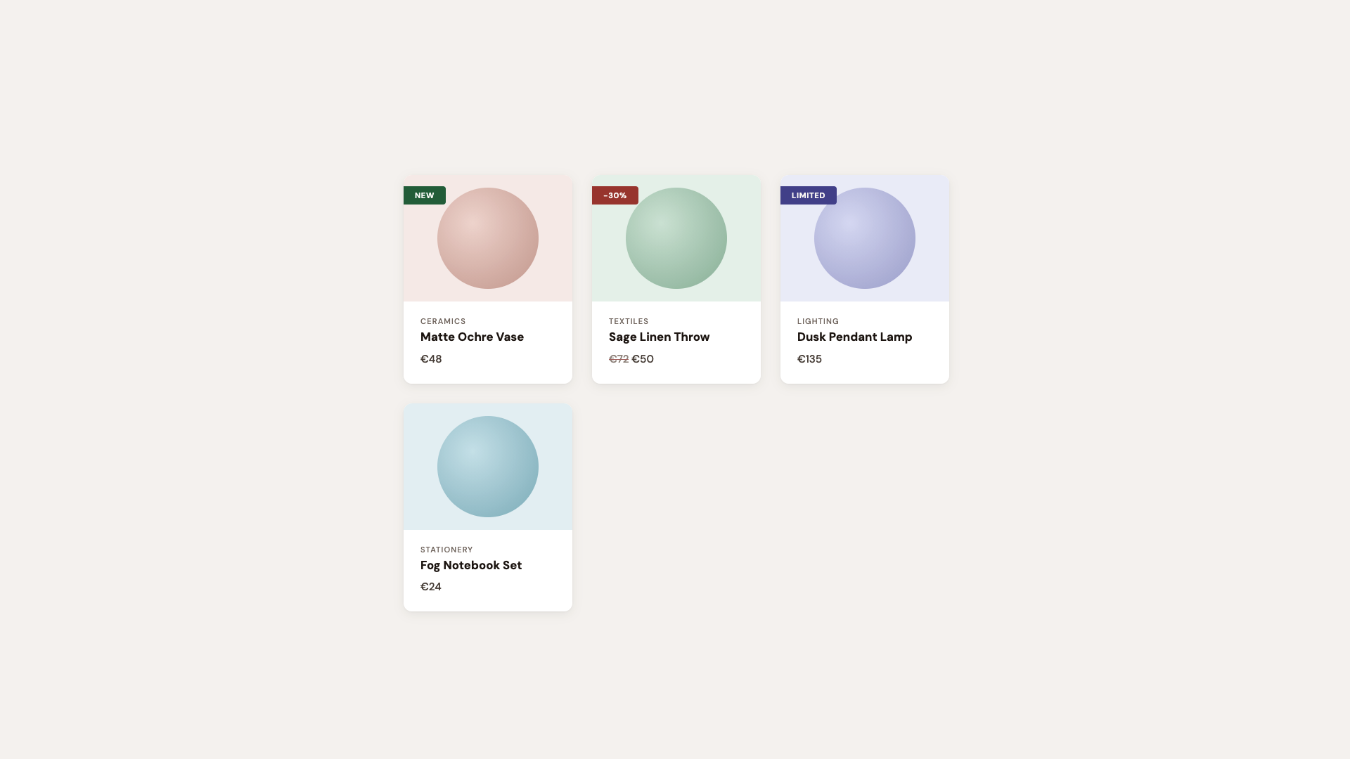
Supporting browsers upgrade that shape with specific corner designations. The pattern round bevel bevel round creates a ribbon suggestion: rounded where it connects to the card, beveled toward the tip. No masking tricks required; borders, backgrounds, and shadows respect the shape. Cards themselves read differently, graduating from shallow rounding to squircle at larger border-radius values.
@layer demo {
  /* If the browser supports `corner-shape` */
  @supports (corner-shape: bevel) {
    .product {
      border-radius: 40px;
      corner-shape: squircle;
    }

    .product__badge {
      padding: 0.35rem 1.4rem 0.35rem 1rem;
      border-radius: 0 16px 16px 0;
      corner-shape: round bevel bevel round;
    }
  }
}
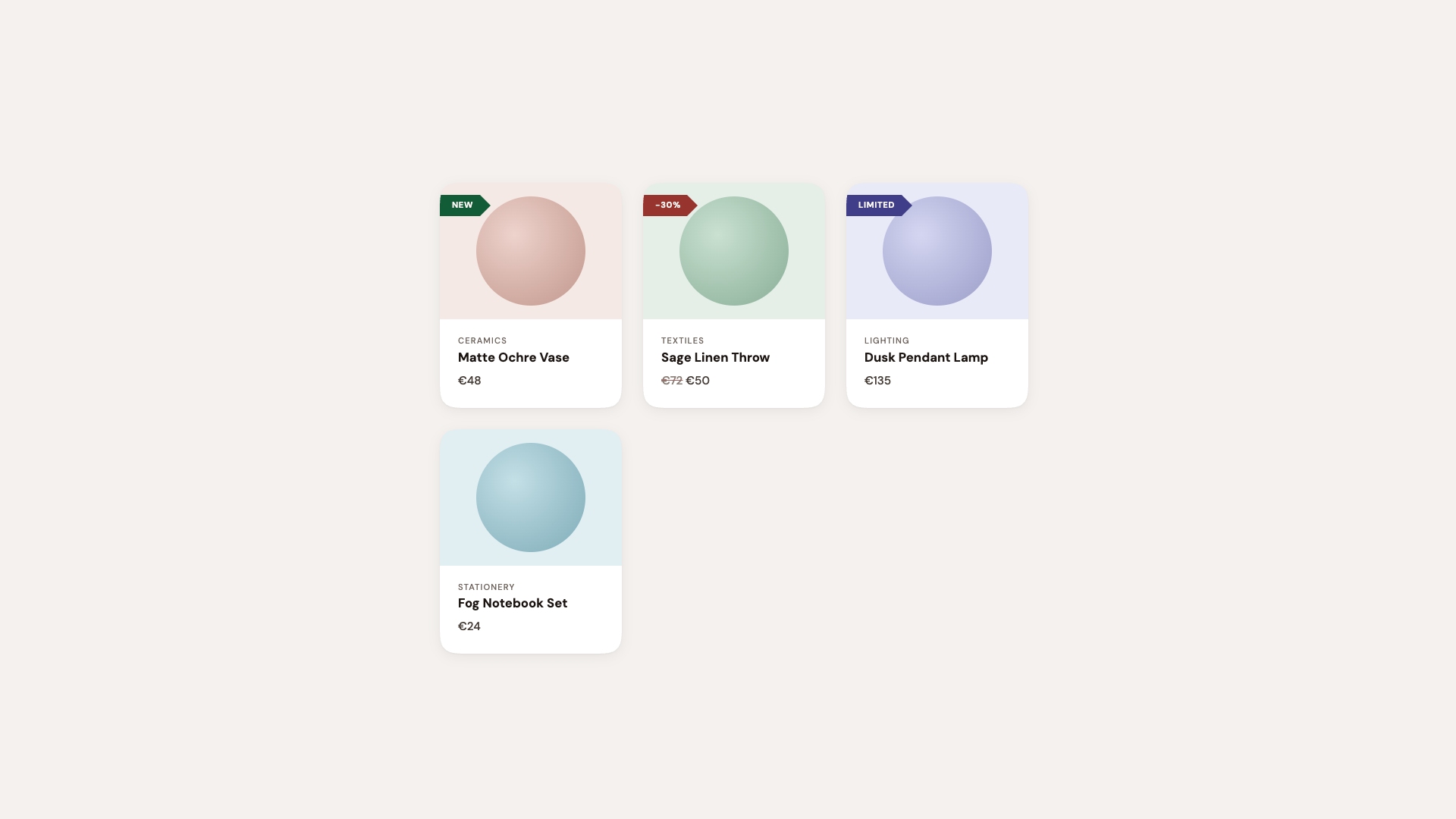
Adopting squircle card geometry deepens visual consistency across a page, though the result can be subtle on small components. Any demo exaggerates the change to make it recognizable.
See the Pen [Corner-shape: Labels [forked]](https://codepen.io/smashingmag/pen/GgjNwQE) by utilitybend.
Buttons and Associated UI Elements
Practical components — buttons, tags, arrows, and badges — provide the most direct expression of corner-shape.
The standard setup uses a straightforward border-radius: 10px surface with clean typographic polish. When supported, a suite of shapes elevates every control:
@layer demo {
  @supports (corner-shape: bevel) {
    .btn--primary {
      corner-shape: bevel;
      transition: corner-shape 0.3s ease;

      &:hover {
        corner-shape: squircle;
      }
    }

    .btn--secondary {
      border-radius: 25px;
      corner-shape: superellipse(0.5);
    }

    .btn--danger {
      border-radius: 16px;
      corner-shape: squircle;
    }

    .btn--notch {
      border-radius: 12px;
      corner-shape: notch;
    }

    .btn--scoop {
      border-radius: 14px;
      corner-shape: scoop;
    }
  }
}
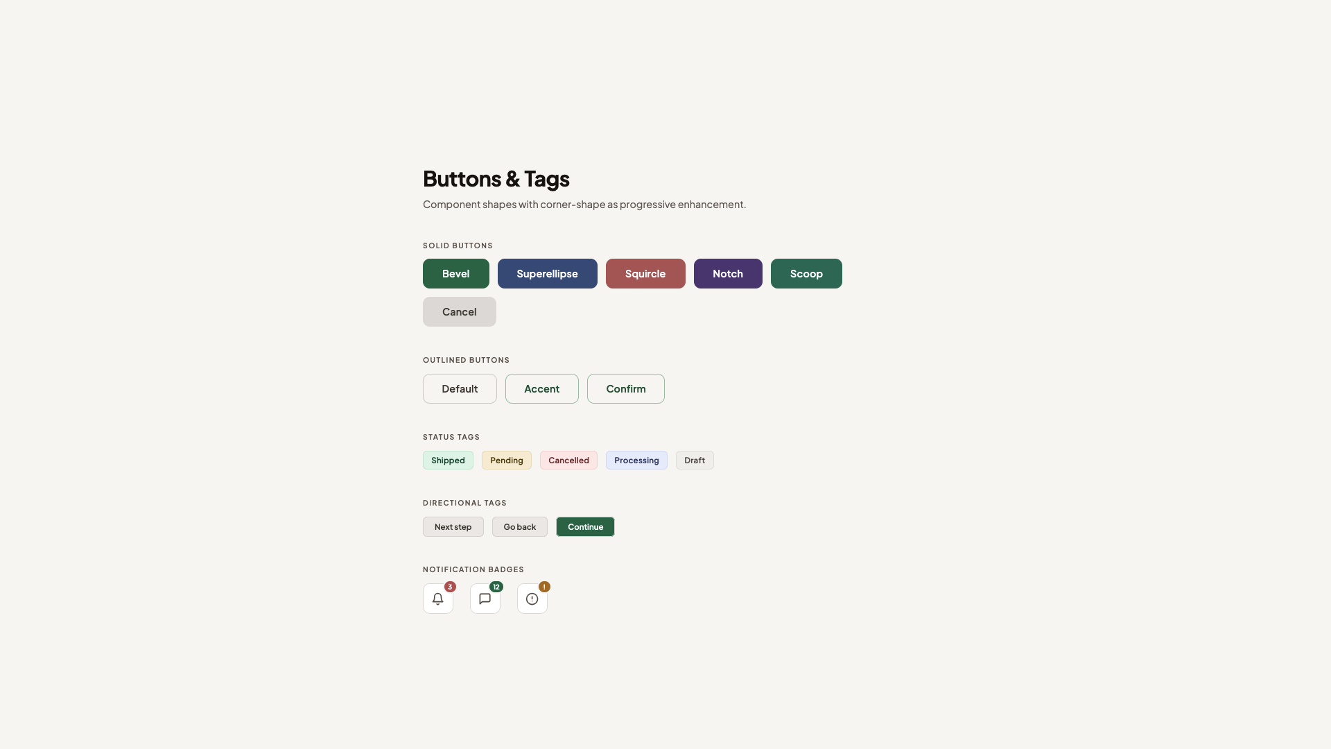
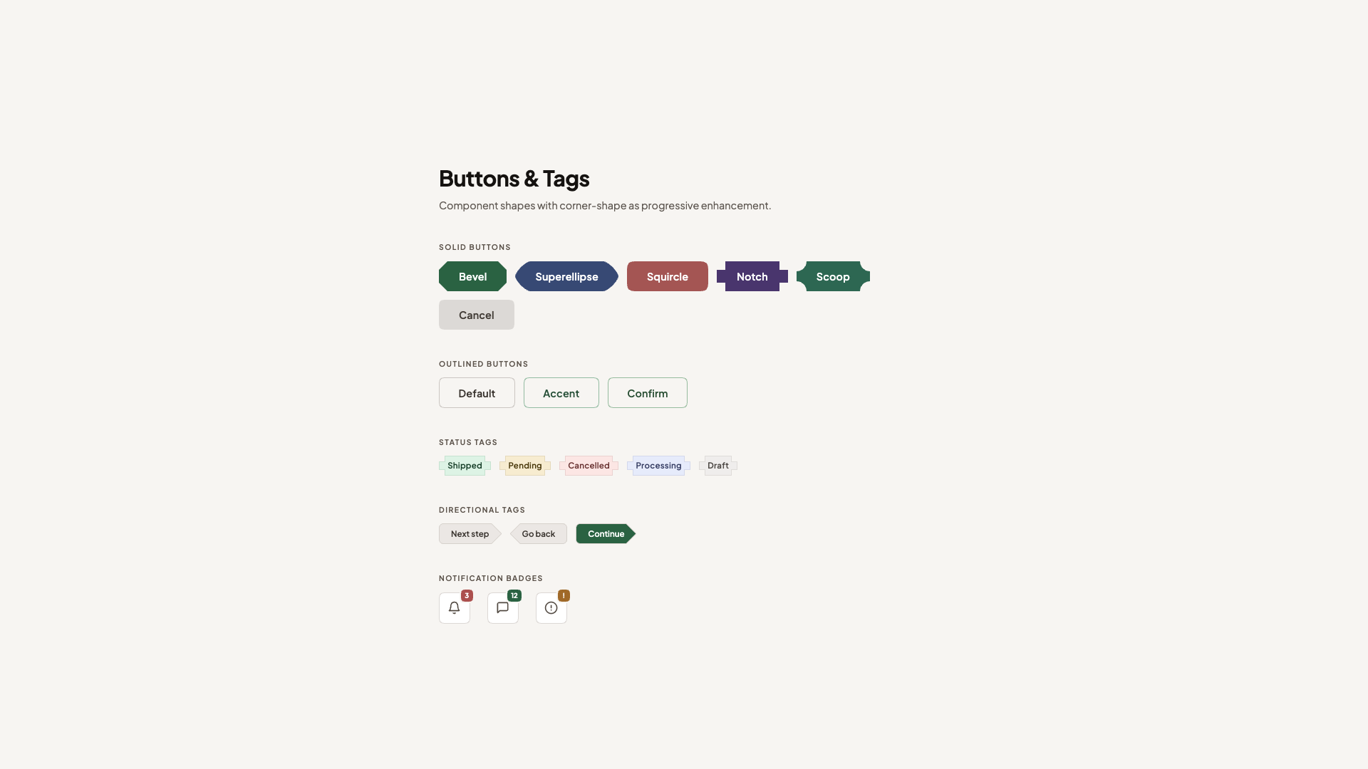
Hover transitions work because corner-shape animates between different superellipse() equivalents. Primary buttons pass through a bevel during rest state and ease into a squircle at interaction. Secondary controls lean on superellipse(0.5) for a middle ground between round and squircle, then combine it with an exaggerated border-radius. Danger and accent elements go further — one embracing notch for edge definition and another using scoop for concavity.
Status tags receive notch, achieving a mechanical, punched appearance. Directional tags toggle round bevel bevel round geometry for arrows, without the corners for borders and states dropping out.
See the Pen [Corner-shape: Buttons & Tags [forked]](https://codepen.io/smashingmag/pen/gbwLQdG) by utilitybend.
Displaying Character in Testimonial Cards
Engagement-minded testimonial cards utilize scoop shapes especially well with serif editorial styling. The fixed treatment makes relatively standard use of rounded card corners and clean avatar rows, but is still full-featured.
In supporting browsers, the featured card uses scoop across every corner to create subtle hand-tooled concavity with an organic quality complementary to typography like this.
@layer demo {
  /* Progressive enhancement */
  @supports (corner-shape: scoop) {
    .testimonial {
      border-radius: 20px;
      corner-shape: squircle;
    }

    .testimonial--featured {
      border-radius: 24px;
      corner-shape: scoop;
    }

    .testimonial:not(.testimonial--featured):nth-child(even) {
      corner-shape: scoop round;
    }

    .testimonial__avatar {
      border-radius: 28%;
      corner-shape: squircle;
    }
  }
}
Alternating cards cycle between scoop and round values, while avatars shift from circles to squircle.
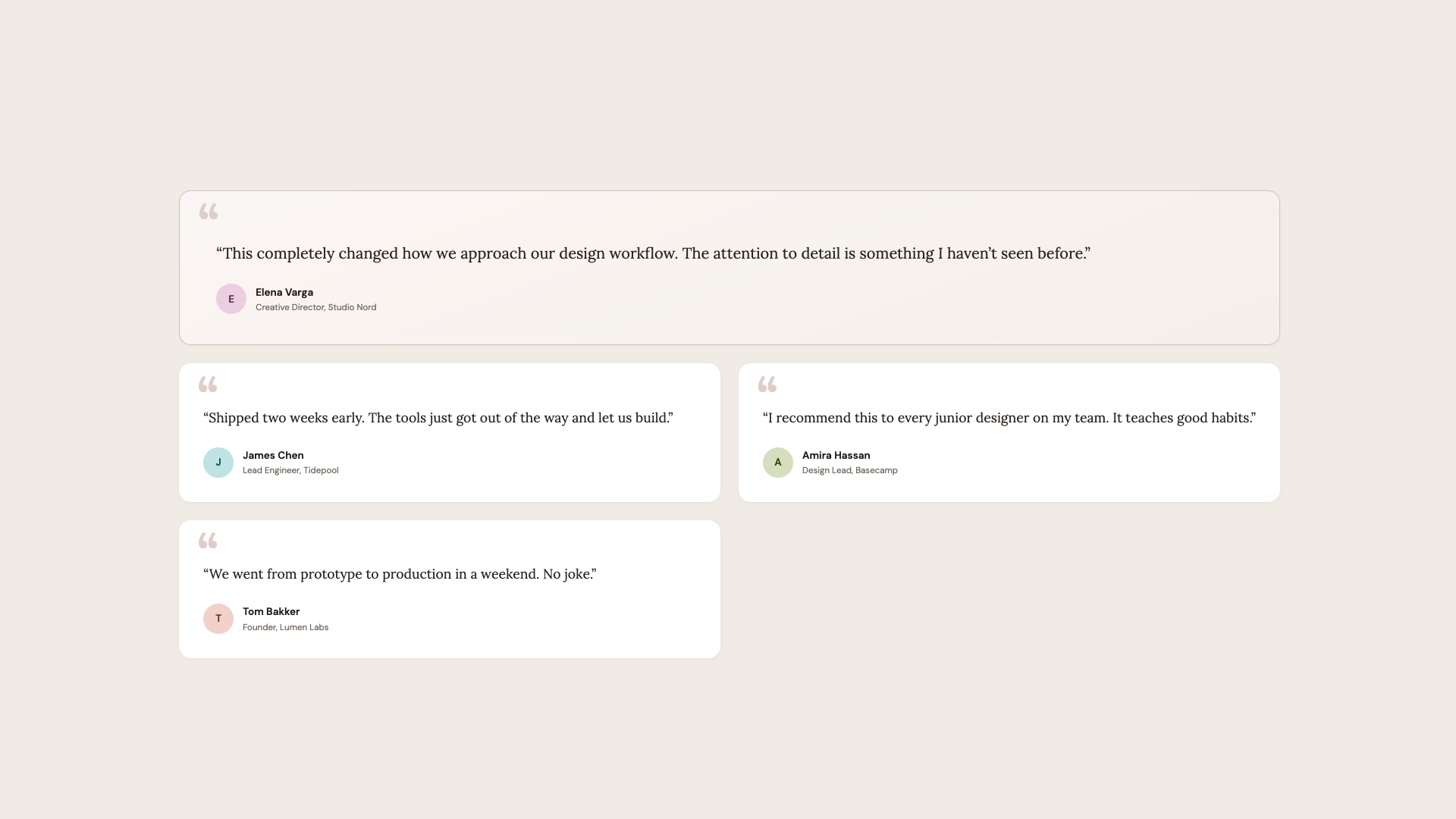
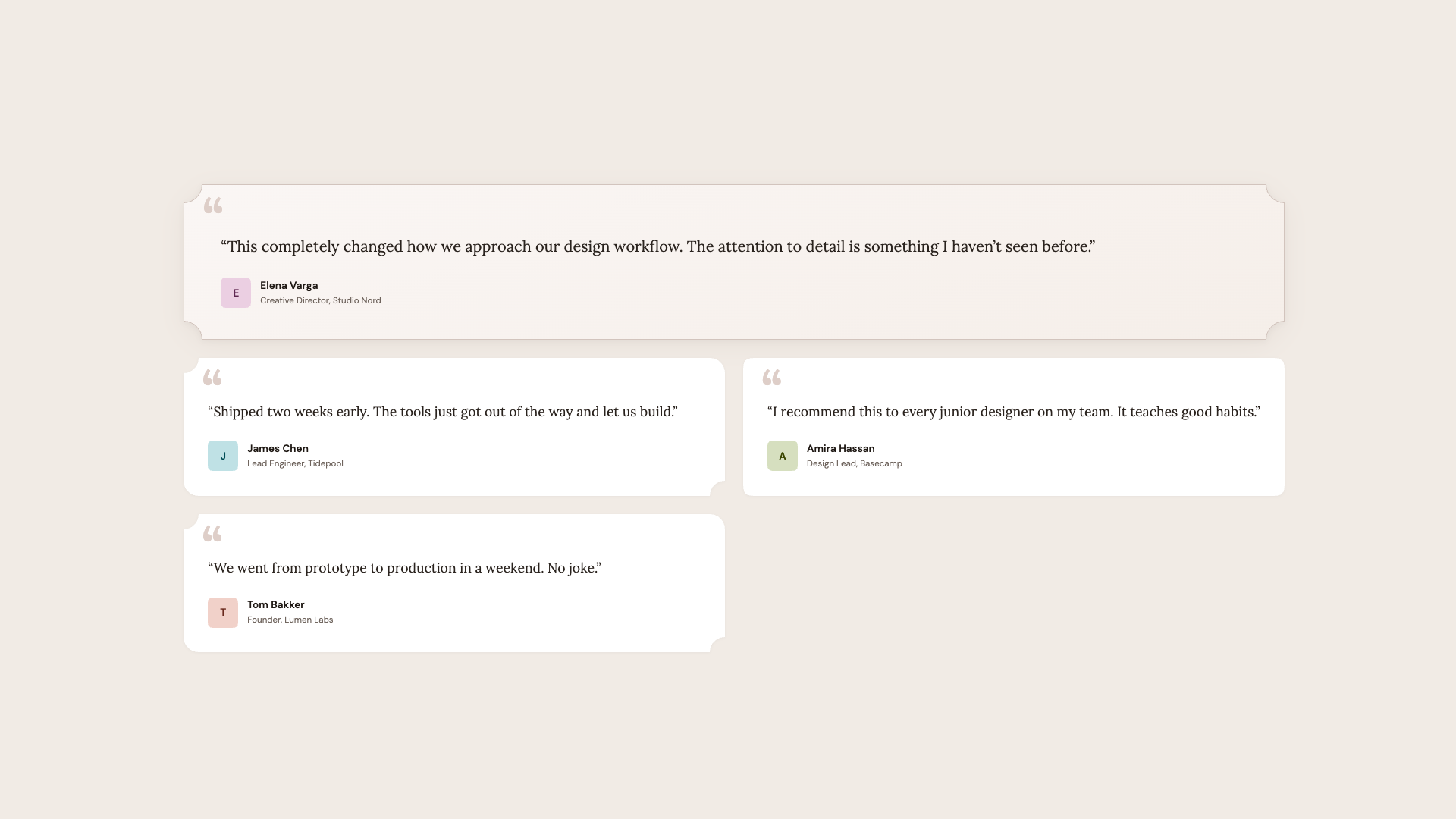
Visual harmony benefits when corner vocabulary follows hierarchy: scoop brings editorial warmth and works well on published media; squircle or bevel stay more consistent for geometric, sans-heavy designs.
See the Pen [Corner-shape: Testimonials [forked]](https://codepen.io/smashingmag/pen/RNGoqvZ) by utilitybend.
Pricing Cards
Pricing tables often need to draw attention to a featured tier without discounting other options. Here two unattributed passes use a gradient hero badge.
@layer demo {
  @supports (corner-shape: squircle) {
    .plan {
      border-radius: 20px;
      corner-shape: squircle;
    }

    .plan--featured {
      border-radius: 24px;
      corner-shape: scoop;
    }

    .plan__badge {
      inset-inline-start: 50%;
      translate: -50% 0;
      padding-inline: 1.2rem;
      border-radius: 10px;
      corner-shape: bevel;
    }

    .plan__cta {
      border-radius: 12px;
      corner-shape: squircle;
    }
  }
}
Regular plans take a squircle shape. The highlighted tier uses full scoop flattening on each side, marking difference through negative space while badge geometry runs with bevel in an emblem-like aesthetic. CTAs ride on squircle toward smoothness.
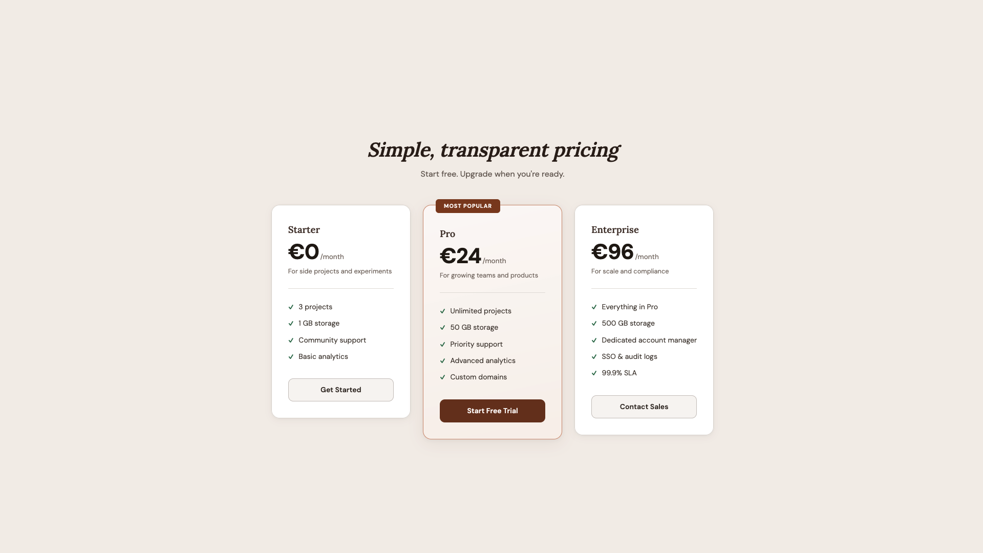
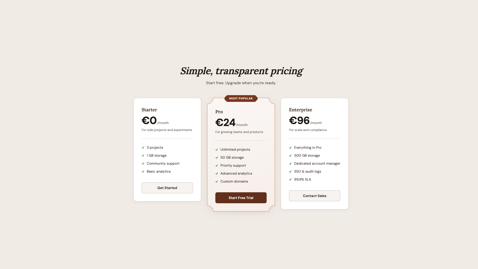
Corner language can echo the information hierarchy of a design. Positioning matters: concave radii for primary cards, sharp bevels for banners, quieter squircle throughout.
See the Pen [Corner-shape: Pricing [forked]](https://codepen.io/smashingmag/pen/vEXyQMZ) by utilitybend.
Music Player UI Angles
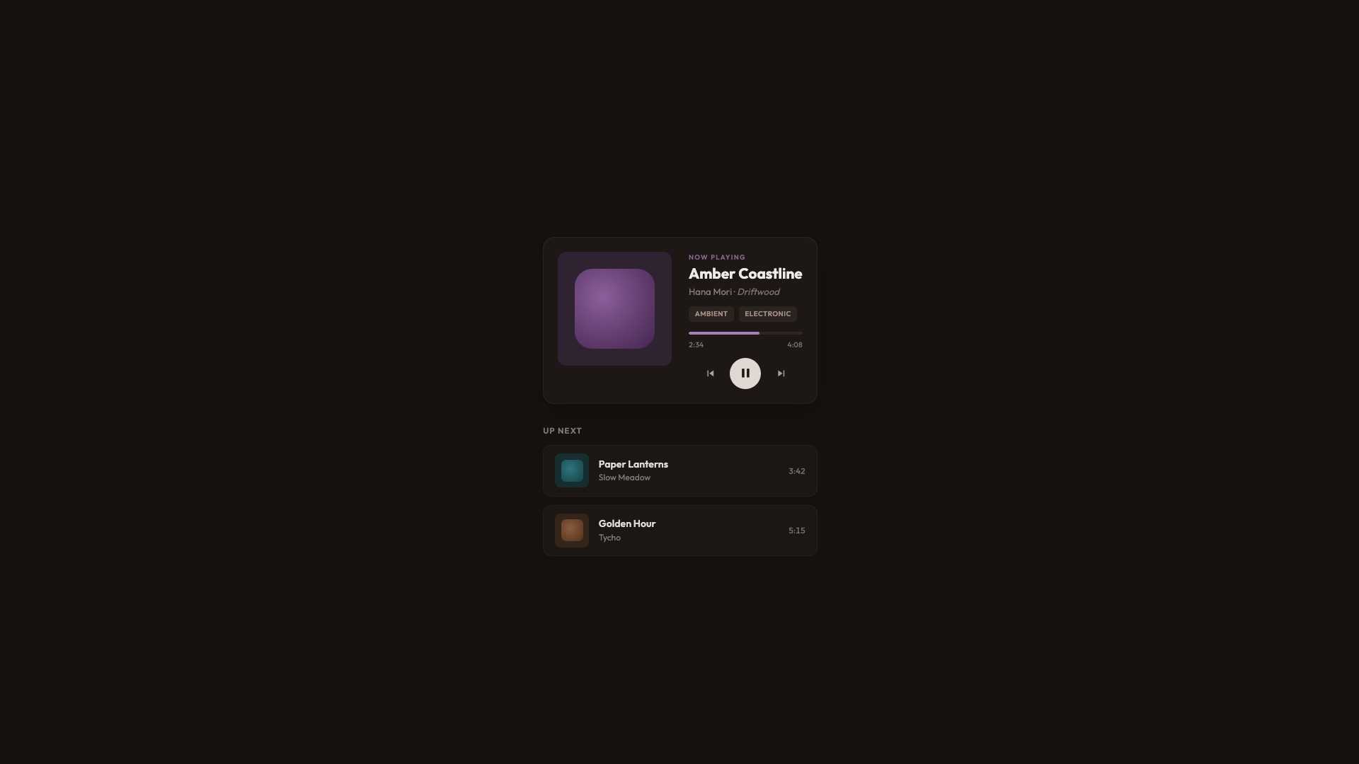
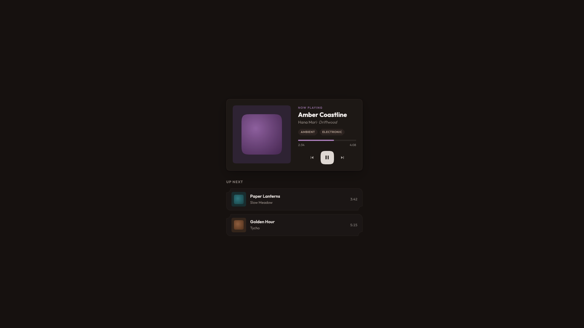
A dark, warm interface — anchored in oklch(18% 0.015 40) — demonstrates harmonization across many element types. The standard revision applies conventional border-radius: 12px to queues and cards, and tighter rounding with tags.
@layer demo {
  @supports (corner-shape: squircle) {
    .now-playing {
      border-radius: 20px;
      corner-shape: squircle;
    }

    .now-playing__art {
      border-radius: 16px;
      corner-shape: squircle;
    }

    .now-playing__swatch {
      border-radius: 26%;
      corner-shape: squircle;
    }

    .queue-item {
      border-radius: 14px;
      corner-shape: scoop round;
    }

    .tag {
      border-radius: 8px;
      corner-shape: bevel;
    }
  }
}
Once enhancements activate, player frames, album artwork, buttons, and queue stripes all promote geometry choices. Album thumbnails switch from border-radius: 22% to an adjusted 26% squircle form — subtle, but calibrated. Play controls carry a higher border-radius: 50% combined with a squircle upgrade, so rounded rectangle affinities persist. Queue entries bring concave edges horizontally at one side for rhythmic articulation, genre tags move on the sharper side through bevel, and the principal call to action, the Play button, joins the broader squircle system without visual noise.
See the Pen [Corner-shape: Music player [forked]](https://codepen.io/smashingmag/pen/ogzYQRB) by utilitybend.
Used with the proper intent, corner-shape redefines how surfaces relate to one another — enabling customization across any control where style is intended to lead viewers.
Support Status and Progressive Enhancement
As of this writing, corner-shape is enabled in Chrome 139+ and other Chromium-based browsers. Firefox and Safari have not yet shipped support. The specification currently lives in CSS Borders and Box Decorations Module Level 4, which is a W3C Working Draft.
That caveat does not block practical use. The demos built around this property follow a clear pattern: the presentation layer styles a complete, polished interface for every browser, while the demo layer—wrapped in @supports (corner-shape: ...)—delivers a bonus for browsers that understand it. This two-tier approach is not new; it mirrors how border-radius first arrived when only Firefox supported it. The working goal is not pixel-identical output everywhere, but rather no broken layouts and no unsupported-feature warnings. A baseline experience that simply works, paired with an enhanced version that adds something extra, means designing for two tiers: good and better.
Building on a Solid Baseline
The guiding principle for adopting corner-shape is to avoid designing for it, or designing around its absence. The right move is to ship a solid, intentional baseline using border-radius, then layer the enhancement on top. In practice, the presentation layer in each demo is deliberately complete—it is not a degraded placeholder waiting for a more capable browser. It stands on its own as a full design. The demo layer opens up a dimension that border-radius alone cannot express.
The most striking aspect of corner-shape is the range of expressions packed into one property. squircle produces the premium, superellipse look suitable for cards and avatars; bevel fits directional elements and gem-like badges; scoop adds editorial warmth and clarifies visual hierarchy; notch gives tags a mechanical, precise feel; and superellipse() provides fine-grained control between round and squircle. Mixing values per corner—for instance round bevel bevel round or scoop round—yields shapes that previously demanded SVG masks or clip-path workarounds.
Looking back, the evolution from five background images to border-radius, and now to corner-shape, is a story of removing categories of hacks. Each step has eliminated a layer of workaround code, and the expressive range now available suggests more creative layouts are just around the corner.
Related Resources
corner-shapeon MDN- “What Can We Actually Do With
corner-shape?” by Daniel Schwarz - CSS Borders and Box Decorations Module Level 4 (W3C specification)
- A demo for “eco-labels” by Sebastian on CodePen



