Bézier curves in shape(): the curve command
The curve command draws a Bézier curve between two points by way of control points. One control point produces a Quadratic curve; two produce a Cubic curve. That definition is not much help on its own, and cubic-bezier() as an easing function remains a mystery to most of us — we lean on a generator or forget an explanation immediately. The practical focus here is narrower: one control point, used mainly to round the corners of irregular shapes.
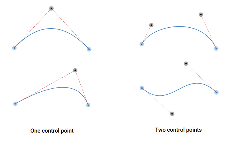
In the figure, the blue dots are the starting and ending points and the black dots are the control points. The curve is tangent to the red dashed lines.
clip-path: shape(
  from Xa Ya,
  curve to Xb Yb with Xc Yc
);
Choosing between arc and curve
The arc command, covered in the earlier parts of this series, establishes rounded edges and corners but does not cover every case, which is where curve comes in. Deciding which to use depends on the shape. The advice is to first see whether arc can do the job easily; if not, use curve.
Some shapes give the same result either way, which makes a useful comparison. First shape:
.shape {
  clip-path: shape(from 0 0,
    arc to 100% 100% of 100% cw,
    line to 0 100%)
}
Second shape:
.shape {
  clip-path: shape(from 0 0,
    curve to 100% 100% with 100% 0,
    line to 0 100%)
}
The difference in the syntax is the parameter: arc needs a radius (100% here), while curve needs a control point (100% 0 here).
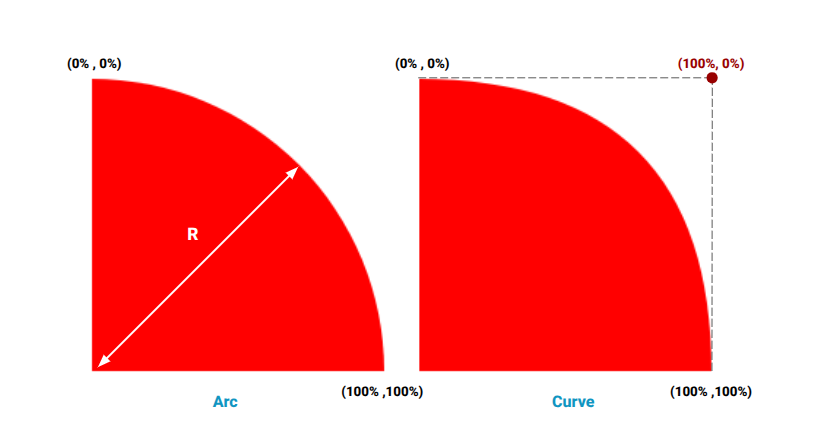
The results are not identical. The arc version produces a quarter of a circle; the curve version is slightly different, and the gap is visible when both are stacked. Which is better depends on visual preference and the shape being built. The rounded tabs from Part 1 can equally be built with curve, and the difference there is barely visible.
Relative coordinates and the from directive
The by directive works with curve the same way it does with arc, but the control point is relative too, which can be confusing. Consider:
shape(from Xa Ya, curve by Xb Yb with Xc Yc)Both (Xb,Yb) and (Xc,Yc) are calculated relative to the starting point. The equivalent using to:
shape(from Xa Ya, curve to (Xa + Xb) (Ya + Yb) with (Xa + Xc) (Yb + Yc))Adding a from directive changes the reference for the control point. It accepts start (the default), end, or origin:
shape(from Xa Ya, curve by Xb Yb with Xc Yc from end)With end, the control point is measured from the ending point instead of the starting point — similar to:
shape(from Xa Ya, curve to (Xa + Xb) (Ya + Yb) with (Xa + Xb + Xc) (Ya + Yb + Yc))With origin, the reference is the origin, so the control point coordinate becomes absolute rather than relative. The from directive adds complexity to the code and the calculation, so there is no need to reach for it; it is enough to know it exists.
The rounding technique
Where arc cannot round a corner, the approach is consistent: write the shape with plain line commands, then replace the line at each corner with line + curve, where the curve reuses the old corner point in its with directive.
A rectangle with one slanted edge makes the case. The slanted shapes are shown below:
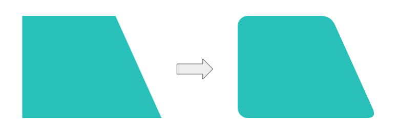
Two corners can be rounded with a simple border-radius. The slanted edge needs shape() with two curve commands. The starting point is the shape without rounded corners, built only from line:
.shape {
  --s: 90px;  /* slant size */

  clip-path:
    shape(from 0 0,
    line to calc(100% - var(--s)) 0,
    line to 100% 100%,
    line to 0 100%
    );
}
For each corner, define a distance R that controls the radius. Move by R along each side of the corner point to create two new points, then draw the curve with those new points as start and end and the corner point as the control point:
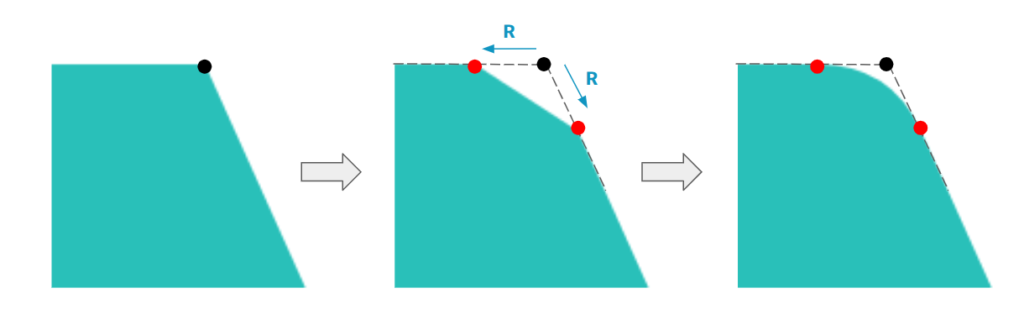
.shape {
  --s: 90px;  /* slant size */

  clip-path:
    shape(from 0 0,
    Line  to Xa Ya,
    curve to Xb Yb with calc(100% - var(--s)) 0,
    line to 100% 100%,
    line to 0 100%
    );
}
Note that the curve takes the corner point in the with directive, plus the two new points A and B. Applying the same logic to the other corner:
.shape {
  --s: 90px;  /* slant size */

  clip-path:
    shape(from 0 0,
    line  to Xa Ya,
    curve to Xb Yb with calc(100% - var(--s)) 0,
    line  to Xc Yc,
    curve to Xd Yd with 100% 100%,
    line to 0 100%
    );
}
Calculating the coordinates of the new points is the hard part, and the logic differs from shape to shape, so the math is skipped here in favor of the final code:
.box {
  --h: 200px; /* element height */
  --s: 90px;  /* slant size */
  --r: 20px;  /* radius */

  height: var(--h);
  border-radius: var(--r) 0 0 var(--r);
  --_a: atan2(var(--s), var(--h));
  clip-path:
    shape(from 0 0,
    line  to calc(100% - var(--s) - var(--r)) 0,
    curve by calc(var(--r) * (1 + sin(var(--_a))))
              calc(var(--r) * cos(var(--_a)))
    with var(--r) 0,
    line  to calc(100% - var(--r) * sin(var(--_a)))
              calc(100% - var(--r) * cos(var(--_a))),
    curve to calc(100% - var(--r)) 100%  with 100% 100%,
    line to 0 100%
    );
}
The code looks daunting, but it is easy to control through CSS variables, so the math does not have to be dealt with directly. One caveat: the height must be known to calculate the coordinates, so the solution is imperfect — the height is a fixed value.
More corners, and polygons
An arrow-shaped box rounds three corners with curve using the same steps: start from the plain version, then replace each corner's line with line + curve.
.shape {
  --s: 90px;

  clip-path:
    shape(from 0 0,
    /* corner #1 */
    line to calc(100% - var(--s)) 0,
    /* corner #2 */
    line to 100% 50%,
    /* corner #3 */
    line to calc(100% - var(--s)) 100%,

    line to 0 100%
    );
}
.shape {
--s: 90px;
clip-path:
shape(from 0 0,
/* corner #1 */
line to Xa Ya
curve to Xb Yb with calc(100% - var(--s)) 0,
/* corner #2 */
line to Xa Ya
curve to Xb Yb with 100% 50%,
/* corner #3 */
line to Xa Yb
curve to Xb Yb with calc(100% - var(--s)) 100%,
line to 0 100%
);
}The remaining work is pen-and-paper calculation. That does not make the technique useless to anyone uncomfortable with geometry: the variables-optimized code can be grabbed and used as-is, and precision is not mandatory. Trial and error to approximate the coordinates is a valid alternative and probably faster than doing all the math.
The payoff is rounded polygons, now possible thanks to shape() and the curve command:
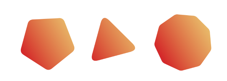
A Sass implementation controls the radius, number of sides, and rotation. Setting aside the geometry, the loop is simple, relying on the same line + curve per corner:
$n: 9; /* number of sides*/
$r: .2; /* control the radius [0 1] */
$a: 15deg; /* control the rotation */

.poly {
  aspect-ratio: 1;
  $m: ();
  @for $i from 0 through ($n - 1) {
    $m: append($m, line  to Xai Yai, comma);
    $m: append($m, curve to Xbi Ybi with Xci Yci, comma);
  }
  clip-path: shape(#{$m});
}
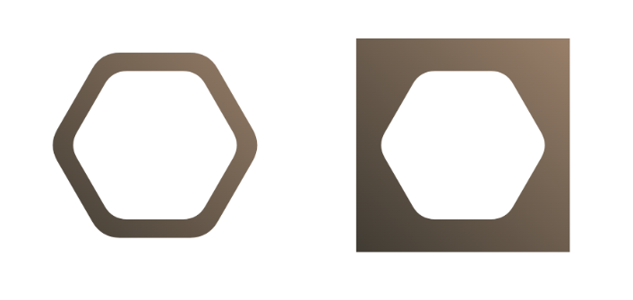
Defining the variables in CSS instead of Sass is handy, especially for animations; the collection below includes a hover effect applied to hexagon shapes. An online generator has also been updated with a radius parameter and offers border-only and cut-out versions, along with copyable CSS for those who do not use Sass:
The curve command is probably not exhausted, but this covers its potential and the complex shapes it enables. The code here reaches a level that is not easy for everyone. The math could have been broken down explicitly, but that would have made the article overly complex and made shape() seem harder than it is.