
CSS shape(): A Short Primer
The clip-path property recently gained a shape() value. At the time of writing (May 2025), browser support is limited to Chrome 137+ and Safari 18.4+. The specification frames it as a CSS-native alternative to path(): where SVG path syntax requires a single string (awkward to assemble with var()) and implicitly allows only the px unit, shape() uses roughly equivalent commands written in standard CSS, opening the door to other units and math functions. The spec calls shape() a superset of path() — a path() converts to a shape() easily, but the reverse requires knowledge of the CSS environment.
Existing SVG art need not be redrawn by hand. An SVG-to-CSS converter takes the d attribute value and emits CSS. No viewBox is needed: the tool finds the smallest rectangle around the shape and computes coordinates from it. Applying that to the CSS-Tricks logo starts from this SVG:
<svg width="35px" height="35px" viewBox="0 0 362.62 388.52" >
  <path d="M156.58,239l-88.3,64.75c-10.59,7.06-18.84,11.77-29.43,11.77-21.19,0-38.85-18.84-38.85-40C0,257.83,14.13,244.88,27.08,239l103.6-44.74L27.08,148.34C13,142.46,0,129.51,0,111.85,0,90.66,18.84,73,40,73c10.6,0,17.66,3.53,28.25,11.77l88.3,64.75L144.81,44.74C141.28,20,157.76,0,181.31,0s40,18.84,36.5,43.56L206,149.52l88.3-64.75C304.93,76.53,313.17,73,323.77,73a39.2,39.2,0,0,1,38.85,38.85c0,18.84-12.95,30.61-27.08,36.5L231.93,194.26,335.54,239c14.13,5.88,27.08,18.83,27.08,37.67,0,21.19-18.84,38.85-40,38.85-9.42,0-17.66-4.71-28.26-11.77L206,239l11.77,104.78c3.53,24.72-12.95,44.74-36.5,44.74s-40-18.84-36.5-43.56Z"></path>
</svg>
and produces:
.shape {
  aspect-ratio: 0.933;
  clip-path: shape(from 43.18% 61.52%,line by -24.35% 16.67%,curve by -8.12% 3.03% with -2.92% 1.82%/-5.2% 3.03%,curve by -10.71% -10.3% with -5.84% 0%/-10.71% -4.85%,curve to 7.47% 61.52% with 0% 66.36%/3.9% 63.03%,line by 28.57% -11.52%,line to 7.47% 38.18%,curve to 0% 28.79% with 3.59% 36.67%/0% 33.33%,curve to 11.03% 18.79% with 0% 23.33%/5.2% 18.79%,curve by 7.79% 3.03% with 2.92% 0%/4.87% 0.91%,line by 24.35% 16.67%,line to 39.93% 11.52%,curve to 50% 0% with 38.96% 5.15%/43.51% 0%,smooth by 10.07% 11.21% with 11.03% 4.85%,line to 56.81% 38.48%,line by 24.35% -16.67%,curve to 89.29% 18.79% with 84.09% 19.7%/86.36% 18.79%,arc by 10.71% 10% of 10.81% 10.09% small cw,curve by -7.47% 9.39% with 0% 4.85%/-3.57% 7.88%,line to 63.96% 50%,line to 92.53% 61.52%,curve by 7.47% 9.7% with 3.9% 1.51%/7.47% 4.85%,curve by -11.03% 10% with 0% 5.45%/-5.2% 10%,curve by -7.79% -3.03% with -2.6% 0%/-4.87% -1.21%,line to 56.81% 61.52%,line by 3.25% 26.97%,curve by -10.07% 11.52% with 0.97% 6.36%/-3.57% 11.52%,smooth by -10.07% -11.21% with -11.03% -4.85%,close);
}
Choosing an Approach
Shapes fall into four categories, sorted by two questions: straight lines or curves, and repetition or none.
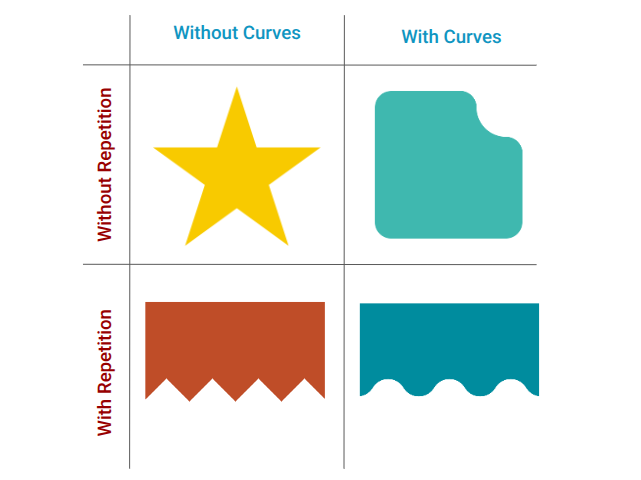
- No curves, no repetition —
clip-path: polygon()does the job. - Repetition (curves or not) — use
mask, since gradients can be sized and repeated whileclip-pathoffers no such option. - Curves, no repetition —
shape()is now the best option; previously this required amaskbecauseclip-pathwas too limited.
These aren't universal rules, just a practical way to pick a method. Code complexity, flexibility and browser support also matter, so the final call is case by case.
Straight Lines: Start With a Rectangle
The polygon below describes a plain rectangle — it draws nothing new, since the element is already a rectangle, but it makes a good starting point:
clip-path: polygon(
  0 0,
  100% 0,
  100% 100%,
  0 100%
);
Rewritten with shape():
clip-path: shape(
  from 0 0,
  line to 100% 0,
  line to 100% 100%,
  line to 0 100%
);
The first and only-once command is from, which sets the starting point; line then draws a line to the next point. The same shape can also be expressed like this:
clip-path: shape(
  from 0 0,
  hline to 100%,
  vline to 100%,
  hline to 0
);
Between 0 0 and 100% 0 only the horizontal value changes, so hline to 100% takes just the horizontal offset; likewise vline covers the vertical run from 100% 0 to 100% 100%. Because these commands are harder to read, it's best to draw with line first and swap in hline/vline as an optimization afterward.
Arcs: How the arc Command Works
A circular cut-out is a natural next step:
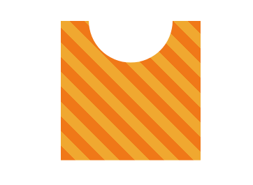
Arcs need some unpacking. Given two points A and B, exactly two circles of a given radius pass through both, and their intersection allows four possible arcs between the points, each with a size and a direction:
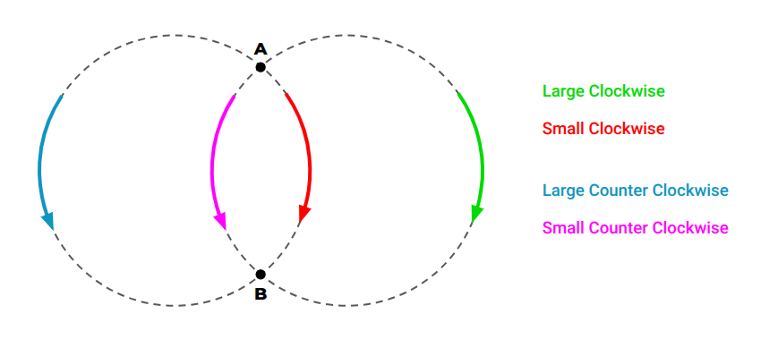
When the radius equals half the distance between A and B, only two arcs are possible and direction alone decides between them:
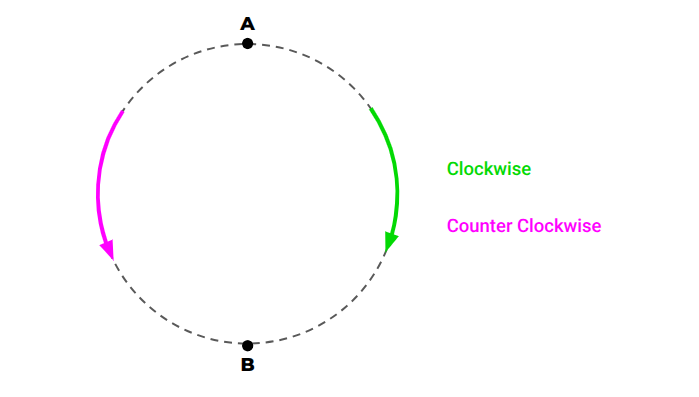
The syntax:
clip-path: shape(
  from Xa Ya,
  arc to Xb Yb of R [large or small] [cw or ccw]
);
Dropped into our shape with arbitrary values:
clip-path: shape(
  from 0 0,
  arc to 40% 0 of 50px,
  line to 100% 0,
  line to 100% 100%,
  line to 0 100%
);
The arc appears between 0 0 and 40% 0. Size and direction were omitted, and the browser defaults to small and ccw. Setting them explicitly exposes four cases — only two render visibly, because the others are drawn outside the element's area; a box-shadow makes them apparent. Since arcs are confusing by design here, trying all four combinations is the practical way to find the right one.
Half Circles at a Precise Radius
To center a half circle of a specific radius:
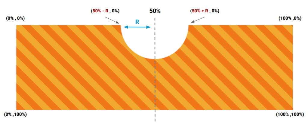
The radius becomes a variable:
.shape {
  --r: 50px;

  clip-path: shape(
    from 0 0,
    line to calc(50% - var(--r)) 0,
    arc to calc(50% + var(--r)) 0 of var(--r),
    line to 100% 0,
    line to 100% 100%,
    line to 0 100%
  );
}
Lines can then be optimized into hline/vline:
.shape {
  --r: 50px;

  clip-path: shape(from 0 0,
    hline to calc(50% - var(--r)),
    arc to calc(50% + var(--r)) 0 of var(--r),
    hline to 100%,
    vline to 100%,
    hline to 0
  );
}
A small radius also works — replace R with 1%:
.shape {
  --r: 50px;

  clip-path: shape(from 0 0,
    hline to calc(50% - var(--r)),
    arc to calc(50% + var(--r)) 0 of 1%,
    hline to 100%,
    vline to 100%,
    hline to 0
  );
}
With a radius smaller than half the distance between the points, no circle satisfies the condition, so the browser's error handling scales the radius up until one does and draws the arc anyway. This quirk simplifies the code: a small placeholder value lets the browser pick the radius. It only holds for half circles — don't apply it to arbitrary arc commands.
to Versus by
Almost every command accepts either a to or a by directive. to gives absolute coordinates, the exact target point, like polygon(); by gives relative ones, measured from the previous point. So this:
arc to calc(50% + var(--r)) 0 of 1%,can become this:
arc by calc(2 * var(--r)) 0 of 1%,The arc starts from the previous point (50% - R) 0 and moves by 2*R 0, landing at (50% - R + 2R) (0 + 0) — that is, (50% + R) 0.
.shape {
  --r: 50px;

  clip-path: shape(from 0 0,
    hline to calc(50% - var(--r)),
    arc by calc(2 * var(--r)) 0 of 1px,
    hline to 100%,
    vline to 100%,
    hline to 0
  );
}
The benefit: repositioning the cut-out means editing a single value, the 50%.
.shape {
  --r: 50px;
  --p: 40%;

  clip-path: shape(
    from 0 0,
    hline to calc(var(--p) - var(--r)),
    arc by calc(2 * var(--r)) 0 of 1px,
    hline to 100%,
    vline to 100%,
    hline to 0
  );
}
Moving the cut-out to the bottom, left, or right side is left as the reader's first exercise, to attempt before comparing against the provided implementation.
Rounded Tab
A rounded tab is another pile of arc and line commands:
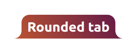
Verbose at first sight, it clarifies command by command; a figure illustrates its left portion:
.shape {
  --r: 26px;

  clip-path: shape(
    /* left part */
    from 0 100%,
    arc by var(--r) calc(-1 * var(--r)) of var(--r),
    vline to var(--r),
    arc by var(--r) calc(-1 * var(--r)) of var(--r) cw,
    /* right part */
    hline to calc(100% - 2 * var(--r)),
    arc by var(--r) var(--r) of var(--r) cw,
    vline to calc(100% - var(--r)),
    arc by var(--r) var(--r) of var(--r)
  );
}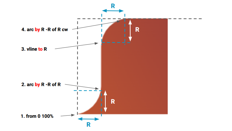
Every arc uses by, since each one moves by an offset equal to R and point coordinates never need computing. The 1% radius trick does not apply here: these are quarter circles, not half circles. Left- and right-side variants follow easily. They need only two arc commands instead of three, because one rounded corner can come from a normal border radius.
Inverted Radius
The classic inner corner curve, also called an inverted radius, raises a question: how many arc commands does it need? Six curves suggest six arcs — the hard way. Three of them can be plain border radius, leaving three arcs. Analyzing a shape before coding pays off; often basic CSS properties do part of the work.
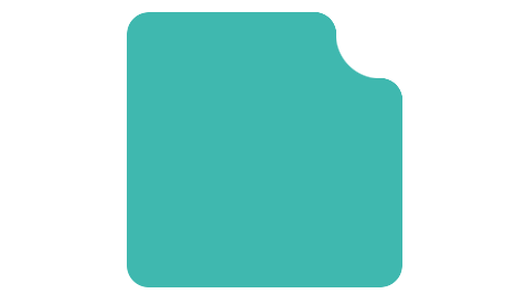
Creating all four variations is the second exercise, with no figure this time; rereading the earlier shapes is the suggested fallback. Implementations are provided for comparison.
Wrapping Up
This first part has covered the line and arc commands, which suffice for most common shapes. Later parts cover more on arcs, curves, and the close and move commands. The SVG-to-CSS converter and the CSS Shape collection are the companion resources.




