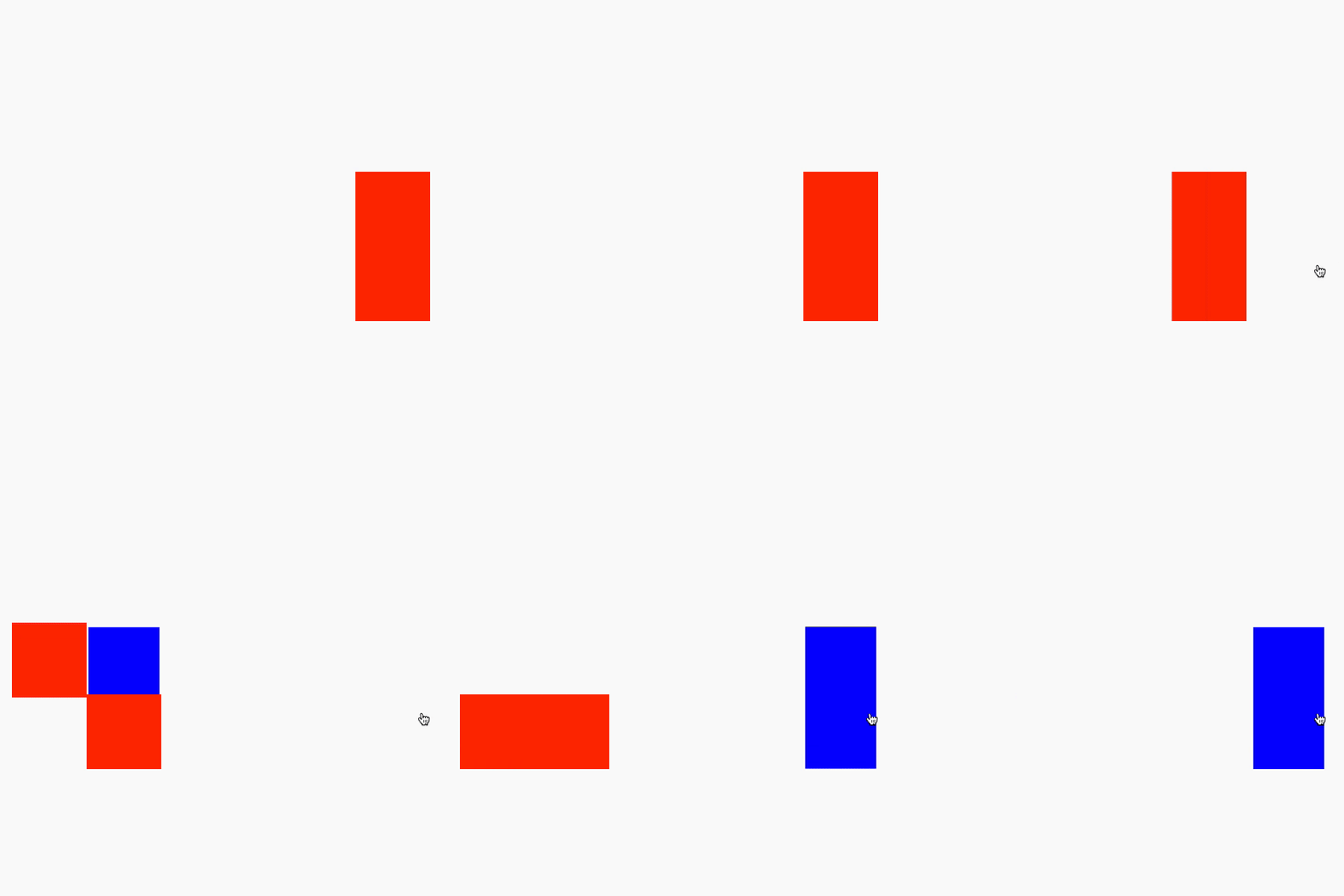
A set of nested Matryoshka dolls holds a charm all its own — and the effect turns out to be achievable in pure HTML and CSS. Instead of wooden figures, the demo uses a little bear character, and the interaction is simple: click a doll, watch it open, and a smaller one appears inside. The work divides into three passes — establish the mechanics, add the animation, then scale and style.
The reset trick and the checkbox hack
To build the mechanics, the markup starts out deliberately plain. There is no true infinity here, so the innermost doll needs a way back to the start without reloading the page. Wrapping the whole scene in an HTML <form> provides it: an input with its type attribute set to reset clears every checkbox state with no JavaScript involved.
<form>
  <input type="reset" id="reset"/>
  <label for="reset" title="Reset">Reset</label>
</form>
The dolls themselves are driven by the classic checkbox hack: a chain of inputs paired with labels. The source markup is generated with Pug because it supports loops, though hand-written HTML works just as well.
The rules of the interaction:
- Only one checkbox is visible at a time.
- Checking a checkbox reveals the label for the next checkbox, which sits three siblings later in the DOM — so the CSS adjacent sibling combinator (
+) does the work. - The last label has no checkbox of its own, so its only option is to reset the form.
The first label gets an inline display: block so it shows before anything is checked. A separate rule handles the final label case. At this stage the dolls can be boxes.
.doll {
  color: #fff;
  cursor: pointer;
  height: 200px;
  font-size: 2rem;
  left: 50%;
  position: absolute;
  text-align: center;
  top: 50%;
  transform: translate(-50%, -50%);
  width: 100px;
}

.doll:nth-of-type(even) {
  background: #00f;
}

.doll:nth-of-type(odd) {
  background: #f00;
}
How the opening sequence works
Animating the dolls happens around a center point and runs through five stages:
- Slide the current doll out to the left.
- Open the doll to reveal the next one.
- Move the next doll into the position the current one started from.
- Fade the current doll out.
- Promote the next doll to current.
Animation speed and behavior live in CSS variables, which makes chaining animations on the labels far easier.
:root {
  --speed: 0.25;
  --base-slide: 100;
  --slide-distance: 60;
}

input:checked + label {
  animation: slideLeft calc(var(--speed) * 1s) forwards;
}

@keyframes slideLeft {
  to {
    transform: translate(calc((var(--base-slide) * -1px) + var(--slide-distance) * -1%), 0);
  }
}
Two problems appear. First, a second click on a label can restart the animation mid-flight; removing pointer-events from a label once it has been clicked prevents that.
input:checked + label {
  animation: slideLeft calc(var(--speed) * 1s) forwards;
  pointer-events: none;
}
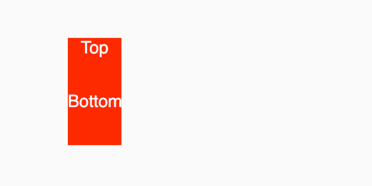
Second, opening the doll to show the next one requires extra elements — a lid, a base, and a stand-in doll. Because the real inner doll shouldn't become available at click time, a "fake" duplicate is revealed in its place and swapped for the real one after the animation finishes. The labels therefore need to contain span elements.
<label class="doll" for="doll--1">
  <span class="doll doll--dummy"></span>
  <span class="doll__half doll__half--top">Top</span>
  <span class="doll__half doll__half--bottom">Bottom</span>
</label>
.doll {
color: #fff;
cursor: pointer;
height: 200px;
font-size: 2rem;
position: absolute;
text-align: center;
width: 100px;
}
.doll:nth-of-type(even) {
--bg: #00f;
--dummy-bg: #f00;
}
.doll:nth-of-type(odd) {
--bg: #f00;
--dummy-bg: #00f;
}
.doll__half {
background: var(--bg);
position: absolute;
width: 100%;
height: 50%;
left: 0;
}
.doll__half--top {
top: 0;
}
.doll__half--bottom {
bottom: 0;
}
.doll__dummy {
background: var(--dummy-bg);
height: 100%;
width: 100%;
position: absolute;
top: 0;
left: 0;
}The lid's opening effect is three translations: pop it up, move it left, pop it down.
@keyframes open {
  0% {
    transform: translate(0, 0);
  }
  33.333333333333336% {
    transform: translate(0, -100%);
  }
  66.66666666666667% {
    transform: translate(-100%, -100%);
  }
  100% {
    transform: translate(-100%, 100%);
  }
}
The delay before opening is derived from the --speed custom property, multiplied by two seconds so it doesn't feel too quick.
input:checked + .doll {
  animation: slideLeft calc(var(--speed) * 1s) forwards;
  pointer-events: none;
}

input:checked + .doll .doll__half--top {
  animation: open calc(var(--speed) * 2s) calc(var(--speed) * 1s) forwards; // highlight
}
Moving the dummy doll to the new position also takes three stages — up, right, and set down — with custom properties controlling the distance.
:root {
  // Introduce a new variable that defines how high the dummy doll should pop out.
  --pop-height: 60;
}

@keyframes move {
  0% {
    transform: translate(0, 0) translate(0, 0);
  }
  33.333333333333336% {
    transform: translate(0, calc(var(--pop-height) * -1%)) translate(0, 0);
  }
  66.66666666666667% {
    transform: translate(0, calc(var(--pop-height) * -1%)) translate(calc((var(--base-slide) * 1px) + var(--slide-distance) * 1%), 0);
  }
  100% {
    transform: translate(0, calc(var(--pop-height) * -1%)) translate(calc((var(--base-slide) * 1px) + var(--slide-distance) * 1%), calc(var(--pop-height) * 1%));
  }
}
Hiding the real doll until the swap is due
As long as the next doll is visible right away, rapid clicking jumps through the whole set. The real doll shouldn't appear until the fake one has landed. Zero-second scale animations handle this: two of them, delayed, with animation-fill-mode holding the state.
@keyframes appear {
  from {
    transform: scale(0);
  }
}
Only one set of @keyframes is needed; the reverse movement comes from animation-direction: reverse. Variables matter a great deal at this point, since animations are chained.
// The next doll
input:checked + .doll + input + .doll,
// The last doll (doesn't have an input)
input:checked + .doll + .doll {
  animation: appear 0s calc(var(--speed) * 5s) both;
  display: block;
}

// The current doll
input:checked + .doll,
// The current doll that isn't the first. Specificity prevails
input:checked + .doll + input:checked + .doll {
  animation: slideLeft calc(var(--speed) * 1s) forwards;
  pointer-events: none;
}

input:checked + .doll .doll__half--top,
input:checked + .doll + input:checked + .doll .doll__half--top {
  animation: open calc(var(--speed) * 2s) calc(var(--speed) * 1s) forwards;
}

input:checked + .doll .doll__dummy,
input:checked + .doll + input:checked + .doll .doll__dummy {
  animation: move calc(var(--speed) * 2s) calc(var(--speed) * 3s) forwards, appear 0s calc(var(--speed) * 5s) reverse forwards;
}
Making the dolls shrink
All dolls still render at the same size. An inline custom property recording each doll's index fixes that: the halves scale to match their own doll, and the fake inner doll scales to match the next one.
<input id="doll--0" type="checkbox"/>
<label class="doll" for="doll--0" style="display: block; --doll-index: 0;">
  <span class="doll__dummy-container">
    <span class="doll__dummy"></span>
  </span> //highlight
  <span class="doll__container">
    <span class="doll__half doll__half--top"></span>
    <span class="doll__half doll__half--bottom"></span>
  </span>
</label>
:root {
--scale-step: 0.05;
}
.doll__container,
.doll__dummy-container {
height: 100%;
left: 0;
position: absolute;
top: 0;
width: 100%;
}
.doll__container {
transform: scale(calc(1 - ((var(--doll-index)) * var(--scale-step))));
transform-origin: bottom;
}
.doll__dummy {
height: 100%;
left: 0;
position: absolute;
top: 0;
transform: scale(calc(1 - ((var(--doll-index) + 1) * var(--scale-step))));
transform-origin: bottom center;
width: 100%;
}The .doll__dummy class computes its scale from var(--doll-index) + 1) — that + 1 is what matches it to the following doll. The scale is applied on containers rather than the dolls themselves so the animations aren't disturbed, and the animation moves from .doll__dummy to the .doll__dummy-container class.
input:checked + .doll .doll__dummy-container,
input:checked + .doll + input:checked + .doll .doll__dummy-container {
  animation: move calc(var(--speed) * 2s) calc(var(--speed) * 3s) forwards, appear 0s calc(var(--speed) * 5s) reverse forwards;
}
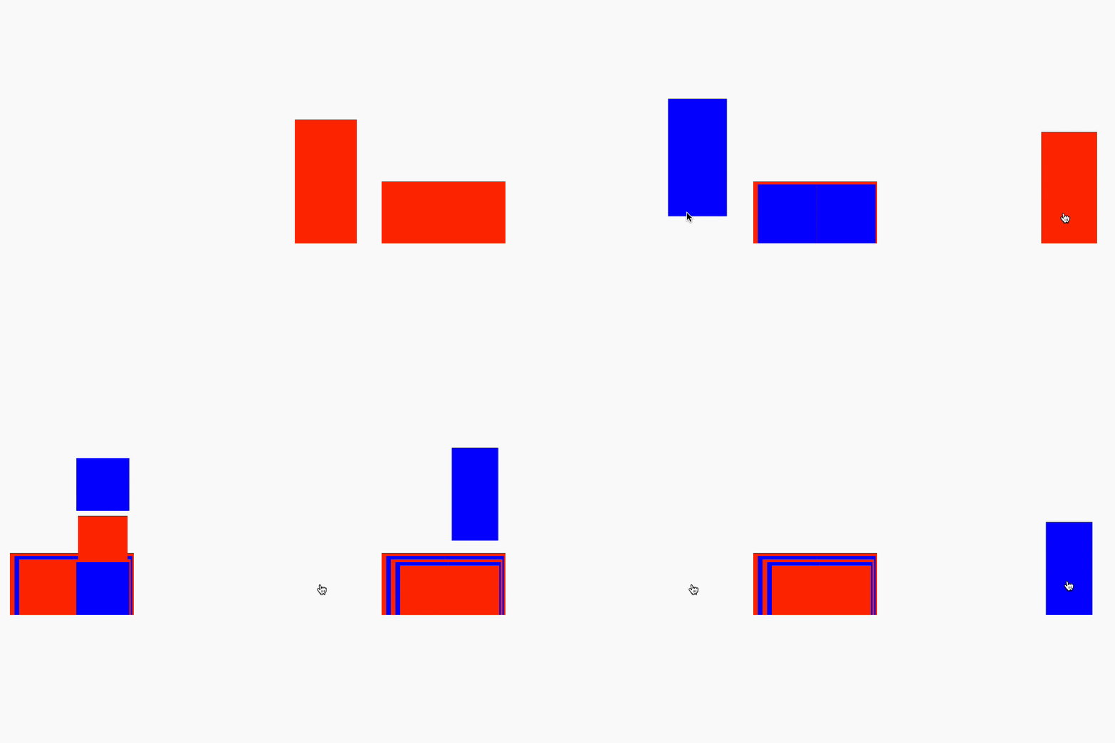
Because the boxes' content resizes while the box itself stays put, the animation behavior stays consistent and the code easier to maintain. A demo with colored container backgrounds shows the effect clearly. Styling options range from a background image to SVG or even emoji with random inline hues; the example uses inline SVG, with generated hue and lightness variables giving each bear a different shirt color.
@keyframes slideOut {
  from {
    transform: translate(calc((var(--base-slide) * -1px) + var(--slide-distance) * -1%), 0);
  }
  to {
    opacity: 0;
    transform: translate(calc((var(--base-slide) * -1px) + var(--slide-distance) * -2%), 0);
  }
}

input:checked + .doll,
input:checked + .doll + input:checked + .doll {
  animation: slideLeft calc(var(--speed) * 1s) forwards,
    slideOut calc(var(--speed) * 1s) calc(var(--speed) * 6s) forwards;
  pointer-events: none;
}