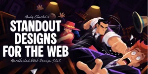
Andy Clarke, the designer and Stuff & Nonsense founder, has published Standout Designs for the Web, an e-book built on his thirty years of web design work. Its argument is that storytelling, color, typography, imagery, and layout should combine to produce sites people recognize and remember.
Why the book exists
Clarke's starting point is a contradiction: designers have more tools, techniques, and technology than ever, yet a great many websites look alike. He does not claim every site needs a novelty design. Rather, he argues designers have grown too comfortable with familiar patterns and predictable layouts, and the book is meant to push them back toward the creativity and personality that drew him to the web originally.
Familiarity versus "commodity design"
Clarke concedes that familiarity is valuable — it helps people understand how a site works, and usability shouldn't be sacrificed just to be different. The trouble begins when familiarity collapses into sameness: a hotel site, an insurance company, or an online shop should each carry some recognizable trace of the company behind it.
He labels that sameness "commodity design." It is acceptable when what you want is merely adequate, but it makes a company hard to recognize and its site hard to remember. His position is not anti-convention; he asks designers to think harder about when conventions serve a project.
Storytelling as a design input
For Clarke, storytelling is not a long company history or a page of marketing copy. Every company holds a story worth telling — its origins, the people in it, its personality, or some unexpected aspect of its work — and those details can drive the words, colors, typography, illustrations, and layouts on the site.
Much of his process is conversation with clients, hunting for what sets them apart. A detail mentioned almost in passing can become the seed of a whole design; the skill lies in spotting which details are worth developing and translating them into something visual.
Wheelman: a deliberately fictional case study
The book's examples run on Wheelman, an invented company for getaway drivers. The premise is playful — characters, criminal connections, questionable business activities — and it freed Clarke to explore ideas without the constraints of a real client engagement.
The joke carries a point. Clarke uses Wheelman to show how a company's character can shape ordinary business pages, e-commerce, editorial content, and even transactional forms. His test case is a donation form for retired criminals: if that can be made interesting, everyday websites have no excuse for lacking personality.
Beyond twelve columns
Clarke treats the twelve-column grid as web design's default setting — familiar and useful, but only one way to organize content. Starting every project from twelve columns, he argues, narrows the possibilities before anyone has asked what the content actually requires.
Standout Designs for the Web surveys the alternatives: column, compound, and modular grids, ratios, symmetry versus asymmetry, and other means of building rhythm and movement across a page. He isn't urging designers to abandon column grids, but to understand layout well enough to pick the appropriate type and combine several of them.
The one change he hopes for
Clarke's ask is that designers bring more curiosity to their next project: before opening Figma or Sketch, choosing a typeface, or settling on a layout, spend more time on what makes the client company interesting. Then interrogate the first decisions — does this layout suit the content, or is it merely familiar? Does the typography express the company's personality? Can an illustration communicate better than an AI-generated image or a stock photo?
He does not expect every website to be extraordinary or every design to break conventions. He wants designers to make decisions with more confidence, so the work ends up with character.
Standout Designs for the Web is available in the CSS-Tricks store.