

Making Web Animation Work With the WCAG
Animation doesn't have to be the enemy of accessibility. With careful planning around how motion contributes to the overall user experience, it's possible to build engaging, animated interfaces that still meet the needs of users with motion sensitivities, epilepsy, or other conditions affected by on-screen movement. The Web Content Accessibility Guidelines (WCAG), currently at version 2.1, offer concrete recommendations for handling animated content responsibly.
Managing Auto-Playing Motion: Pause, Stop, Hide
The first WCAG recommendation aimed at animation is Pause, Stop, Hide. This criterion addresses any content that moves, blinks, or scrolls automatically for more than five seconds alongside other content. The requirement is straightforward: give users a mechanism to pause, stop, or hide that motion.
At first glance, this might seem less relevant to UI design, since most interface animations run well under five seconds. However, the rule applies to the total duration of the motion pattern, not just individual animation steps. This means common patterns like auto-advancing carousels, animated backgrounds, and looping illustrations all fall under this requirement, as does infinitely looping motion of any kind.
Meeting the Pause, Stop, Hide Criteria
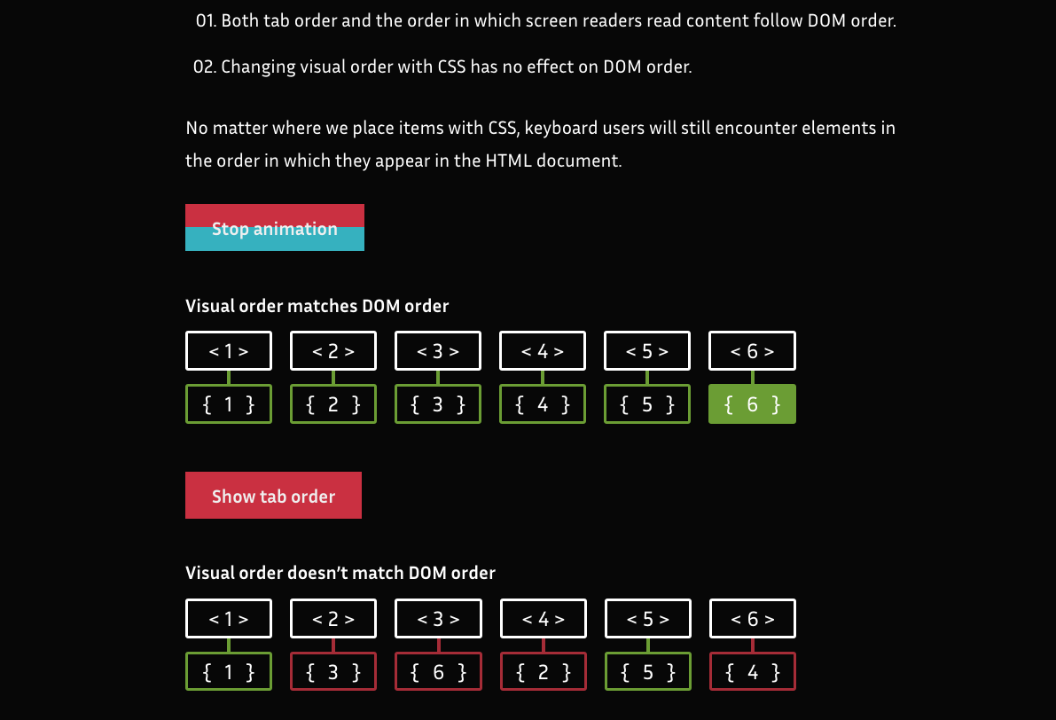
When you need to comply, add controls that let users start and stop the animation. The WCAG doesn't specify how those controls must look; the implementation is left to your design. For instance, the article series “Dark Side of The Grid” on matuzo.at embeds a play/stop button with every looping figure. More decorative animations play through once and present a replay button if users want to see them again. These controls match the article's overall aesthetic, proving accessible features can coexist with strong design.
Three Flashes or Below Threshold
The second animation-related guideline, three flashes or below threshold, dates back to broadcast television research on photosensitive epilepsy. Its requirement is simply that a page must not contain anything that flashes more than three times in any one-second period, unless the flash stays below the general flash or red flash thresholds.
Meeting the Flashing Criteria
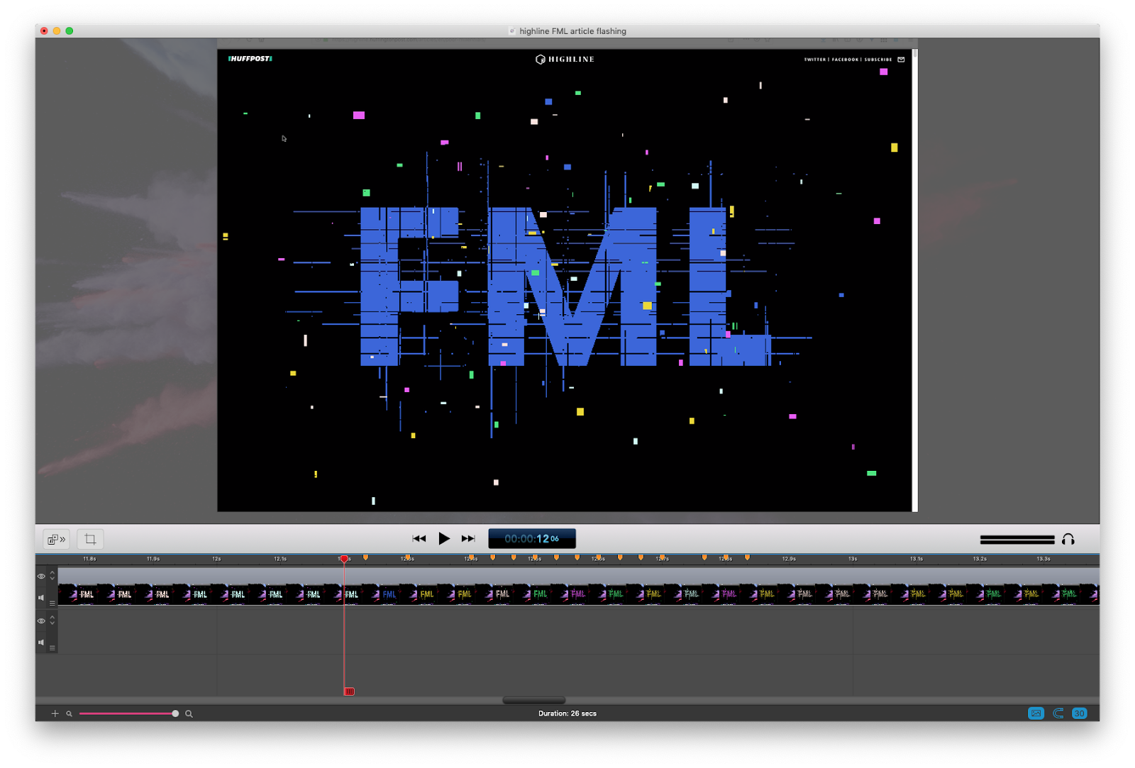
For most work, the safest way to meet this criterion is to avoid anything that flashes more than three times per second entirely. Excessive flashing is rarely an intentional design goal, but it sneaks in with effects meant to evoke video games, glitch aesthetics, or similar visual styles. The Huffington Post's feature on millennials and the modern economy is an example: its intentionally glitchy, 8-bit-inspired design is thematically appropriate, yet in some frames the text color flickers more frequently than the threshold permits. That could be a problem for users with epilepsy.
Conformance Levels: A, AA, and AAA
WCAG conformance is measured in levels. Level A is the minimum; Level AA requires A and AA criteria; Level AAA packs on the most. Most organizations target AA compliance, and the Pause, Stop, Hide and flashing guidelines are part of that Level AA set.
Handling Motion Triggered by Interaction
Beyond auto-playing animation, the WCAG's Level AAA adds a recommendation directed in particular at user-triggered motion: "Motion animation triggered by interaction can be disabled, unless the animation is essential to the functionality or the information being conveyed."
"Motion animation" needs clarification, since motion and animation are usually interchangeable terms. Here, the WCAG makes a specific distinction: motion animation means effects used "to create the illusion of movement," and it explicitly does not include changes of color, blurring, or opacity. Those non-motion effects fall outside this criterion. Understanding that line helps target your accessibility work effectively.

prefers-reduced-motion setting from their operating system or browser.
Avoid Unnecessary Animation
What counts as necessary depends on context and expectations. A movie or video game site has a higher tolerance for dramatic motion built into user expectations, while a government or construction company site does not. Evaluate your animation against what your users reasonably expect to encounter.
Provide a Way to Turn Off Problematic Motion
Any motion effect that can trigger reactions for sensitive users needs an off switch in practice. Parallax is the canonical case: it's well-documented as a frequent trigger and remains enormously popular. Rather than eliminating parallax, the responsible approach is to give control. The Netlify 1 Million Devs site and the official Animal Crossing page both implement visible motion toggles users can flip on demand.

Build With prefers-reduced-motion in Mind
Sites that don't rely on heavy motion may find a custom toggle overkill. In that case, they can rely on the prefers-reduced-motion media query by itself. Users set a global preference in their OS, and every site can react to it through CSS or JavaScript. This is a single setting that travels across the web with the user and makes reduced-motion detection straightforward.
As an example, a recurring bounce can be suppressed entirely for those users:
/* A constant bouncing motion effect applied to the title */
h2 {
  animation: bouncing 1.5s linear infinite alternate;
}

/* Replace it with a safer effect when prefers-reduced-motion returns true */
@media (prefers-reduced-motion: reduce) {
  h2 {
    animation: fade 0.5s ease-in both;
  }
}prefers-reduced-motion and a manual toggle together. Users who have reduced motion enabled globally get switched automatically; anyone else has the option to toggle. This dual mechanism is advocated by accessibility expert Marcy Sutton, who details the pattern in her egghead.io training course and on CodePen.
Putting accessible animation into practice
That covers the full set of WCAG recommendations that touch animation specifically. The extra effort required to implement them is worthwhile when it expands the audience who can engage meaningfully with your site.
Animation is not the only area where accessibility intersects with frontend work, though. For a broader view, useful references include the book Accessibility for Everyone by Lara Kalbag, as well as the resource collections at WebAIM and The A11y Project. If much of your animation work involves SVG, Heather's article on accessible SVGs offered on CSS-Tricks covers that territory in depth.


