

Focus as an accessibility primitive
Focus is the visual signal that tells a user what in the interface is currently being interacted with. CSS is aware of that state on interactive elements, which makes it the natural place to style it. The styling should follow your branding if you like, but the focus indicator — the ring around a focusable element — has to keep proper color contrast throughout the experience.
“The
MDN (Mozilla Developer Network):focusCSS pseudo-class represents an element (such as a form input) that has received focus. It is generally triggered when the user clicks or taps on an element or selects it with the keyboard’s Tab key.”
Focus is written like this:
:focus {
  /* INSERT STYLES HERE */
}
One rule matters more than any other: never set outline to 0 or none. That removes a visible focus indicator for every user, everywhere in the experience. If a reset or a design decision strips focus styling, it has to be restored later. CSS resets in particular frequently blank out focus styles — if you use one, consider Josh Comeau's reset.
*DO NOT DO what is below!*
:focus {
  outline: 0;
}

:focus {
  outline: none;
}
Selecting a container by its descendants
The :focus-within pseudo-class selects an element when any descendant it contains receives focus. That makes it useful for signaling interaction: you can change the background of the whole form, or react when focus moves into a particular input.
<header>
  <h1>Semantic Markup</h1>
  <nav>
    <ul>
      <li><a href="/">Home</a></li>
      <li><a href="https://css-tricks.com/about">About</a></li>
    </ul>
  </nav>
</header>

<section><!-- Code goes here --></section>
<section><!-- Code goes here --></section>
<aside><!-- Code goes here --></aside>
<footer><!-- Code goes here --></footer>
Semantic markup does much of this work by default. header, nav, main, section, aside and footer are semantic elements, as are h1 and ul. Prefer them over divs. A div is acceptable when you are building a custom component, paired with ARIA (Accessible Rich Internet Applications).
A contact form example
The markup below is a simple contact form built with semantic HTML:
<form>
  <div>
    <label for="firstName">First Name</label><input id="firstName" type="text">
  </div>
  <div>
    <label for="lastName">Last Name</label><input id="lastName" type="text">
  </div>
  <div>
    <label for="phone">Phone Number</label><input id="phone" type="text">
  </div>
  <div>
    <label for="message">Message</label><textarea id="message"></textarea>
  </div>
</form>
Styling the form's focus state
form:focus-within {
  background: #ff7300;
  color: black;
  padding: 10px;
}
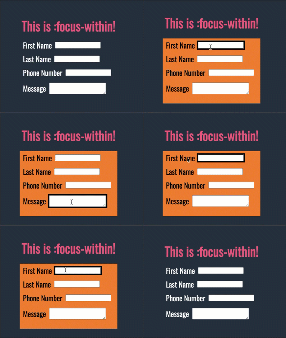
When any field inside the form has focus, this adds an orange background, some padding, and changes the label color to black.
Supporting users with low vision
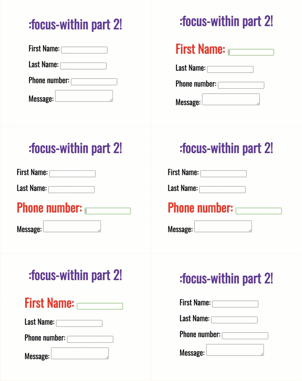
A second use case is making the labels bolder, a different color, or larger for users with low vision.
<form>
  <h1>:focus-within part 2!</h1>
  <label for="firstName">First Name: <input name="firstName" type="text" /></label>
  <label for="lastName">Last Name: <input name="lastName" type="text" /></label>
  <label for="phone">Phone number: <input type="tel" id="phone" /></label>
  <label for="message">Message: <textarea name="message" id="message"/></textarea></label>
</form>
label {
  display: block;
  margin-right: 10px;
  padding-bottom: 15px;
}

label:focus-within {
  font-weight: bold;
  color: red;
  font-size: 1.6em;
}
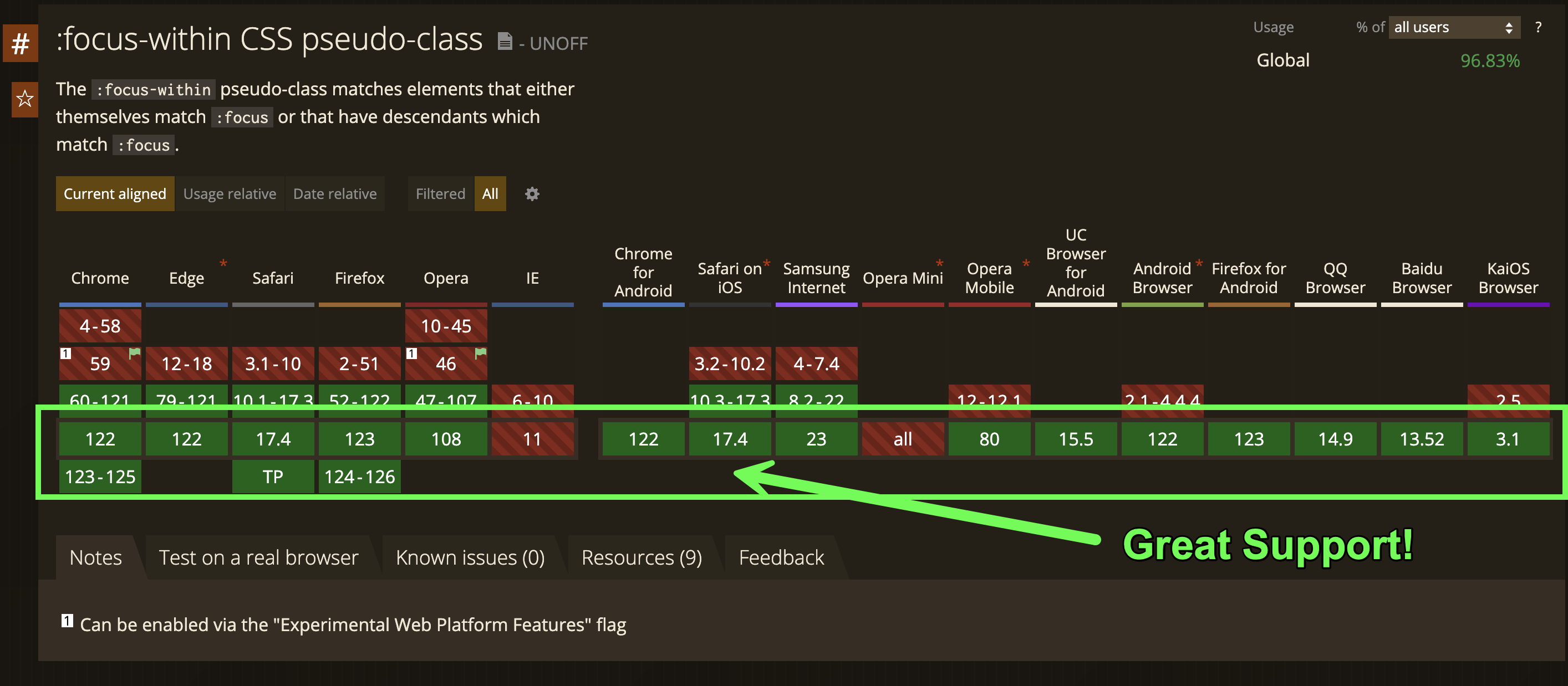
Browser support for :focus-within is broad across the board according to Can I use.
Why it matters
An accessible user experience should be a top priority when shipping software, whether the audience is external users or internal colleagues. Beyond code, that means recognizing the challenges people face and providing things like screen readers where employees need them; color contrast is a related, easy win. Developers at every level, up to senior leadership, have a part in making the web platform more inclusive. Semantic markup and CSS are the practical tools for building those inclusive spaces.
More detail on :focus-within is available in the CSS-Tricks Almanac.




