

Customizable select: opt-in mechanics and caveats
Customizable <select> currently runs only in recent Chromium-based browsers. Because a customized select is still a <select> element, browsers without support degrade to a normal select, so the feature works as progressive enhancement. Opting in means resetting the default appearance of the select and its dropdown:
select,
::picker(select) {
  appearance: base-select;
}
That single rule unlocks styling for the button, dropdown and options. Without it you get a standard select.
A curved stack of folders
The markup is deliberately minimal — each option holds only a folder name, with the icon drawn in CSS:
<select>
  <option value="documents"><span>Documents</span></option>
  <option value="photos"><span>Photos</span></option>
  <option value="music"><span>Music</span></option>
  <option value="videos"><span>Videos</span></option>
  <option value="downloads"><span>Downloads</span></option>
  <option value="desktop"><span>Desktop</span></option>
  <option value="projects"><span>Projects</span></option>
  <option value="backups"><span>Backups</span></option>
  <option value="trash"><span>Trash</span></option>
</select>
The <span> inside each <option> wraps the folder name for later styling of the selected state. This is a significant shift: options previously accepted text only, and the HTML parser has been relaxed to allow far more embedded elements. Non-supporting browsers ignore the extra elements and render the text.
Start with the button: hide the picker icon and give it a proper look.
select::picker-icon {
  display: none;
}
select {
background: linear-gradient(
135deg,
rgba(40, 40, 50, 0.4) 0%,
rgba(60, 60, 70, 0.25) 50%,
rgba(50, 50, 60, 0.35) 100%
);
backdrop-filter: blur(12px) saturate(180%);
box-shadow:
0 8px 32px rgba(0, 0, 0, 0.2),
inset 0 1px 1px rgba(255, 255, 255, 0.15),
inset 0 -1px 1px rgba(0, 0, 0, 0.1);
border: 1px solid rgba(255, 255, 255, 0.2);
color: white;
min-inline-size: 12rem;
}The dropdown carries many browser default styles for position, background-color, margin and more, so those must be disabled and overridden. Here the container should not be visible at all — the folders should appear to float above the page unconstrained:
::picker(select) {
  background: transparent;
  border: none;
  box-shadow: none;
  overflow: visible;
}
With the container neutralized, options can no longer be clipped by the dropdown area. Next, swap the checkmark for a small disc and add a folder emoji before each option via option::before:
option::checkmark {
  content: "●";
  color: #222;
}
The ::checkmark pseudo-element allows changing the shape, color and size of the checkmark. After additional fine-tuning:
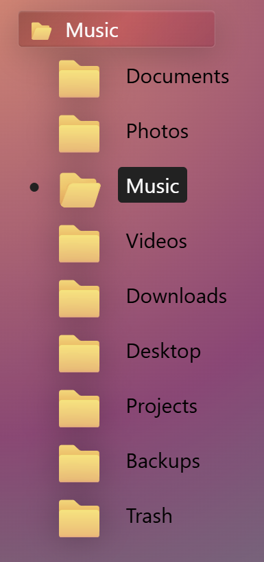
The result behaves like any other select with mouse or keyboard, so the browser continues to handle accessibility while the CSS does the rest.
Curving the stack requires a newer piece of syntax that is not yet widely available: sibling-index(), which returns an element's index among its siblings. (sibling-count() returns the total number of siblings, but isn't needed here.) The index lets each option be styled by its position in the dropdown:
option {
  --rotation-offset: -4deg;
  rotate: calc(sibling-index() * var(--rotation-offset));
}
The custom property --rotation-offset defines the angle applied between successive options, and the rotate property multiplies it by sibling-index(): the first option rotates by -4 degrees, the second by -8, the third by -12, and so on. That alone doesn't produce a curve, because each folder rotates around its own top-left origin. A shared transform-origin fixes it, and since the property is relative to each element, sibling-index() is used again to shift every origin up and to the right onto the same point:
option {
  --rotation-offset: -4deg;
  rotate: calc(sibling-index() * var(--rotation-offset));
  transform-origin: right calc(sibling-index() * -1.5rem);
}
Finally, animate the stack so it curves into shape. Reset the rotation by default and apply an elastic easing function:
option {
  rotate: 0deg;
  transition: rotate 0.3s cubic-bezier(0.34, 1.56, 0.64, 1);
}
Apply the real angle only while the select is open:
select:open option {
  rotate: calc(sibling-index() * -1 *  var(--rotation-offset));
}
CSS transitions do not fire when an element first appears, so the @starting-style at-rule supplies the options' initial state and lets the transition play as they show up:
@starting-style {
  select:open option {
    rotate: 0deg;
  }
}
A short transition delay multiplied by sibling-index() staggers each folder slightly behind the previous one:
option {
  transition-delay: calc((sibling-index() - 1) * 0.01s);
}
Fanned deck of cards
This picker opens as a fanned deck of cards. Each option contains a few <span> elements for the card's content:
<option class="red" value="QH">
  <span class="rank">Q</span>
  <span class="suit">♥</span>
</option>
An empty <button> placed directly under the opening <select> tag suppresses the default <selectedcontent> behavior:
<select>
  <button></button>
  <option>…</option>
  <!-- ... -->
</select>
Normally the browser mirrors the selected option's content — here the card face — inside the select's button area via a generated <selectedcontent> element. This demo needs the button to always show the back of the deck, so the custom <button> overrides the default while keeping the select styleable:
select {
  background:
    /* Diamond pattern overlay */
    repeating-linear-gradient(45deg,
      transparent,
      transparent 1vmin,
      rgba(255, 255, 255, 0.05) 1vmin,
      rgba(255, 255, 255, 0.05) 2vmin),
    repeating-linear-gradient(-45deg,
      transparent,
      transparent 1vmin,
      rgba(255, 255, 255, 0.05) 1vmin,
      rgba(255, 255, 255, 0.05) 2vmin),
    /* Base gradient */
    linear-gradient(135deg, #8b0000 0%, #dc143c 50%, #8b0000 100%);
}
As before, the dropdown container's background, border and overflow defaults get overridden. Positioning matters more here: the deck must fan out from the deck and stay centered above it. The ::picker(select) pseudo-element is positioned relative to the button through anchor positioning, and that alignment can be overridden with position-area:
::picker(select) {
  position-area: center center;
  inset: 0;
}
Setting inset to 0 sets top, right, bottom and left to 0 in one declaration, letting the dropdown use all available space instead of being pinned to the side of the button. The cards then need to sit side by side:
select:open::picker(select) {
  display: flex;
}
Rotating each card produces the fan: the center card stays straight, cards to the left rotate left and cards to the right rotate right. This uses sibling-index() together with sibling-count():
option {
  --card-fan-rotation: 7deg;
  --card-fan-spread: -11vmin;
  --option-index: calc(sibling-index() - 1);
  --center: calc(sibling-count() / 2);
  --offset-from-center: calc(var(--option-index) - var(--center));

  rotate: calc(var(--offset-from-center) * var(--card-fan-rotation));
  translate: calc(var(--offset-from-center) * var(--card-fan-spread)) 0;
  transform-origin: center 75vmin;
}
Each card's offset is computed relative to the center and used to rotate in 7-degree increments. In a 9-card deck, the left-most card gets a -4 offset for -4 * 7 = -28 degrees, and the right-most rotates by 28 degrees. The translate property pulls the cards together and transform-origin finishes the look.
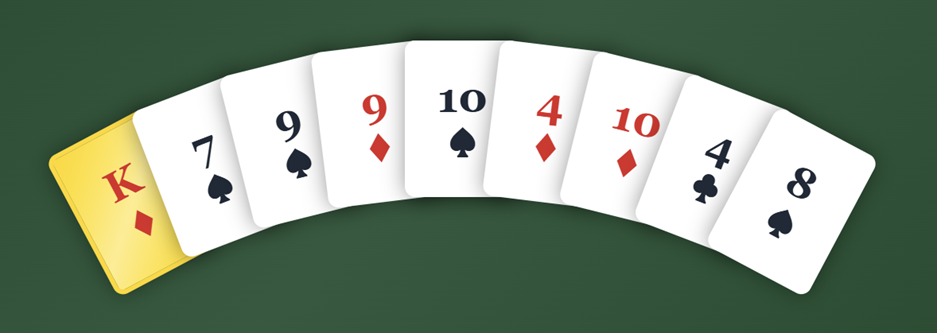
Opening is animated by transitioning the custom --card-fan-rotation property from 0 to 7 degrees. Animating a custom property takes a few steps. First, declare its type so the browser can interpolate it:
@property --card-fan-rotation {
  syntax: '<angle>';
  inherits: false;
  initial-value: 7deg;
}
Then add the @starting-style at-rule so the transition plays when the options appear:
@starting-style {
  select:open option {
  --card-fan-rotation: 0deg;
  }
}
Next, define the closed-state angle and the transition itself:
option {
  --card-fan-rotation: 0deg;
  transition: --card-fan-rotation 0.2s ease-out;
}
Finally, set the open-state angle:
select:open option {
  --card-fan-rotation: initial;
}
The initial value can stand in for a hard-coded 7deg, since the @property rule already defines it as the initial value.
Radial emoji picker
Here the emojis circle the select button, again achieved by overriding the dropdown's anchor positioning — this time with the anchor() function for the top and left coordinates:
::picker(select) {
  top: calc(anchor(top) - var(--radius));
  left: calc(anchor(left) - var(--radius));
  width: calc(var(--radius) * 2 + var(--option-size));
  height: calc(var(--radius) * 2 + var(--option-size));
}
--radius is the radius of the emoji circle, and because customizable selects already rely on anchor positioning, anchor() can position the dropdown relative to the button. Placing the options in a circle inside the dropdown uses CSS trigonometry — cos() and sin() combined with sibling-index() and sibling-count():
option {
  position: absolute;
  --angle: calc((sibling-index() - 2) * (360deg / (sibling-count() - 1)) - 90deg);
  top: 50%;
  left: 50%;
  translate:
    calc(-50% + cos(var(--angle)) * var(--radius)) calc(-50% + sin(var(--angle)) * var(--radius));
}
The demo also animates the opening of the options, though those details are left out here.
What stays constant
Customizable selects permit overriding not just the look of the button and options but also how everything is positioned and animated. Even when customized, the element remains a <select> and works in non-supporting browsers, which makes the feature usable today as a progressive enhancement despite its early state.




