

Why a repeatable design-to-code process is worth the upfront cost
Translating design files into HTML, CSS and JavaScript is the core of front-end work, yet the part where you break a design down and decide how to approach the build rarely appears in tutorials on any specific technology. New developers tend to pick it up on the job. Without some way to dig in and predict your approach, estimating how long a build takes—or which questions need answering first—becomes very difficult. Designs that look simple at first glance often turn complex once you get into the weeds, which leads to overpromises, tighter deadlines and stress.
A second factor is tooling context. Solo projects let you keep static content in the HTML; real-world work is more dynamic, and you often operate at the layer of "make things a non-developer can use to make a web page." For the walkthrough below, assume a marketing-style page whose content professionals edit through a CMS—reordering sections, replacing images, changing styles—so the page's building blocks must be chosen with that in mind.

A clinical-trial site serves as the example. It relies on familiar patterns: a big hero, product images, small sections of short-form content, company information. On mobile the left columns stack above the right and other typical reflow occurs; nothing structural changes. So what you see is the core of the design: a header, many distinct sections, a footer. Several sections share a two-column layout, and button and heading styles look consistent throughout. That repeated-pattern recognition is where note-taking starts.
Sorting design ideas into buckets
Before coding, record the ideas the design contains so the finished page can represent all of them. Five buckets work well:
- Layout-level patterns—repeating layout ideas and the overall grid
- Element-level patterns—headings, text sizes, fonts, spacing, icons, button sizes
- Color palette
- Structural ideas—logical organization of sections, independent of layout
- Everything else—ideas present in only one component
Documenting patterns this way informs the CSS approach, the choice of HTML elements, and conversations with designers or stakeholders. If you have the source files, section and layer labels may reveal the designer's intent and give you vocabulary for discussing specific areas.
Evaluate in five passes, each hunting for one bucket, always outside-in, top-to-bottom and left-to-right. The list needn't be perfect—it can change later; the goal is recording first impressions.
Pass 1: Layout-level ideas

- A header with a horizontal nav
- A main content column whose left and right edges align across every section from header to footer
- Sections with two columns, with a single centered column, and with a single left-aligned column
- A footer with three columns
- Fairly generous padding inside each section
Note first impressions too, good and bad—you never get a first impression twice. Praising what works also softens constructive criticism later. Examples: the design is clean and readable; sections are titled as questions, which draws readers in and gives each a clear purpose; question marks are used inconsistently (perhaps an oversight); some very similar font sizes sit side by side (worth following up, since it reads as less polished than the rest); the logo's small gradient is nice.
Pass 2: Element-level ideas
- Primary (blue) and secondary (white) button styles, plus a "Learn more" header button with an arrow (possibly an expanding menu)
- Heading and sub-heading styles
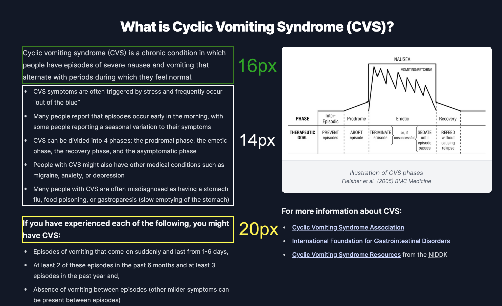
- Three body text sizes:
16px,18px,20px - A dark-mode section with white text on a dark background
- Consistent "image & caption" sets
- Custom bullet points of various kinds
- Inline links underlined; links elsewhere, such as the footer, not
- A repeated card with an icon on top and a heading and list inside
- The logo repeated in different contexts and sizes
- Uppercase footer headings that appear nowhere else
Pass 3: Color palette
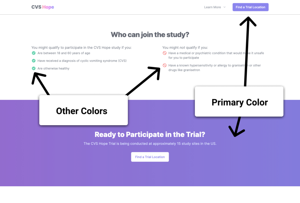
The palette is small: a blue/purple primary; light and dark body text colors; light and dark link colors; a gradient under the word "hope" in the logo; a light gray background; a dark navy background; and specific red and green checkmark and stop icon colors. Some design tools export hex values, or full Sass or CSS variable declarations—use that if available; otherwise capture and name the values yourself, since they anchor the initial CSS. Refer to colors by reusable labels such as "primary" and "secondary" throughout the code, so values are easy to adjust later and themes are easy to add.
Pass 4: Structure and semantics
This pass names the page's regions and maps the content hierarchy. Documenting the nature and structure of the content in plain language reveals the underlying patterns that become components, and clarifies how people using assistive technology should perceive the page. That, in turn, determines the semantic HTML you need. Browsers turn your HTML into the accessibility tree that assistive tech uses to present the page, and semantic HTML gives it a solid outline. Aim to understand the content well enough to explain it verbally with no visuals, then work backward to the markup that expresses it. (Choosing the best element for a given situation is another topic—but an accessibility tree built entirely from proper elements and attributes is far more useful than one that reads "generic generic generic.")
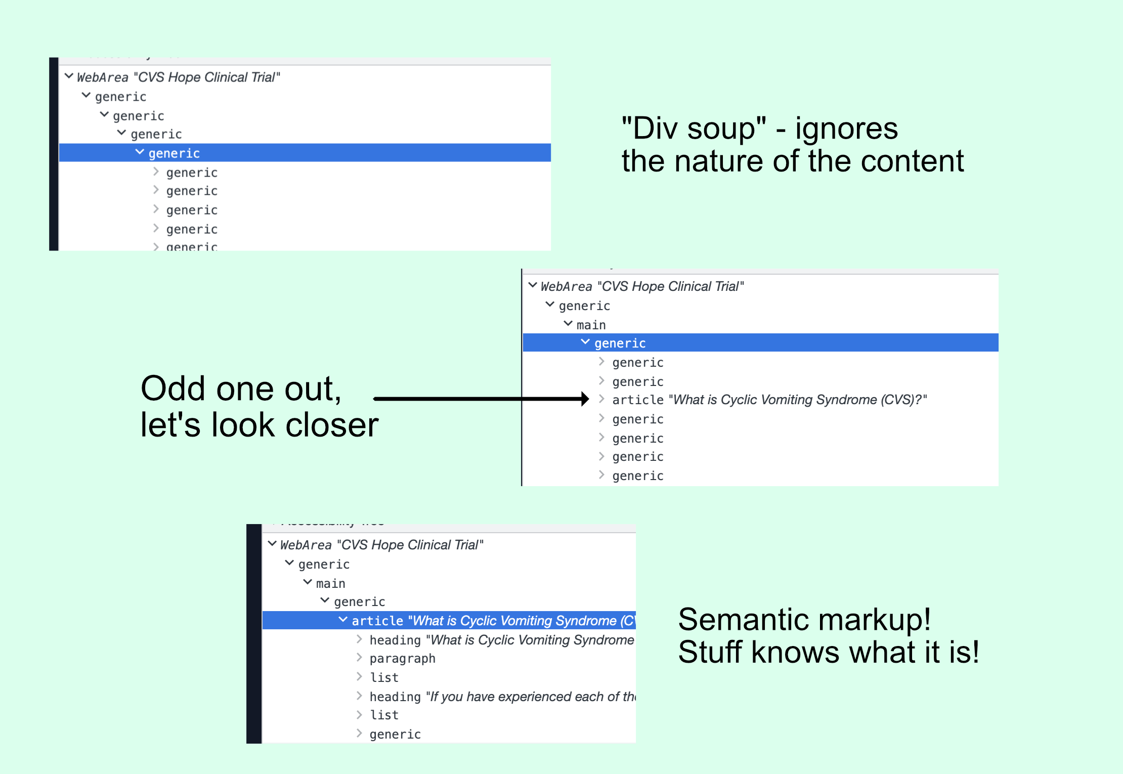
Top-level structure on the first sweep:
- Header
- Main Content
- Footer
Go one level deeper—just enough to label each section's items:
- In the Header: home link; navigation section
- In Main Content: hero; short explainer about the disease; explainer about the treatment; intro to the trial; explainer with trial details; statement about who can join; call-to-action to participate; short company explainer
- In the Footer: logo; summary sentence; lists of links with titles; divider; copyright notice
This reveals that header and footer are shallow and already reach raw links and text, while main holds eight distinct topic subsections. One more pass into the details of those sections:
- Header home link—a link, done.
- Header nav—an expanding hover nav requiring JavaScript to work correctly. Accessible examples exist, but it takes longer to develop and test than plain links.
- Hero—title; column 1 with subtitle (missed in the element-level pass), paragraph, primary button link and secondary button link; column 2 with the hero image.
- Disease explainer—title; paragraph; unordered list; large text; unordered list; image and caption (figure and figcaption); list of links.
- Treatment explainer—title; column 1 with paragraphs; column 2 with image and caption (figure and figcaption).
- Trial intro—title; column 1 with a YouTube video player; column 2 with paragraphs.
- Trial details—title; subtitle; cards with icon, title and list.
- "Who can join" statement—title; column 1 with paragraph and unordered list; column 2 with paragraph and unordered list.
- Call-to-action—title; paragraph; secondary button link.
- About the company—title; paragraph.
The list grows quickly, but now you know what to build and what's tricky. It also surfaces helper components not owned by any one section—say, a two-column layout that stacks on mobile with a title on top, or a generic section container that accepts background and foreground colors and supplies standard internal padding. The breakdown doubles as a decent description of the accessibility tree your HTML should produce, which keeps accessibility from becoming rework later.
Pass 5: Everything else
This pass is the flip side of first impressions, made with full context in hand. Capture anything that stands out, especially open questions about behavior—for example, what the nav's "Learn More" link is supposed to do, where the answer might be a list of links to each section that opens on hover. Designers sometimes assume such behavior is implied by the design even when undocumented, and it surfaces at design review only after the feature is built—too late to fix without moving dates.
Look deeply for hidden glue work: wrangling styles, handling mobile, configuring the CMS, adding and testing authoring options and arrangements for the building blocks, writing automated tests. With all of this in hand, you can pin down which components the CMS needs and offer a decent estimate grouped into categories:
- Already 100% ready—no dev time
- Existing but needing tweaks for the new purpose—predictable dev time
- Entirely new with an obvious, safe path—predictable dev time
- New and needing research, an unclear design, or otherwise unsettling—raise it with whoever runs the project as early as possible
What the process buys you
The exact steps and their order matter less than knowing what information to gather at the start.
- Extra discovery. Designs arrive with assumptions that may be impractical or conflict with accessibility. Assess the whole up front, start conversations with the people who can resolve the issues, and keep coding the parts that are ready instead of hitting roadblocks mid-build. Flagging concerns early earns gratitude.
- Effective help. Without a plan, progress is hard to gauge and extra hands are hard to deploy. A sound plan breaks work into chunks that can be delegated as tickets, with confidence the pieces fit. Mature developers understand that seeing the whole picture, and recognizing early when a timeline looks wrong, beats working around the clock to heroically hit it.
- Better component architecture. Naming, placement, communication between components, where to split—many of those choices only make sense against the bigger picture, and many are marginal enough that picking "best" wastes time. Gathering most of the needed information first separates "what pieces do I need" from "the best code for those pieces," and clarifies which decisions truly don't matter. New discoveries while coding become easier because you're prepared for them.
- Clearer styles. Planning reveals which styles are global, section-specific, component-specific, or one-off exceptions. Andy Bell's Cube CSS pairs well with this breakdown; a video of Andy working through an example with Chris Coyier is available.
- Accessibility from day one. Understanding the design's ideas makes semantic element choices and accessible patterns easier. The bar becomes: high-quality front-end code correctly expresses the nature and structure of its content to all users, with accessibility as the measure. Designs soon reveal themselves as known patterns, and breakdown-to-implementation speeds up sharply. Carie Fisher has written on an accessibility-first approach.
Much of this sits in the "oral tradition" of web development—the things a senior developer tells you in your first role. Others would prioritize differently, and many people work without a solid process or a senior to consult. A baseline helps in that situation: ideally the job is more than dropping everything into divs until things look right, even when eagerness to see results pushes us there.




