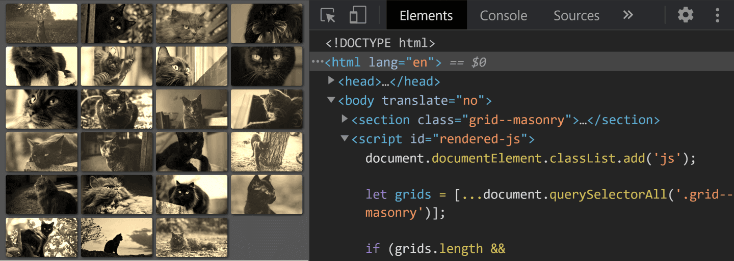
Firefox's experimental masonry support landed in CSS grid earlier this year, and while it is hidden behind a flag and limited to a single browser, it gives us a reference behavior to build against. The proposal works by assigning masonry to either grid-template-rows or grid-template-columns; everything else stays ordinary grid. That is enough to write a native path for Firefox and a JavaScript fallback for everyone else, which together cover the browsers in use today.
Turning on the native path
Native masonry is opt-in. Visit about:config, search for "masonry", and double-click layout.css.grid-template-masonry-value.enabled to flip it from false to true.

Markup and the base grid
The demo grid is a flat list of images:
<section class="grid--masonry">
  <img src="black_cat.jpg" alt="black cat" />
  <!-- more such images following -->
</section>
The container becomes a grid, with a column width capped at 10em but allowed to shrink below that on narrow viewports. The width is therefore Min(10em, 100%), and the number of columns is not fixed — auto-fit packs in as many as fit:
$w: Min(10em, 100%);

.grid--masonry {
  display: grid;
  grid-template-columns: repeat(auto-fit, $w);

  > * { width: $w; }
}
Min() is written capitalized to sidestep a Sass conflict. Center the grid with margin, add equal grid-gap and padding using a $s spacing variable, and give it a background:
$s: .5em;

/* masonry grid styles */
.grid--masonry {
  /* same styles as before */
  justify-content: center;
  grid-gap: $s;
  padding: $s
}

/* prettifying styles */
html { background: #555 }
Each image can then be evened out with a filter, softened with slightly rounded corners, and lifted with a box-shadow:
img {
  border-radius: 4px;
  box-shadow: 2px 2px 5px rgba(#000, .7);
  filter: sepia(1);
}
With the presentation in place, the native masonry declaration is a single property:
.grid--masonry {
  /* same styles as before */
  grid-template-rows: masonry;
}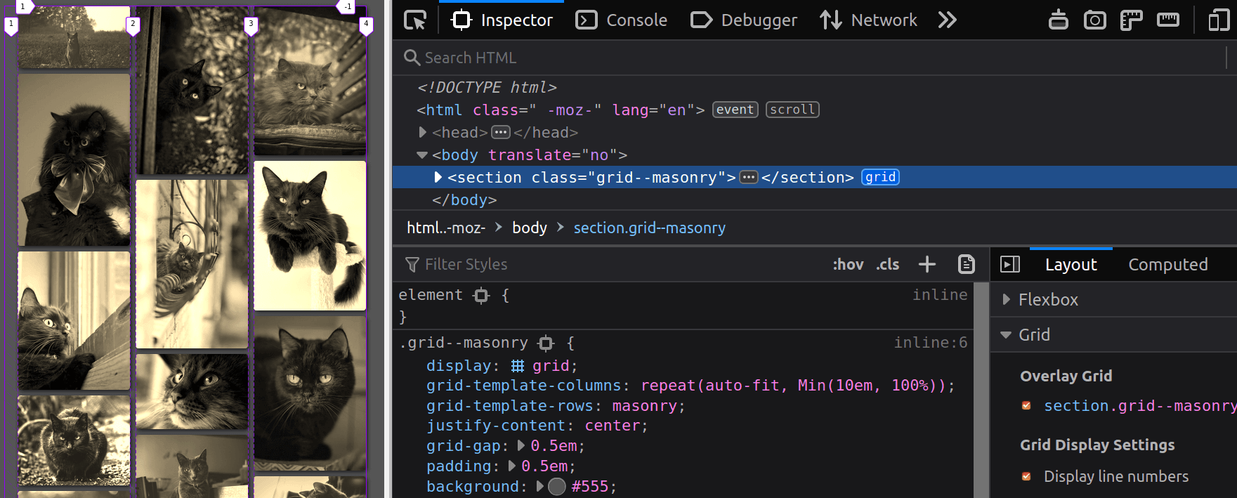
grid-template-rows: masonry working in Firefox with the flag enabled (Demo).Firefox with the flag enabled renders the intended layout; elsewhere this declaration has no effect, which is the point.
Fallback script
The script starts cheaply: it exits unless the page contains .grid--masonry elements and the browser did not actually honor the masonry value for grid-template-rows. The check is generic, so multiple masonry grids can coexist on one page.
let grids = [...document.querySelectorAll('.grid--masonry')];

if(grids.length && getComputedStyle(grids[0]).gridTemplateRows !== 'masonry') {
  console.log('boo, masonry not supported 😭')
}
else console.log('yay, do nothing!')
For each unsupported grid, the script reads its row-gap, collects the items, and tracks a column count initialized to 0:
let grids = [...document.querySelectorAll('.grid--masonry')];

if(grids.length && getComputedStyle(grids[0]).gridTemplateRows !== 'masonry') {
  grids = grids.map(grid => ({
    _el: grid,
    gap: parseFloat(getComputedStyle(grid).gridRowGap),
    items: [...grid.childNodes].filter(c => c.nodeType === 1),
    ncol: 0
  }));

  grids.forEach(grid => console.log(`grid items: ${grid.items.length}; grid gap: ${grid.gap}px`))
}
Child nodes must be filtered to elements, i.e. nodes whose nodeType is 1; otherwise carriage-return text nodes end up in the item array.

Layout runs only once the page has loaded and the elements have settled. For each grid, the current number of columns is compared against the stored value; a mismatch means the stored value is updated and the items are rearranged. This same layout() call must run on initial load and on resize.
if(grids.length && getComputedStyle(grids[0]).gridTemplateRows !== 'masonry') {
  grids = grids.map(/* same as before */);

  function layout() {
    grids.forEach(grid => {
      /* get the post-resize/ load number of columns */
      let ncol = getComputedStyle(grid._el).gridTemplateColumns.split(' ').length;

      if(grid.ncol !== ncol) {
        grid.ncol = ncol;
        console.log('rearrange grid items')
      }
    });
  }

  addEventListener('load', e => {
    layout(); /* initial load */
    addEventListener('resize', layout, false)
  }, false);
}
Rearranging begins by clearing the top margin on every item — a non-zero value there may have been applied by a previous pass. If the viewport is down to a single column, there is nothing further to do. Otherwise the first ncol items are skipped and each remaining item is compared against the one directly above it: the bottom edge of the upper item and the top edge of the current one give the vertical offset needed to place it exactly one grid gap lower.
/* if the number of columns has changed */
if(grid.ncol !== ncol) {
  /* update number of columns */
  grid.ncol = ncol;

  /* revert to initial positioning, no margin */
  grid.items.forEach(c => c.style.removeProperty('margin-top'));

  /* if we have more than one column */
  if(grid.ncol > 1) {
    grid.items.slice(ncol).forEach((c, i) => {
      let prev_fin = grid.items[i].getBoundingClientRect().bottom /* bottom edge of item above */,
          curr_ini = c.getBoundingClientRect().top /* top edge of current item */;

      c.style.marginTop = `${prev_fin + grid.gap - curr_ini}px`
    })
  }
}
Refinements for real content
Real grids rarely hold bare images. Wrapping each one in a link to its full-size version is more typical:
<section class='grid--masonry'>
  <a href='black_cat_large.jpg'>
    <img src='black_cat_small.jpg' alt='black cat'/>
  </a>
  <!-- and so on, more thumbnails following the first -->
</section>
In that case the grid items are anchors, which stretch to full row height by default and would corrupt the offset math, so align-self: start is required. An explicit width on the items is no longer needed:
.grid--masonry > * { align-self: start; }

img {
  display: block; /* avoid weird extra space at the bottom */
  width: 100%;
  /* same styles as before */
}
To make the first item span the whole grid, add a rule that also caps its height so the image cannot overflow or distort:
.grid--masonry > :first-child {
  grid-column: 1/ -1;
  max-height: 29vh;
}

img {
  max-height: inherit;
  object-fit: cover;
  /* same styles as before */
}
That stretched item must then be excluded from the item collection with an extra filter condition:
grids = grids.map(grid => ({
  _el: grid,
  gap: parseFloat(getComputedStyle(grid).gridRowGap),
  items: [...grid.childNodes].filter(c =>
    c.nodeType === 1 &&
    +getComputedStyle(c).gridColumnEnd !== -1
  ),
  ncol: 0
}));
Blog-style content and variable ratios
The same script handles items of differing aspect ratios, as in a grid of blog posts, with identical JS and only small masonry-specific CSS changes: the maximum column width is adjusted and the max-height limit on the first item dropped. The approach holds up here, including on viewport resize, as long as columns stay at a fixed width.
Flexible column widths expose a bug. If the column width itself changes, text in one item may reflow to a different number of lines — and therefore a different height — while its neighbors do not. When the column count is unchanged, offsets are never recomputed, so items overlap or leave enlarged gaps. The fix is to recompute offsets whenever at least one item in the grid changed height, which requires tracking whether more than zero items changed and resetting that state after the if block so the next pass does not rearrange needlessly.
$w: minmax(Min(20em, 100%), 1fr)if(grid.ncol !== ncol || grid.mod) {
/* same as before */
grid.mod = 0
}A ResizeObserver is the obvious tool for maintaining that flag, and it does correctly trigger rearrangement even when the column count is stable:
if(grids.length && getComputedStyle(grids[0]).gridTemplateRows !== 'masonry') {
  let o = new ResizeObserver(entries => {
    entries.forEach(entry => {
      grids.find(grid => grid._el === entry.target.parentElement).mod = 1
    });
  });

  /* same as before */

  addEventListener('load', e => {
    /* same as before */
    grids.forEach(grid => { grid.items.forEach(c => o.observe(c)) })
  }, false)
}
It also makes the if condition redundant, because the observer sets the modification flag on any change to an item's height or width — and width changes on every viewport resize, whether or not text reflowed. Storing previous item heights and comparing them on resize is the better fit:
function layout() {
  grids.forEach(grid => {
    grid.items.forEach(c => {
      let new_h = c.getBoundingClientRect().height;

      if(new_h !== +c.dataset.h) {
        c.dataset.h = new_h;
        grid.mod++
      }
    });

    /* same as before */
  })
}
The result is small: the minified JavaScript is under 800 bytes and the strictly masonry-related styles are under 300 bytes.
Degrading gracefully
@supports has broader support than any of the newer CSS features used here, so the enhanced rules can live inside a feature query, leaving a plain non-masonry grid elsewhere. This variant works back to IE9:

It will not look identical, but it remains functional — support means the page does not break, not that every visual flourish is replicated.
Without JavaScript, the fancy styles are simply never applied: they are scoped to a js class that the script adds to the root element. No script, no class, and the grid falls back to equal-sized items.