
Color Values: From Basic to Advanced
CSS offers several ways to define colors, each with different trade-offs. Named colors are the simplest option, but they're extremely limited and rarely match real design requirements. Hex values provide millions of colors but are nearly impossible to read or adjust without a visual tool. If a designer asks for a color that's 20% darker, modifying a hex value by hand is impractical without a color picker.
RGB and HSL
The rgb() function provides a more readable alternative to hex, using red, green, and blue channels. Since web colors are additive, higher channel values produce lighter results. Maxing out all three channels yields white. The rgba() function adds an alpha channel for transparency. Mixing colors with RGB works to some degree, but the outcomes can be unpredictable.
HSL (hue, saturation, lightness) offers a more intuitive model for developers. The hsl() function accepts a hue from 0 to 360deg, plus saturation and lightness percentages. Generating darker or lighter variants simply means adjusting the lightness parameter. The hue value also accepts turn units (0.5turn) and unitless numbers. Both hsl() and hsla() pair well with custom properties for color manipulation.
One practical tip: in Chrome and Firefox dev tools, holding SHIFT while clicking a color swatch toggles between hex, RGB, and HSL representations.
The currentColor keyword is another long-standing option. It uses the element's text color as a variable, commonly applied to SVG icon fill colors to match their parent's text color.
Modern Syntax
CSS Color Module Level 4 introduces a more convenient syntax that's now widely supported. Color functions no longer require comma-separated arguments, and rgb() and hsl() can include an optional alpha parameter after a forward slash.
New Color Functions
HWB
HWB stands for hue, whiteness, and blackness. Like HSL, the hue ranges from 0 to 360. The other two parameters control how much white or black mixes into the hue, up to 100%, which produces pure white or black. Equal parts white and black create increasingly gray tones. This model resembles mixing paint and works well for building monochrome palettes.
LAB
LAB and LCH are defined in the specification as device-independent colors. LAB is available in software like Photoshop and suits use cases where on-screen and printed colors should match. It uses three axes: lightness, the a-axis (green to red), and the b-axis (blue to yellow).
Lightness is expressed as a percentage and can exceed 100% — up to 400% for extra-bright whites. The a and b axes accept positive and negative values. Two negative values produce colors toward green/blue, while two positive values lean toward orange/red.
LCH
LCH stands for lightness, chroma, and hue. Lightness behaves like LAB and can exceed 100%. Hue ranges from 0 to 360 as in HSL. Chroma represents the amount of color and is theoretically unbounded, though hardware limitations exist. Values above 230 rarely make a visible difference — the browser reduces chroma until it falls within the displayable range.
LAB and LCH offer access to a larger color gamut than HSL or RGB, covering the full spectrum of human vision. More importantly, HSL and RGB are not perceptually uniform: increasing or decreasing lightness in HSL has different visual effects depending on the hue. LCH and LAB behave more consistently with how the human eye perceives color.
This difference is especially visible in gradients. Two gradients starting and ending at equivalent colors — one using LCH, the other using HSL — show dramatically different midpoints. The LCH version passes through vibrant blue and purple shades, while the HSL version looks muddied and washed out in comparison.
Lea Verou's article LCH color in CSS: what, why, and how? covers the advantages of LCH in depth, and she has built an LCH color picker for experimentation. As with other color functions, hwb(), lab(), and lch() accept an optional alpha parameter.
Browser Support and Color Spaces
Currently, hwb(), lab(), and lch() are supported only in Safari. Non-supporting browsers simply ignore the rule, making fallbacks straightforward. Feature queries can also conditionally apply styles that depend on these newer functions.
Although modern screens can display colors beyond the RGB gamut, most browsers restrict color output to the sRGB color space. Sliders in LAB and LCH demos may appear to do nothing beyond a certain point, even in Safari where these functions are supported. Values outside sRGB range will only take effect as hardware and browser support advance.
Safari now supports the color() function, which enables Display-P3 color output. This remains limited to RGB colors for now, without the full perceptual advantages of LAB and LCH.
Once LAB and LCH gain wider adoption, they may also improve accessibility workflows. Foreground text keeps the same contrast ratio against backgrounds with different hue or chroma values, as long as lightness stays constant — something HSL cannot guarantee.
Managing Colors in Practice
Custom Properties and HSL
CSS custom properties store reusable values and accept partial property values, making them excellent for color management. HSL works particularly well with custom properties due to its intuitive structure. For instance, hue values can be calculated dynamically based on element indexes, enabling color strips and complementary color schemes without manual computation.
RGB may suffice for static color values, but deriving new shades from a base palette is far easier with HSL or, eventually, LCH. Converting hex or RGB values to HSL is straightforward with online converters.
Colors stored as Sass variables can be converted to HSL custom properties:
$primary: rgb(141 66 245);
:root {
  --h: 265;
  --s: 70%;
  --l: 50%;

  --primary: hsl(var(--h) var(--s) var(--l));
  --primaryDark: hsl(var(--h) var(--s) 35%);
  --primaryLight: hsl(var(--h) var(--s) 75%);
}
With hue, saturation, and lightness split into separate custom properties, creating darker, lighter, more saturated, or more muted variants requires minimal effort. Adam Argyle's article Building a Color Scheme demonstrates creating light, dark, and dim themes from a single brand color. This allows fine-grained control — like reducing saturation specifically for dark mode — while updating the brand color in one place propagates across all schemes.
Sass Limitations
Sass has long provided color functions for saturating, desaturating, lightening, darkening, and mixing colors. These work at compile-time only, not for live in-browser manipulation. They're also confined to RGB and HSL, inheriting perceptual uniformity issues. Desaturated colors can still appear increasingly lighter when converted to grayscale.
For uniform lightness, custom properties with LCH mirror the HSL approach and provide more perceptually consistent results.
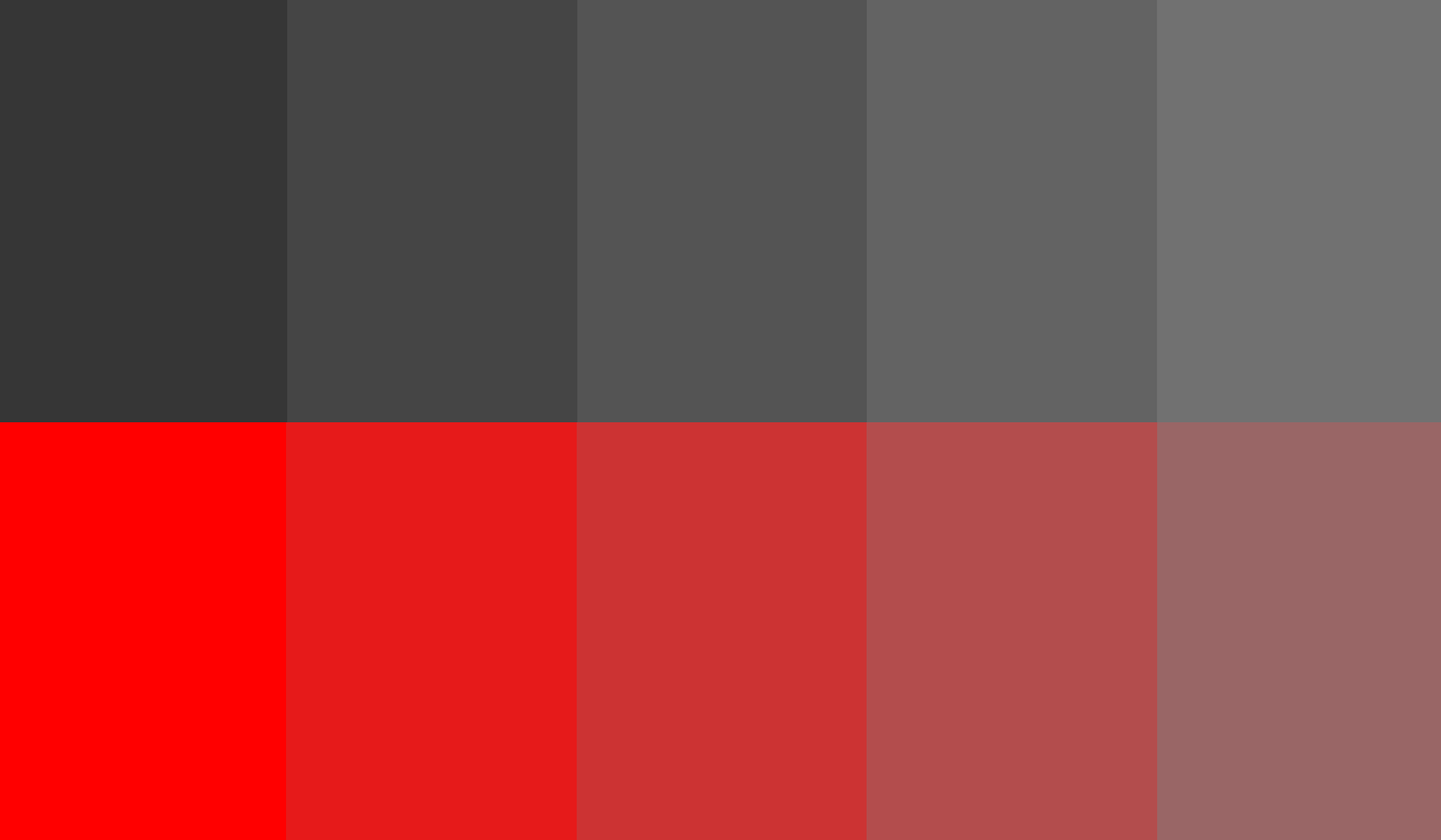
li {
  --hue: calc(var(--i) * (360 / 10));
  background: lch(50% 45 var(--hue, 0));
}
Mixing Colors In The Browser
CSS has long lacked a native way to blend colors at runtime, a gap that developers have traditionally filled with preprocessors like Sass. The Level 5 Color Specification (a working draft) closes that gap with color-mix(), which combines two colors much like Sass’s mix()—but with a key difference: CSS lets you choose the interpolation color space. By default it uses LCH, which yields noticeably cleaner results than the naive RGB blending many tools default to.
The input colors themselves don’t need to be declared in LCH; only the interpolation happens in the color space you specify. You also control the proportion of each color, much like setting gradient stops, letting you dial in the exact blend you want.
.my-element {
  /* equal amounts of red and blue */
  background-color: color-mix(in lch, red, blue);
}

.my-element {
  /* 30% red, 70% blue */
  background-color: color-mix(in lch, red 30%, blue);
}
Note: color-mix() and color-contrast() are now available behind a flag in Safari 15, though the syntax may still shift as the spec matures.
Automated Contrast Selection
The same specification introduces color-contrast(), a function aimed squarely at accessibility. Instead of manually testing color pairs against WCAG thresholds, you hand the browser a base color and a list of candidates, plus a target contrast ratio. The browser evaluates each candidate from left to right and returns the first that satisfies the ratio. If none do, it falls back to the candidate with the highest contrast.
.my-element {
  color: wheat;
  background-color: color-contrast(wheat vs bisque, darkgoldenrod, olive, sienna, darkgreen, maroon to AA);
}
No browser supports color-contrast() today, so the example above is taken directly from the spec. In it, the browser is comparing candidate colors against a wheat background with an AA-level ratio in mind; the first candidate to pass is darkgreen, so that’s the value the expression resolves to.
Because the Level 5 specification is still a working draft, both color-mix() and color-contrast() should be treated as experimental—syntax is subject to change, and production use isn’t yet practical. Still, they signal a promising direction for color handling on the web.
The Energy Cost Of Color
Your palette can also influence how much power your site consumes. On OLED displays—now common in laptops and TVs—pixels emit their own light, so darker colors draw significantly less energy than light ones. White is the most power-hungry choice; black is the cheapest. There’s more nuance to consider: according to Tom Greenwood, author of Sustainable Web Design, blue is more energy-intensive than colors in the red and green parts of the spectrum.
If you want to trim your site’s environmental footprint, a darker scheme helps, as does cutting back on blue or offering users a dark mode. An accessible side effect: those same choices can also extend battery life on mobile devices, a real win for users on the go.
Useful Utilities And References
If any of these color spaces spark your interest, the following tools and articles are worth a look.
Tools
- Hexplorer, Rob DiMarzo — an interactive visualization for understanding hex colors.
- LCH color picker, Lea Verou and Chris Lilley — get LCH values and their RGB equivalents.
- HWB color picker — visualize HWB and convert to HSL, RGB, and hex.
- Ally Color Tokens, Stephanie Eckles — generate accessible color tokens.
Further Reading
- “A Nerd’s Guide To Color On The Web,” Sarah Drasner, CSS-Tricks
- “LCH Colors In CSS: What, Why, And How?,” Lea Verou
- “The Best Color Functions In CSS?,” Chris Coyier, CSS-Tricks
- “Building A Color Scheme,” Adam Argyle, Web.dev
- “Using HSL Colors In CSS,” Ahmad Shaheed, Smashing Magazine
- “On Switching From Hex And RGB To HSL,” Sara Soueidan
- “Improving Color On The Web,” Dean Jackson, Webkit Blog



