
Finding the Root of a CSS Bug
CSS debugging often starts with recognizing that layout problems tend to fall into a handful of recurring categories. Once you know what you’re looking for, tracking down the offending rule becomes more systematic. The most common culprits are:
- Overflow from content escaping its parent, which creates unexpected scrollbars or pushes elements outside the viewport.
- Browser inconsistencies inherited from default styles that differ across engines.
- Cascade-related surprises, where competing rules override each other and break spacing, alignment, or other properties.
- Fragile selectors that break when the DOM changes, such as when a child gets wrapped in an extra
divor new elements are introduced.
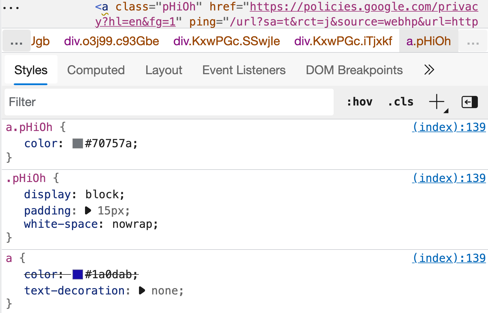
Before diving into fixes, it helps to use DevTools to narrow the search. Toggling rules off one at a time, or removing all rules and reintroducing them gradually, can quickly expose the culprit. Because CSS is global, the problematic rule may live on a parent or grandparent element, so check the cascade trace in the Styles panel rather than only inspecting the element that looks wrong.
Isolating the component in a local file or an online editor can also clarify whether the issue comes from the component itself or its ancestors in the page. Note that online editors sometimes inject their own defaults—CodePen, for instance, applies a Normalize reset unless you disable it. If the problem disappears in isolation, the source is likely an ancestor’s styles or inheritance. When the fix works in isolation, port the updated styles back into the main stylesheet.
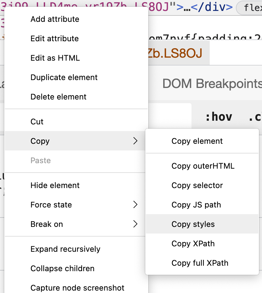
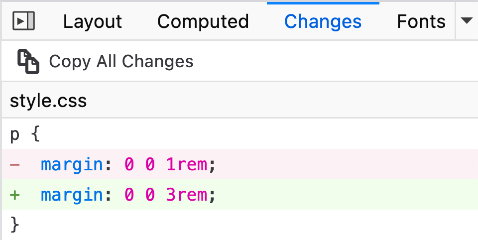
All major browsers include a change-tracking panel so you can review and export your DevTools edits. In Chrome and Edge, open the kebab menu and select “More Tools > Changes.” Firefox and Safari show a “Changes” panel by default, next to the “Computed” tab in Firefox and next to “Styles” in Safari.
Debugging Overflow
Overflow is one of the most visible CSS failures, but pinpointing the element responsible is not always straightforward. As Miriam Suzanne notes, CSS intentionally shows overflowing content rather than clipping it—the behavior is by design, even when it looks like a bug.

A reliable first step is to outline every element so you can see their boundaries and nesting:
* {
  outline: 1px solid red;
}
Use outline rather than border for this diagnostic pass: borders change the computed size of elements and can create overflow of their own. Outlines reveal which element is pushing past the viewport or its parent.
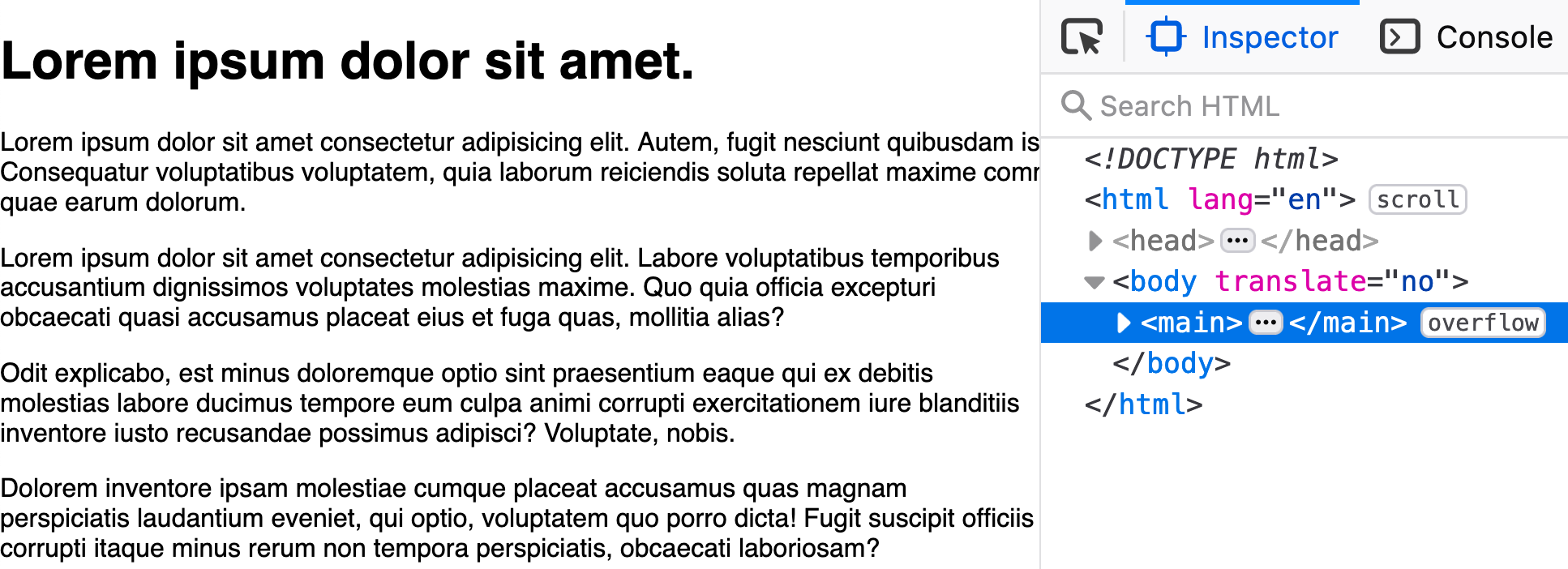
scroll, noting that it has become a scrollable region, and main has an indicator tag of overflow because one of the paragraphs expands beyond its boundaries. (Large preview)Common Overflow Triggers
Most overflow problems come from a mismatch between a parent’s available width and a child’s fixed size or total computed width.
An absolutely sized element—say, width: 600px—will overflow on viewports narrower than 600px. One fix is to add max-width: 100% so the element can shrink:
.wide-element {
  width: 600px;
  max-width: 100%;
}
That solution falls short when margins add to the element’s footprint. A paragraph with horizontal margins will still escape its container even with max-width: 100% applied, because the margin is added on top of the width.
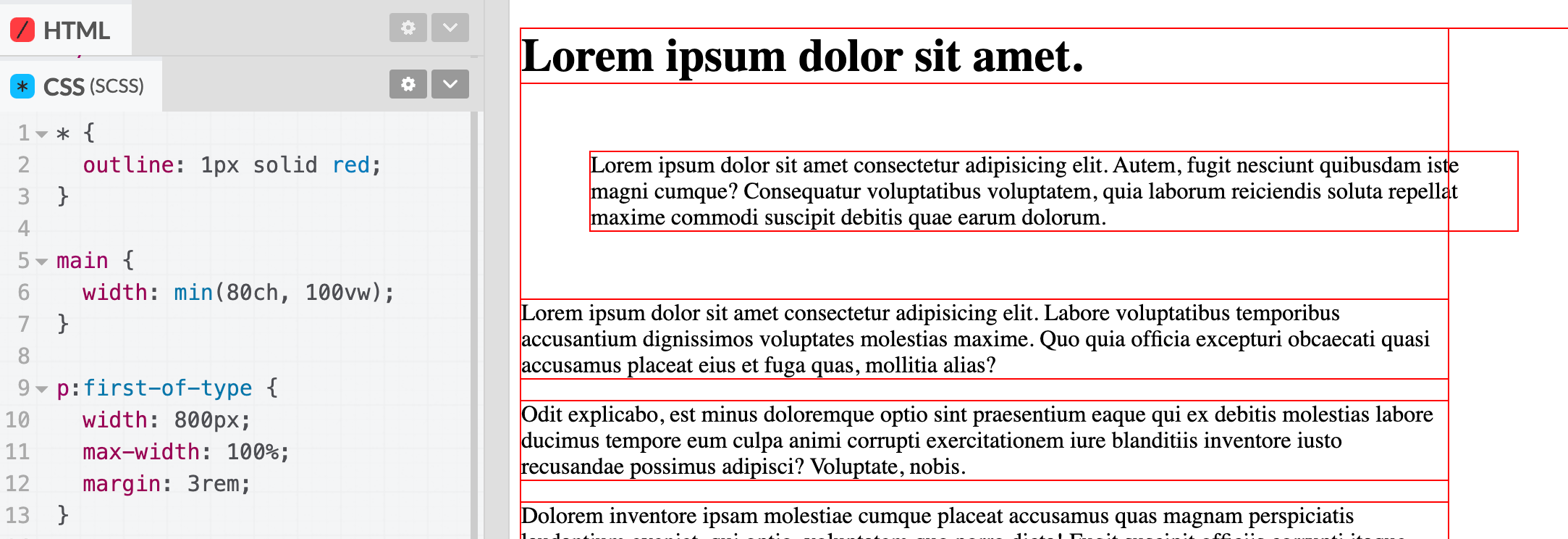
You can account for the extra space with calc, subtracting the total horizontal margins from the width:
p:first-of-type {
  width: 800px;
  max-width: calc(100% - 6rem);
  margin: 3rem;
}
That said, absolute widths are rarely the right tool. If you need to constrain an element, setting only a max-width avoids many responsive-layout pitfalls. In the example above, removing both width and max-width entirely lets the paragraph size itself normally within the parent.
There are still valid cases for limiting width—such as max-width: 100% on responsive images—and flexbox layouts sometimes pair flex-basis with calc to accommodate margins.
Another frequent source of overflow is the box model itself. The CSS Working Group has acknowledged that box-sizing defaulting to content-box was a mistake, but all browsers still ship that legacy behavior. With content-box, borders and padding are added to an element’s specified width or height, so a fixed dimension plus padding and borders easily exceeds its parent’s space. Resetting everything to border-box makes those additions come out of the content box instead, which prevents a whole class of overflow bugs.
UA Styles, Resets, And Cross-Browser Debugging
Default browser stylesheets — officially known as user-agent (UA) styles — remain a source of subtle layout differences between browsers. Although feature parity has improved dramatically, these defaults still apply margins and padding you may not expect. The body element, for instance, carries margin in every browser, and that default can push a layout into horizontal overflow.
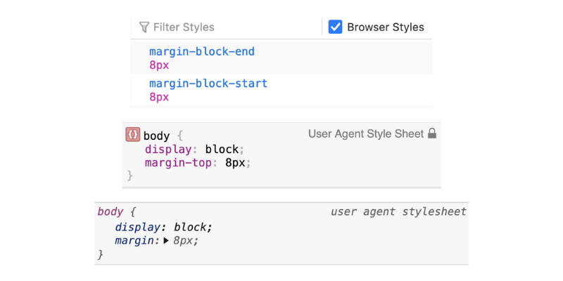
A CSS reset is the standard remedy. Normalize.css (last updated in November 2018) is a widely used, opinionated reset, while Andy Bell’s Modern CSS Reset offers a leaner alternative that smooths out common inconsistencies without overriding too many design choices. Both typically reset body back to margin: 0. With Internet Explorer reaching end of life on June 15, 2022, the list of legacy hacks that resets must accommodate will shrink considerably.
Viewport Units And Scrollbars
One common trigger for unexpected overflow is using 100vw. Because vw refers to the viewport width including the scrollbar, an element set to 100vw will be wider than the visible content area when the body has its default margin. The immediate fix is switching to 100% wherever possible.
A longer-term solution is the scrollbar-gutter property, currently specified in CSS Overflow Module Level 4 and supported in Chromium browsers since version 94. Adding overflow: auto; scrollbar-gutter: stable both-edges; reserves space for a scrollbar on both sides of the content, preventing a layout shift when a scrollbar appears. Use overflow: auto so the browser only adds a scrollbar when content actually requires it, and the gutter property ensures consistent spacing even when the user’s preferences force scrollbars to always be visible.
The 100vh unit comes with its own set of complications. On mobile devices, particularly in iOS WebKit browsers, 100vh can resolve to an area that extends behind the browser chrome. In a fixed-height layout like a mobile menu, that pushes content out of view. A common workaround is a combination of height: 100% and height: 100vh with fallbacks:
html {
  height: -webkit-fill-available;
}

body {
  min-height: 100vh;
  /* mobile viewport bug fix */
  min-height: -webkit-fill-available;
}
Safari 15 introduces a different approach via env(safe-area-inset-bottom), which returns 0 when no inset is relevant and a dynamic value when it is. It can be used in padding, margin, or inside calc() expressions:
body {
  min-height: calc(100vh — env(safe-area-inset-bottom));
}
The CSS Working Group also has new units in draft: the small svh/svb/svw/svi set (viewport with all dynamic UI elements expanded), the large lvh/lvb/lvw/lvi set (all such elements retracted), and dynamic dvh/dvb/dvw/dvi units that shift as the browser chrome changes. These are intended to resolve the long-standing iOS viewport inconsistencies.
Typography Defaults And Feature Support
UA styles also set defaults for headings, paragraphs, and lists, and these defaults differ between browsers. If a heading’s font-size looks inconsistent in one browser, your resets have likely not overridden that value. The straightforward fix is to explicitly define preferred values in the stylesheet.
For actual feature-support gaps, several tools reduce guesswork. caniuse tracks support tables for CSS and JavaScript; its usage data relies on a Statcounter sample of 2 million sites, so figures may not reflect your specific audience. The webhint extension for VS Code (also powering part of Edge’s Issues panel) warns about features with limited support while you work, and can be configured per-browser via a browserslist entry.
Vendor-prefixed properties — those starting with -webkit or -moz — still need attention if you are supporting older browsers. Tools like autoprefixer automate prefix insertion, and can be integrated into build processes such as postCSS. Like webhint, they consult your browserlist configuration. Browser dev tools also flag unsupported properties: Chromium, Safari, and Firefox all show a yellow warning triangle and hover states for properties they do not recognize.
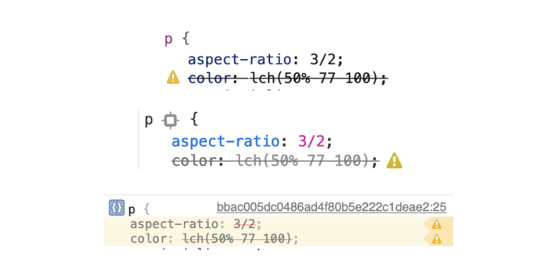
Debugging unsupported features after the fact is error-prone. Checking support during development lets you design with fallbacks or progressive enhancement in place from the start, rather than chasing bug reports once the site is live.
When the Cascade Overrides Your Intentions
Even when you’re using well-supported CSS features, a new section can render incorrectly once it’s placed into the real layout. This often happens when working with a framework or design system alongside custom CSS: a rule that works fine in isolation gets beaten by something in the surrounding cascade.
Browser dev tools are the first stop for tracing this kind of problem. The Styles panel shows which rules are winning and which are being overridden. In a simple case, a rule like main * can win the cascade for applying color to a paragraph, and the dev tools will display that rule on top while showing the rule for p crossed out as an indicator that it didn’t apply.
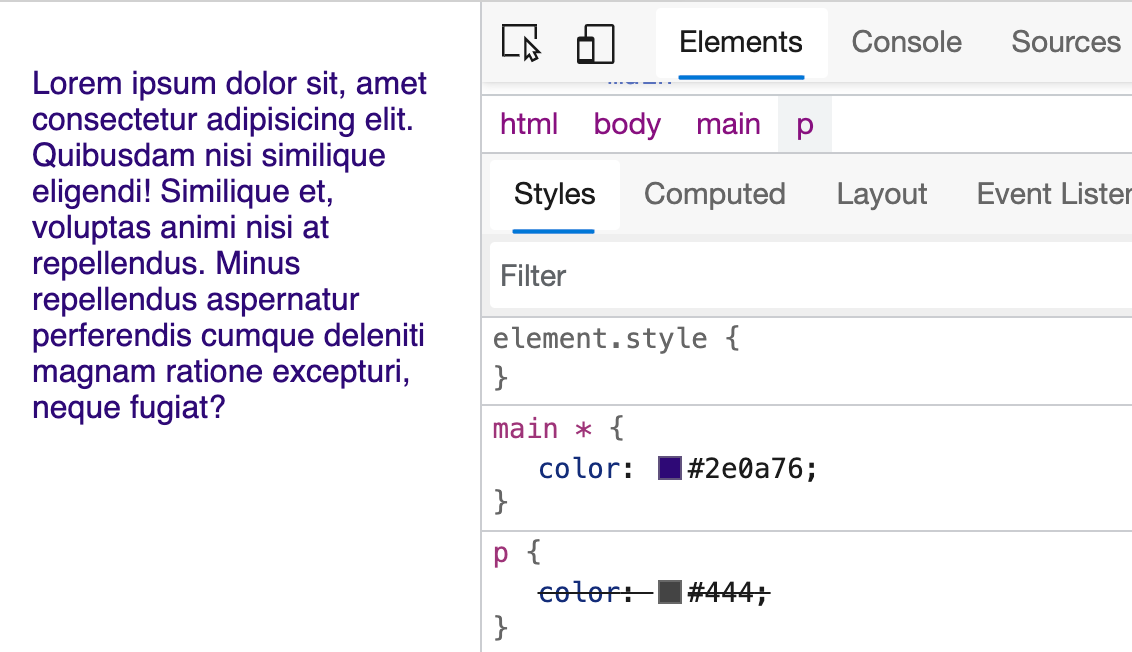
p for the selected paragraph, making it a navy blue instead of gray. (Large preview)The root cause here is a basic cascade principle: main * and p have equal specificity, so the tie-breaker is rule order in the stylesheet:
body {
  color: #222;
}

p {
  color: #444;
}

main * {
  color: hsl(260, 85%, 25%);
}
To make the p rule win, either move it after the main rule in the stylesheet or increase its specificity. This behavior is fundamental to CSS, but it can feel like a bug when you’re not expecting it, especially on a legacy codebase or when you’re stuck working around framework specificity.
There’s rarely a single clean fix for cascade conflicts. Step back and look at the full stack of styles affecting the element before deciding where to intervene. An !important might solve the immediate issue but can create worse specificity problems later, so try reordering rules first. Another option is to move toward “component”-style CSS, which scopes styles and encourages more deliberate inheritance.
There is also a newer solution designed specifically to orchestrate the cascade: the Cascade Layers spec (@layer) has experimental support in all major browsers. For details, Bramus’s overview of CSS layers is a good starting point.
Note: See the resources at the end for specificity-checking tools.
Broken Styles From DOM Changes
CSS that was carefully crafted can stop working when the underlying DOM shifts. If your rules are tightly coupled to the current markup, they won’t survive changes. A grid layout defined as .grid li breaks when the list items become article elements, and a row of icons designed for a fixed count overflows when the client adds one more.
Similar to creating an API in another programming language, it’s a worthwhile endeavor to consider how your CSS rules will be used beyond the current problem you’re solving.
Debugging this category means going back to the original rules and asking whether they can be extended to cover the updated structure. Dev tools help here too: you can trace which rules are being applied and follow the reference link to jump to the source.
Note: For strategies to make styles more resilient, review my article on future-proofing CSS styles.
Preventing Layout Bugs Before They Happen
Many CSS bugs come from how we handle spacing, widths, and dynamic content loads. Here are some concrete patterns that avoid those issues altogether.
Use gap Instead of Margins for Spacing
After flexbox gained support, developers spent years writing width calculations that had to account for margins added between flex children. That complexity is gone now that the gap property is supported for flexbox in all evergreen browsers. Grid has also supported gap for a long time.
The critical advantage gap has over margin is that it only applies between elements, no matter the orientation. You never need to attach margins to the correct side or use negative margins on the parent to compensate. And because gap never touches the outer edges of the container, it is far less likely to cause overflow than margins. The only way overflow can still occur is if the children themselves cannot shrink to a narrower width.
Making Flex and Grid Children Shrink Properly
When a flex or grid child overflows its container, check two things. In flexbox, use flex-basis instead of width, and confirm that flex-shrink is set to 1. Those properties explicitly allow the element to be reduced in size.
For grid, a common technique for auto-wrapping children relies on a fixed minimum track size, like minmax(30ch, 1fr):
grid-template-columns: repeat(auto-fit, minmax(30ch, 1fr));
That approach prevents children from shrinking below 30ch, which can still cause overflow. A better pattern keeps the minimum on wider viewports while still letting children shrink inside narrower spaces:
grid-template-columns: repeat(auto-fit, minmax(min(100%, 30ch), 1fr));
CSS math functions make these scenarios much easier to handle. If you are not familiar with calc(), clamp(), and min(), they are worth learning to write more flexible styles.
Outside of grid or flex, you can replace an absolute width with the min() function. Using min() is a shorthand for setting both width and max-width at once; the computed value switches dynamically as the element's context changes:
width: min(100vw - 2rem, 80ch);
Because min() accepts more than two arguments, you can also include a percentage. That makes the container responsive not only to the viewport but also to nested parent containers, which eliminates overflow bugs in many contexts and moves toward styles that are independent of any specific DOM location.
Mitigating Cumulative Layout Shift
Cumulative Layout Shift (CLS) is a Lighthouse metric that tracks how much content jumps during page load. Ads and popup banners are common culprits, but they are not the only ones. Before fixing anything, verify that you actually have a problem. In Chrome and Edge, the Lighthouse panel in dev tools will report a CLS score; anything below 0.1 is shown in green and does not require action.

Images and custom fonts are two other frequent sources of layout shift. Browsers now reserve space for images when the width and height attributes. Those attributes give the browser the aspect ratio it needed to hold space before the image loads. If you stripped those attributes years ago in favor of responsive CSS, it is time to add them back. You may also need a slightly more specific CSS rule so the image can respond to narrower contexts without losing that aspect ratio:
img[width] {
  height: auto;
}
Custom fonts cause a similar problem when the font's metrics differ noticeably from those of the system fallback. This used to be called FOUT (flash of unstyled text). When you observe this, the network throttling tools built into Edge and Chrome can help you replicate slow-loading conditions:
A small amount of shift from a webfont may not move your CLS score into a problematic range. If it does, you have options. Picking a fallback system font whose metrics more closely match your custom font reduces the size difference. Or set a minimum size on the parent elements and adjust layout attributes so that the shift is not dramatic when the font finally loads. Using font-display: optional is the most effective way to prevent font-related layout shift entirely, though it means the font may not appear for all users and is thus not always the best design choice. Google's guidance on preloading fonts is useful for other mitigation routes.
References for Deeper CSS Debugging
- Ahmad Shadeed's ebook, Debugging CSS, walks through many common issues.
- MDN has a dedicated primer on dev tools for CSS debugging and a related article on handling common HTML and CSS problems.
- Miriam Suzanne's video, "Why is CSS So Weird?", is worth revisiting.
- Kitty Giraudel's Selectors Explained tool helps you understand CSS specificity.
Beyond the standard dev tools, two alternatives offer extra context:


