
Icon fonts are convenient to use but painful to maintain: any customization depends on third-party font generators, and because fonts are binary files, merge conflicts are hard to resolve. Plain SVG files avoid those problems but are not automatically as easy to consume. The goal is a system with the ergonomics of an icon font and the maintainability of SVG.
The desired end state is specific:
- Adding an icon means dropping a file into a designated
iconsfolder; removing one means deleting the file. - Templates reference icons as
<svg-icon icon="rocket" />. - Scaling and coloring work through CSS
font-sizeandcolor, like an icon font. - Repeated use of the same icon on a page does not duplicate its SVG code.
- No webpack configuration is edited.
Two small single-file components get you there. The approach assumes webpack (already present if the app was scaffolded with Vue CLI) and the svg-inline-loader package, installed with npm install svg-inline-loader --save-dev, which loads the SVG source and strips the parts we don't want.
Building the sprite
Avoiding duplicate SVG markup requires a sprite: a hidden SVG that contains other SVGs and can be referenced from a <use> tag by icon id.
<svg><use xlink:href="#rocket" /></svg>The SvgSprite.vue component holds a single <svg> whose content is bound to $options.svgSprite. $options exposes properties attached directly to the component, which fits here because the loader runs only at build time and the sprite needs no reactivity — so it does not belong in data.
<!-- SvgSprite.vue -->

<template>
  <svg width="0" height="0" style="display: none;" v-html="$options.svgSprite" />
</template>

<script>
const svgContext = require.context(
  '!svg-inline-loader?' +
  'removeTags=true' + // remove title tags, etc.
  '&removeSVGTagAttrs=true' + // enable removing attributes
  '&removingTagAttrs=fill' + // remove fill attributes
  '!@/assets/icons', // search this directory
  true, // search subdirectories
  /\w+\.svg$/i // only include SVG files
)
const symbols = svgContext.keys().map(path => {
  // get SVG file content
  const content = svgContext(path)
   // extract icon id from filename
  const id = path.replace(/^\.\/(.*)\.\w+$/, '$1')
  // replace svg tags with symbol tags and id attribute
  return content.replace('<svg', `<symbol id="${id}"`).replace('svg>', 'symbol>')
})
export default {
  name: 'SvgSprite',
  svgSprite: symbols.join('\n'), // concatenate all symbols into $options.svgSprite
}
</script>
The script uses require.context to collect every SVG in /assets/icons and pass it through svg-inline-loader, configured with query-string-like parameters (split across lines above for readability). The loader cleans the files for reuse anywhere in the app.
const svgContext = require.context(
  '!svg-inline-loader?' +
  'removeTags=true' + // remove title tags, etc.
  '&removeSVGTagAttrs=true' + // enable removing attributes
  '&removingTagAttrs=fill' + // remove fill attributes
  '!@/assets/icons', // search this directory
  true, // search subdirectories
  /\w+\.svg$/i // only include SVG files
)
Parameter behavior worth knowing:
removeTagsdrops tags the icons don't need, such astitleandstyle. Removingtitlematters in particular because it can trigger unwanted tooltips. To keep hard-coded styling but still strip tooltips, useremovingTags=titleinstead.removeSVGTagAttrstogether withremovingTagAttrsstripsfillattributes so colors can be set with CSS. Drop both parameters if the original fills should survive.- The final parameter is the icon folder path. The two extra arguments to
require.contextmake it search subdirectories and match only SVG files.
For the icons to nest inside the sprite, each must change from an <svg> element to an SVG <symbol> with a unique id taken from its filename.
const symbols = svgContext.keys().map(path => {
  // extract icon id from filename
  const id = path.replace(/^\.\/(.*)\.\w+$/, '$1')
  // get SVG file content
  const content = svgContext(path)
  // replace svg tags with symbol tags and id attribute
  return content.replace('<svg', `<symbol id="${id}"`).replace('svg>', 'symbol>')
})
Place the <SvgSprite> component on the page before any icon that depends on it — the top of App.vue is the recommended spot.
<!-- App.vue -->
<template>
  <div id="app">
    <svg-sprite />
<!-- ... -->
Building the icon component
SvgIcon.vue is the much simpler half. It renders a <use> tag whose target id comes from the component's icon prop.
<!-- SvgIcon.vue -->

<template>
  <svg class="icon" :class="{ 'icon-spin': spin }">
    <use :xlink:href="`#${icon}`" />
  </svg>
</template>

<script>
export default {
  name: 'SvgIcon',
  props: {
    icon: {
      type: String,
      required: true,
    },
    spin: {
      type: Boolean,
      default: false,
    },
  },
}
</script>

<style>
svg.icon {
  fill: currentColor;
  height: 1em;
  margin-bottom: 0.125em;
  vertical-align: middle;
  width: 1em;
}
svg.icon-spin {
  animation: icon-spin 2s infinite linear;
}
@keyframes icon-spin {
  from {
    transform: rotate(0deg);
  }
  to {
    transform: rotate(359deg);
  }
}
</style>
An optional spin prop toggles an .icon-spin class for animation — useful, for example, on a loading spinner icon.
<svg-icon v-if="isLoading" icon="spinner" spin />Additional behavior such as rotate or flip can be added as props, or the classes can be applied directly to the component if props are unnecessary. Most of the component's content is CSS, and beyond the spin animation its job is to make the SVG behave like an icon font: vertical-align: middle with a bottom margin of 0.125em aligns icons to the text baseline in most cases, and fill: currentColor lets the icon be colored exactly like text.
<p style="font-size: 2em; color: red;">
  <svg-icon icon="exclamation-circle" /><!-- This icon will be 2em and red. -->
  Error!
</p>
To use the component throughout the app without importing it everywhere, register it globally in main.js:
// main.js
import Vue from 'vue'
import SvgIcon from '@/components/SvgIcon.vue'
Vue.component('svg-icon', SvgIcon)
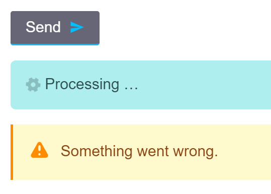
// ...
Deliberately out of scope
A few enhancements were left out to keep the solution approachable:
- Scaling non-square icons so their proportions are preserved.
- Injecting the sprite into the page without a dedicated component.
- Supporting vite, the webpack-free build tool from Vue creator Evan You.
- Using the Vue 3 Composition API.
A demo app built on the default vue-cli template is available for trying the components out.




