
The Mechanics of Displacement
A displacement filter distorts any graphic it touches by moving pixels according to data supplied by a second image, the displacement map. The source graphic is warped spatially: pixels shift to new positions based on color information in the map rather than being recolored or blended.
The filter primitive responsible for this is feDisplacementMap. It requires two inputs:
- The source graphic that will be distorted.
- A displacement map, which encodes directional shift information in its color channels.
The map is referenced through a preceding feImage primitive. For now, think of the map as a bitmap, though other SVG content can be used, as we will see. The key parameters on feDisplacementMap are:
scale: A positive or negative value controlling the strength of displacement.xChannelSelectorandyChannelSelector: Determine which color channel (R, G, B, or A) drives the X and Y axes of distortion. Both default to the alpha channel.
A subtle but critical detail: if the map has no alpha information and these attributes are not explicitly set, the default values apply and the result is merely a diagonal shift of the source.
The spec defines the transform precisely:
P'(x,y) ← P( x + scale * (XC(x,y) - .5), y + scale * (YC(x,y) - .5))
This is not as intimidating as it looks. In practice:
XandYare the original pixel coordinates.XCandYCare the color values of the map at that location, normalized to a 0–1 range.- The formula describes the inverse mapping, meaning each source pixel is looked up in the map using the result coordinates.
A simple experiment makes behavior clear. Consider a map filled flat with rgb(51, 51, 51) and a scale of 100. For a source pixel at (100, 100):
X: 100 - 100 * (51/255 - .5) = 130
Values below 128 shift the source in the positive direction; above 128 shift it negatively. A mid-gray value of 127–128 yields no change at all. This leads to a useful rule of thumb: neutral colors in the map mean no displacement, while channel values at the extremes produce maximum shift.
The Absolute Map: A Foundation
There is one special map worth knowing intimately if you intend to harness displacement effects predictably. An "identity map" or "absolute map" performs a uniform scale. Its construction is straightforward:
- Create a black background layer.
- Overlay a horizontal gradient from
rgb(255, 0, 0)to fully transparent red. - Add a vertical gradient from
rgb(0, 0, 255)to fully transparent blue. - Set the blend mode of the blue layer to
screen.
This composite map lets you:
- Scale X and Y axes independently by adjusting the opacity of either gradient.
- Combine it with other distortions since the gradients encode the base displacement metric.
- Mask regions to prevent displacement entirely by painting them with the neutral
rgb(127, 0, 127).
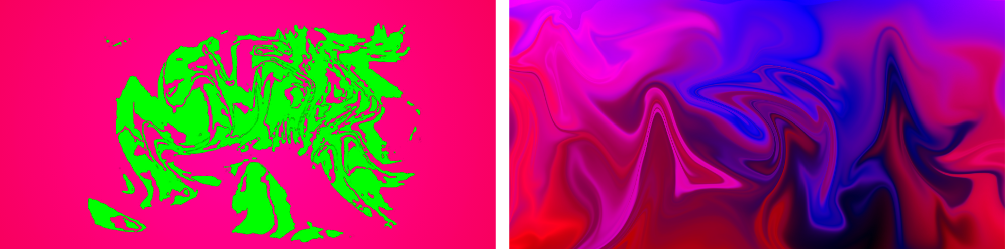
This map can then itself be distorted (using common image-editing tools), effectively granting you access to filter effects that are not native to CSS or SVG.
Handling Undefined Pixels and Jagged Output
Displacement is a pixel-level operation. The output can exhibit undesirable artifacts for high-contrast source material such as text or vector shapes:
- Bitmap quality: The source is sampled as bitmapped data; antialiased edges are not recalculated after their new positions are determined.
- Precision loss: Pixel coordinates may need rounding from floating-point values to integer grid locations.
- No interpolation: The spec does not demand fill-in between pixels that land at separate positions. Undefined pixels are set to transparent black.
A practical workaround seen in production is chaining a slight blur followed by a feConvolveMatrix to sharpen edges again. It doesn't fully solve the problem but mitigates the visible defects enough for most use cases.
The WebKit Caveat
Applying SVG filters to HTML elements is supported in WebKit, but with a significant exception as of this writing: filters whose pipeline includes an feImage will break — WebKit will not render the element at all. Approaches like wrapping HTML content inside <foreignobject> are not consistently reliable, especially when the HTML has CSS position or transform applied, which currently leaves those elements unfiltered. If you are developing for WebKit-dominant browsers, avoiding filters that require an external or generated feImage input will save significant debugging time.
Before moving to animation and advanced techniques, one quick check of your understanding: take a map with a simple linear gradient and predict how it will skew the image before you compare that with the rendered result.
Building SVG Displacement Maps With Filters
An SVG displacement map can be created entirely within SVG itself. The approach is to layer two rectangles, each filled with a gradient, and merge them with CSS mix-blend-mode: screen. This provides a foundation you can later manipulate dynamically with JavaScript or CSS.
See the Pen [Universal SVG Identitymap](https://codepen.io/smashingmag/pen/QWgNdba) by Dirk Weber.
Note: Always specify width and height in pixel values inside the SVG. Omitting these units prevents the map from rendering in Firefox and leads to blurry output in Chrome.
Referencing the Map From a Filter
Loading the generated map into an feImage primitive is less direct than it seems, due to security restrictions and inconsistent browser support. There are three methods available:
- As an external resource with
<feImage href="mymap.svg" />, which is unsupported in Webkit and Safari. - As an SVG fragment with
<feImage href="#mymapfragment" />, which only works in Safari. - As a data URL, which is the only reliable cross-browser route.
<feImage href="data:image/svg+xml;charset=utf-8,…"/>
Because of this constraint, an SVG map must be URL-encoded in advance—either manually, through a build tool, or with client-side conversion:
const feImage = document.querySelector('#myFeImage');
const url = feImage.getAttribute('href');

fetch(url)
  .then((response) => {
    return response.text();
  })
  .then((svgText) => {
    const uri = encodeURIComponent(svgText);
    feImage.setAttribute('href', `data:image/svg+xml;charset=utf-8,${uri}`);
  })
  .catch((error) => {
    feImage.setAttribute('href', someFallbackURI);
  });
For resources served from another domain or a CDN, you can load the map as a data URL using the CORS mode:
fetch('mymap.svg', {mode: 'cors'})
    .then(…)
A fragment can also be converted directly into a data URL. Just remember that an encoded fragment must be an SVG element with a namespace attribute:
const myFragmentId = myFeImage.getAttribute('href');
const myFragmentHTML = document.getElementById(myFragmentId).outerHTML;
const myFragmentDataURL = encodeURIComponent(myFragmentHTML);

myFeImage.setAttribute('href', 'data:image/svg+xml;charset=utf-8,${myFragmentDataURL}');
For very large SVG or cross-domain bitmaps, using a blob instead offers a way to sidestep security issues with external images, a technique especially useful for environments like CodePen:
fetch('mymap.svg')
  .then((response) => {
    return response.blob();
  })
  .then((blob) => {
    const objURL = URL.createObjectURL(blob);
    feImage.setAttribute('href', objURL);
  });
Building a Magnifying Glass Effect
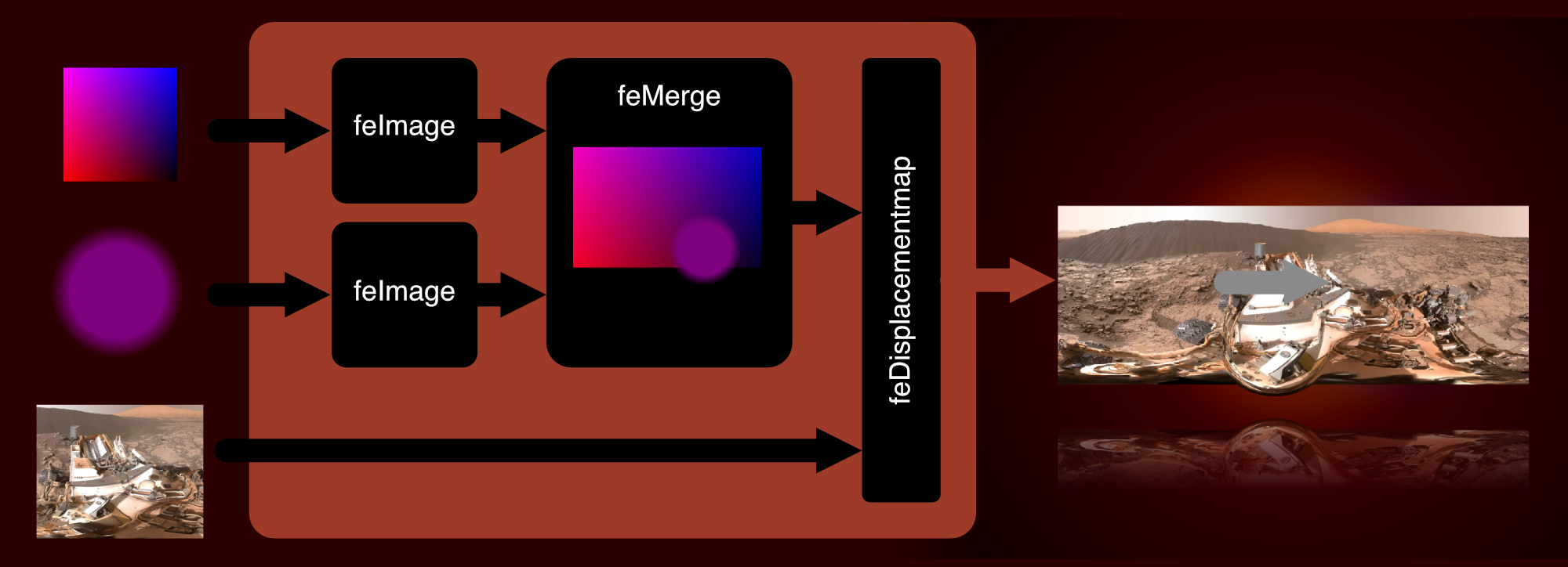
To apply these principles, a practical case involves creating a magnifying glass over imagery. The effect combines a displacement map with a moveable mask:

- Insert a
feImageprimitive referencing anabsolutemapdisplacement map. - Create a separate SVG filter containing a circle with a radial gradient from
rgba(127, 0, 127, 0)at its center torgba(127, 0, 127, 1)at the edge. - Add a second
feImagethat references the circular gradient. - Merge both images into an
feMergeprimitive, and use that result as thein2of thefeDisplacementMap. A negative scale factor here makes the area outside the circle shrink while preserving the normal size inside it. - Use JavaScript to sync the
xandyattributes of the circularfeImagewith the mouse position.
Creating Maps with Blurred Paths
An alternative way to build an SVG displacement map is to merge extremely thick bezier paths that have been heavily blurred. This technique can produce striking, organic distortions. However, excessive blurring hurts rendering performance; Firefox, for example, applies a hard limit of 100px on blur distance.
Animating SVG Filters
While SVG filters can be animated or transitioned, filter values that depend on a URL reference get swapped out abruptly, with no intermediate transition steps—a case covered under the spec for filter interpolation.
Animated GIF or WebP sequences technically work, but their performance runs from poor to extremely poor depending on browser. Blink specifically struggles to apply such animated displacement filters to elements containing other animations. Instead, SMIL and JavaScript are the two reliable ways forward. Every node attribute added from x, y, width, and height to scale is animatable with SMIL.
A Simple Glitch Effect
One minimal yet effective use of SMIL is a glitch effect constructed with two feFlood primitives:
See the Pen [`deDisplacementMap`: A simple glitch](https://codepen.io/smashingmag/pen/XWgdpXO) by Dirk Weber.
deDisplacementMap: A simple glitch by Dirk Weber.- The first
feFloodcovers the entire source area and uses the neutral map colorrgb(127, 0127)—the missing comma intended—to ensure zero displacement. - The second
feFloodusesrgb(255, 0, 127)to cause horizontal displacement across a portion of the filter's height. - Attach SMIL animation nodes to control the flood's
yandheightattributes. - Blend both
feFloodoutputs into one usingfeMerge, which feeds thefeDisplacementMap'sin2.
Moving Maps and Performance Costs
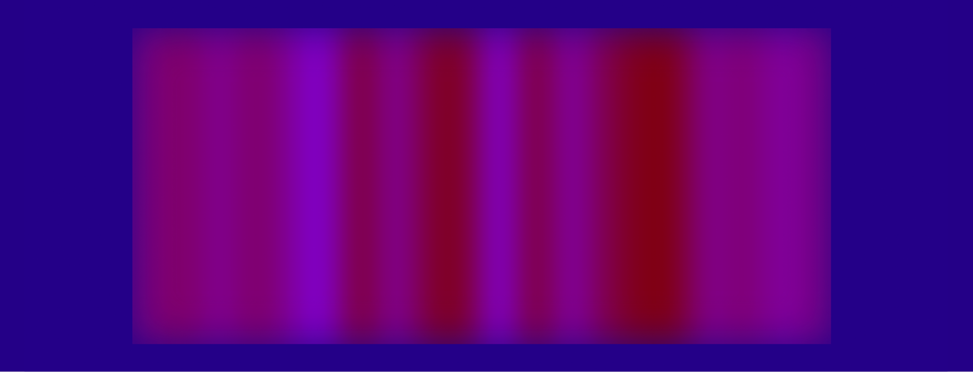
More complex results come from animating position attributes on a feImage. Sliding a warped, repeating pattern along the x-axis produces a continuous, psychedelic distortion:
Further embellishment with masks, blurs, and hues increases visual impact but also highlights a hard truth: SVG filter performance remains inconsistent. The GPU handles simple operations like color adjustments smoothly, but compound filters chaining many primitives at full dimensions will quickly dent framerates, primarily in WebKit and Firefox. To stay prudent, keep the paint area small, minimize the number of iterations, and avoid heavy blur and blend passes everywhere possible, testing across all target browsers and devices.
Constrained, localized animations suit UI elements well—one demonstration replaces a basic progress bar's fill with an animated feImage pattern:
See the Pen [SVG `feDisplacementMap`: Download Progressbar](https://codepen.io/smashingmag/pen/wveGgzr) by Dirk Weber.
feDisplacementMap: Download Progressbar by Dirk Weber.A second UI pattern is a play button morphing into a pulsating soundwave. This effect works by blurring several feFlood primitives to generate the map, then animating the feDisplacementMap's scale attribute:
See the Pen [SVG `feDisplacementmap`: Play](https://codepen.io/smashingmag/pen/abwNpmg) by Dirk Weber.
feDisplacementmap: Play by Dirk Weber.Glitch Transitions Between Elements
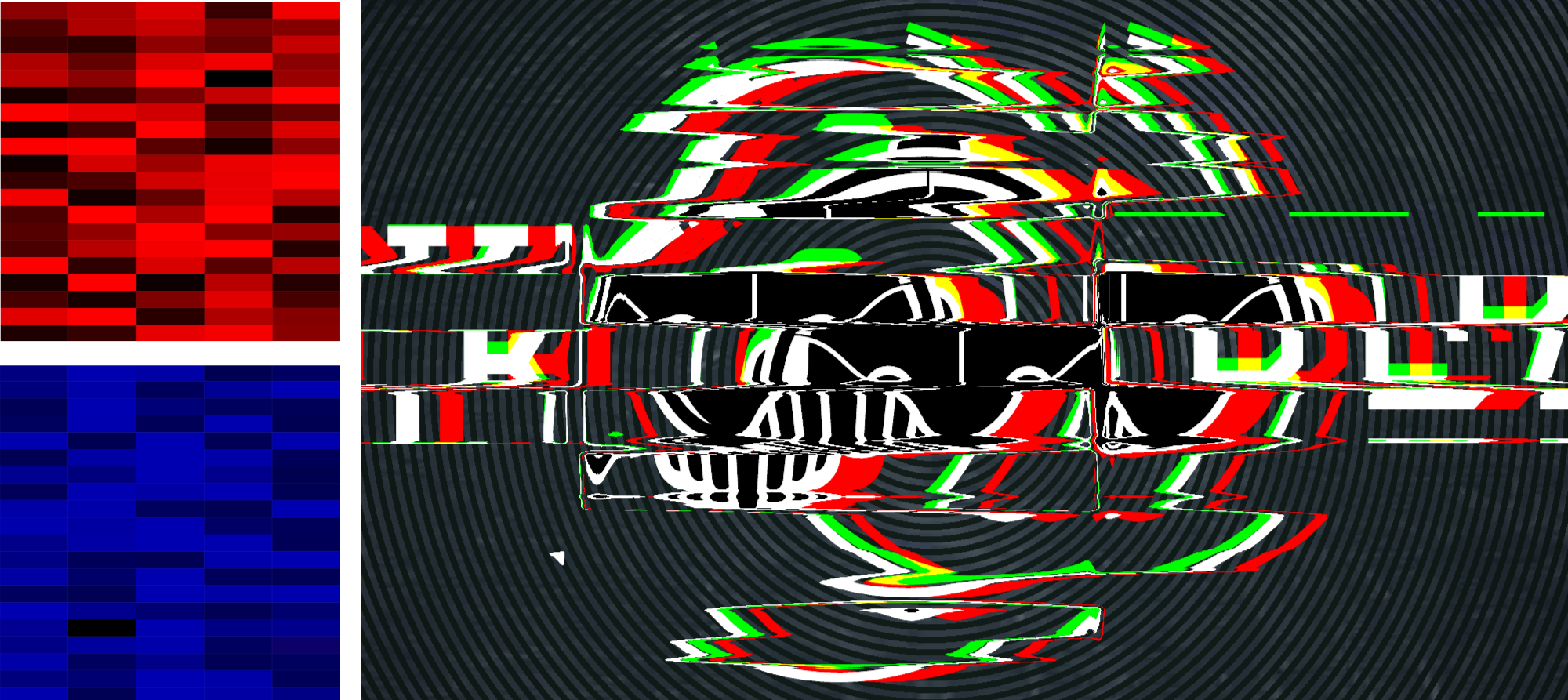
A comparable approach creates transitions between elements by generating per-channel grids of rectangles with randomized intensity. Build an SVG for each channel, encode it, and direct each feImage to its target. SMIL animations on width, height, and y are applied to each image; blending them all together before applying displacement yields additional color-separation effects, as seen here:
y, width and height attributes of each image are added. (Source: DirkWeber) (Large preview)- Use random rectangle grids for each SVG channel.
- Encode each map into a file and reference it with its own
feImagenode. - Animate
width,height, andyattributes through SMIL. - Fade channels together with
feBlend. - Apply colored
feDropShadowsto each output path. - Blend everything before passing it to
feDisplacementMap. - Animate
scalewith SMIL and experiment with different geometries and timings.
Animating the Map Itself
Animating the filter attributes directly saves effort, but the most exciting possibilities come from rotating maps, changing patterns, morphing shapes—all in real-time.
There is a major catch, though: SMIL and CSS animations inside URL-encoded SVG fragments referenced by feImage will not run in Blink or Gecko. Only Webkit runs them, which means implementing a dual approach:
- For pure Webkit: reference the map as the
in2of thefeDisplacementMapdirectly, then animate freely with JavaScript and libraries of choice. - For Blink and Firefox: step through each frame, recompute every changed attribute, serialize the fragment to a new URL-encoded data URI, and programmatically update the
hrefon thefeImageeach frame.
The second method is unwieldy, but ironically it shows better frame rates in Blink than the “pure” fragment approach does in Webkit.
Feature Detection
A quick way to determine which path to take is feature detection: render a tiny SVG into a canvas and inspect the color values being drawn:
async function testSVGFragmentToFeImg() {
  if (!document.createElement("canvas").getContext) {
    return false;
  }

  const testCode = '<svg width="10" height="10" xmlns="https://www.w3.org/2000/svg">
        <defs>
            <rect id="m" x="0" y="0" width="10" height="10" fill="rgb(255, 0, 127)" />
            <filter id="fltr" x="0" y="0" width="10" height="10" color-interpolation-filters="sRGB">
                <feImage width="10" height="10" x="0" y="0" result="FEIMG" href="#m" />
                <feDisplacementMap in="SourceGraphic" in2="FEIMG" scale="10" xChannelSelector="R" yChannelSelector="B" />
            </filter>
        </defs>
        <rect x="0" y="0" height="10" width="10" fill="rgb(0, 0, 255)" />
        <rect filter="url(#fltr)" x="0" y="0" height="10" width="10" fill="rgb(0, 255, 0)"/>
    </svg>';
  const imgURI = 'data:image/svg+xml;charset=utf-8,${encodeURIComponent(
    testCode
  )}';
  const cnvs = document.createElement("canvas");
  const ctx = cnvs.getContext("2d");
  cnvs.width = 10;
  cnvs.height = 10;
  ctx.fillStyle = "rgb(0,0,0)";
  ctx.fillRect(0, 0, 10, 10);

  const isSupported = new Promise((resolve) => {
    const svg2img = new Image(10, 10);

    svg2img.onload = () => {
      ctx.drawImage(svg2img, 0, 0);
      const colA = ctx.getImageData(1, 1, 1, 1).data;
      const colB = ctx.getImageData(9, 1, 1, 1).data;

      resolve(colA[1] !== colB[1]);
    };

    svg2img.onerror = () => resolve(false);
    svg2img.src = imgURI;
  });

  return await isSupported;
}
If the detection confirms fragment support, apply the clean method; otherwise use the per-frame URL redraw loop with a copy of the animated map saved as a regular data URI.
<filter id="filter"
    x="0"
    y="0"
    width="1"
    height="1"
    color-interpolation-filters="sRGB"
    />

    <feImage
        id="feimage-abs-map"
        x="0"
        y="0"
        width="100%"
        height="100%"
        result="ABSOLUTEMAP"
        preserveAspectratio="none"
        href="data:image/svg+xml;charset=utf-8,…"
    />

    <feImage
        id="feimage-polyline"
        x="0"
        y="0"
        width="100%"
        height="100%"
        result="POLYLINE"
        preserveAspectratio="none" href="[polyline as data-uri or url(#feimage-polyline)]"
    />

    <feMerge result="MERGE_IMG">
        <feMergeNode in="ABSOLUTEMAP" />
        <feMergeNode in="POLYLINE" />
    </feMerge>

    <feDisplacementMap
        in="SourceGraphic"
        in2="MERGE_IMG"
        scale="-200"
        xChannelSelector="R"
        yChannelSelector="B"
    />
</filter>
Handling Cross-Browser Animation
Because different rendering engines update SVG filter inputs in different ways, the animation code needs to be split by browser. In Blink- and Quantum-based browsers, the script updates a string and the href attribute of the filter primitive; in WebKit, it updates the point attribute on the polyline instead. Despite these divergent paths, the visual result should be identical everywhere.
The Animejs library is well suited to this task. In addition to the usual animation features — easing functions, keyframes, timelines — it can mutate values inside a plain JavaScript object and invoke an update callback on every frame. That single hook is enough to drive both rendering paths.
// The feImage filter primitive that will get the reference to the polyline:
const feImagePolyline = document.getElementById('feimage-polyline');

// The polyline’s "points" attribute start coordinates:
const pStart = '141,90 220,168 118,210 138,210 36,168';

// The polyline’s "points" attribute end coordinates:
const pEnd = '140,40 230,105 30,190 220,190 26,85';

// An animejs configuration object containing base values:
const animeBaseConfig = {
    duration: 4000,
    loop: 100,
    direction: 'alternate',
    easing: 'easeInOutQuad',
    round: 10
};

// We create an array with two string segments containing parts of the SVG fragment:
let polyTpl = '
    <svg id="polylinemap" width="256" height="256"
    preserveAspectRatio="none" version="1.1"
    xmlns="https://www.w3.org/2000/svg">
        <defs>
            <filter id="blurfilter" color-interpolation-filters="sRGB">
                <feGaussianBlur stdDeviation="7" />
            </filter>
        </defs>
        <polyline id="line" filter="url(#blurfilter)" fill="rgb(127, 0,127)"
        points="~" />
    </svg>
    '.split(‘~');

// This variable will store the animation specific animejs configuration settings:
let animeConfig;

// Time for action. We call the feature detection script and,
// as soon as the promise fulfils,
// conditionally create an animejs configuration object:
testSVGFragmentToFeImage().then((fragmentInFeImageSupported) => {
    if (!fragmentInFeImageSupported) {
    // Fragments in feImage are not supported. This must be a Blink/Quantum based browser.

    // We store the polyline’s point coordinates in this JavaScript object.
    // It’s the animation target for Animejs that will be updated in every frame
    const points = {
        p: pStart
    };

    // Of course we do not want to url encode the string on every
    // frame again and again (performance!), we only do it once in advance:

    polyTpl = polyTpl.map(part => encodeURIComponent(part));

    // The animejs configuration for Blink/Quantum based browsers:
    animeConfig = {
        targets: points,
        p: pEnd,
        update: function () {
            // this function is called in every frame of the animation.
            // It will update the feImage’s “href” value with a "snapshot" of the current polyline:
            const href = `data:image/svg+xml;charset=utf-8,${polyTpl[0]}${points.p}${polyTpl[1]}`;
            feImagePolyline.setAttribute('href', href);
        }
    };
} else {
    // This must be a Webkit browser. Let’s give it another treatment:
    const filter = document.getElementById('filter');

    // An animejs configuration for Webkit based browsers:
    animeConfig = {
        targets: '#line',
        points: pEnd
    };

    // Finally we insert the Fragment into the DOM:
    filter.insertAdjacentHTML('beforebegin', `${polyTpl[0]}${pStart}${polyTpl[1]}`);
    feImagePolyline.setAttribute('href', '#polylinemap');
}

// Now we are safe to trigger the animation by calling animejs with the
// merged base and specific configuration objects:
anime({
    ...animeBaseConfig,
    ...animeConfig
});
That covers a simple animated feDisplacementFilter input. To close out this deep dive, here are three more involved examples of filter animation.
1. Ripple Fade for a Modal
Modal dialogs almost always use a plain opacity fade. A water-like distortion makes for a more interesting reveal. The ripple effect works by animating a radial gradient inside the displacement map.
2. Staggered Grid Typography
Animejs provides stagger and grid helpers that make it easy to orchestrate effects across many elements. This type distortion comes from animating a grid of circles as the displacement source.
3. Waving Flag Menu
A second-level submenu can be swapped out with a more expressive transition. In this example, the fade-in is produced by moving a set of horizontal stripes across the map, which bends the menu into a flag-like wave.
These three demos are deliberately experimental and exist to show what is possible with animated displacement maps. Before using any of these techniques in production, revisit the performance recommendations from earlier in this article. Each of these examples is provided as an illustration of the concept rather than a drop-in solution.
Further Reading
- Mastering SVG Arcs
- The Design Leader Dilemma
- Regexes Got Good: The History And Future Of Regular Expressions In JavaScript
- Mastering Typography In Logo Design