

Radial and Conic Gradients: Understanding the Mechanics
CSS gradients are a versatile tool for creating visual effects without extra HTML elements. Two of the most powerful gradient functions are radial-gradient() and conic-gradient(). While they may look similar at first glance, they work quite differently: radial gradients emanate from a center point along straight lines, while conic gradients rotate around a central axis. Understanding these differences is key to using them effectively.
How Radial Gradients Behave
The simplest radial gradient uses just two color stops. In this case, the browser renders an ellipse that fills the container's width and height.
.element {
    background: radial-gradient(#9c27b0, #ff9800);
}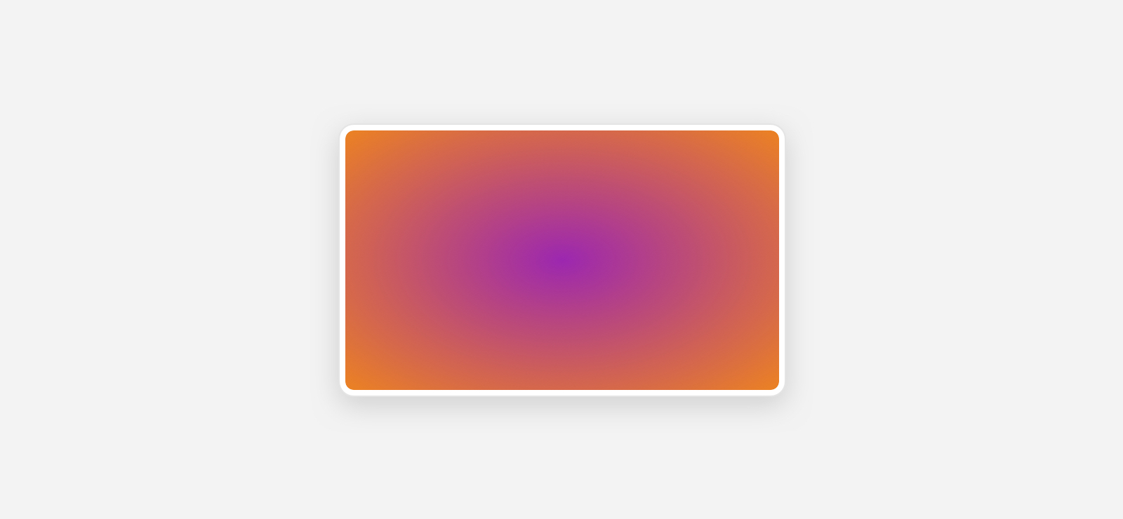
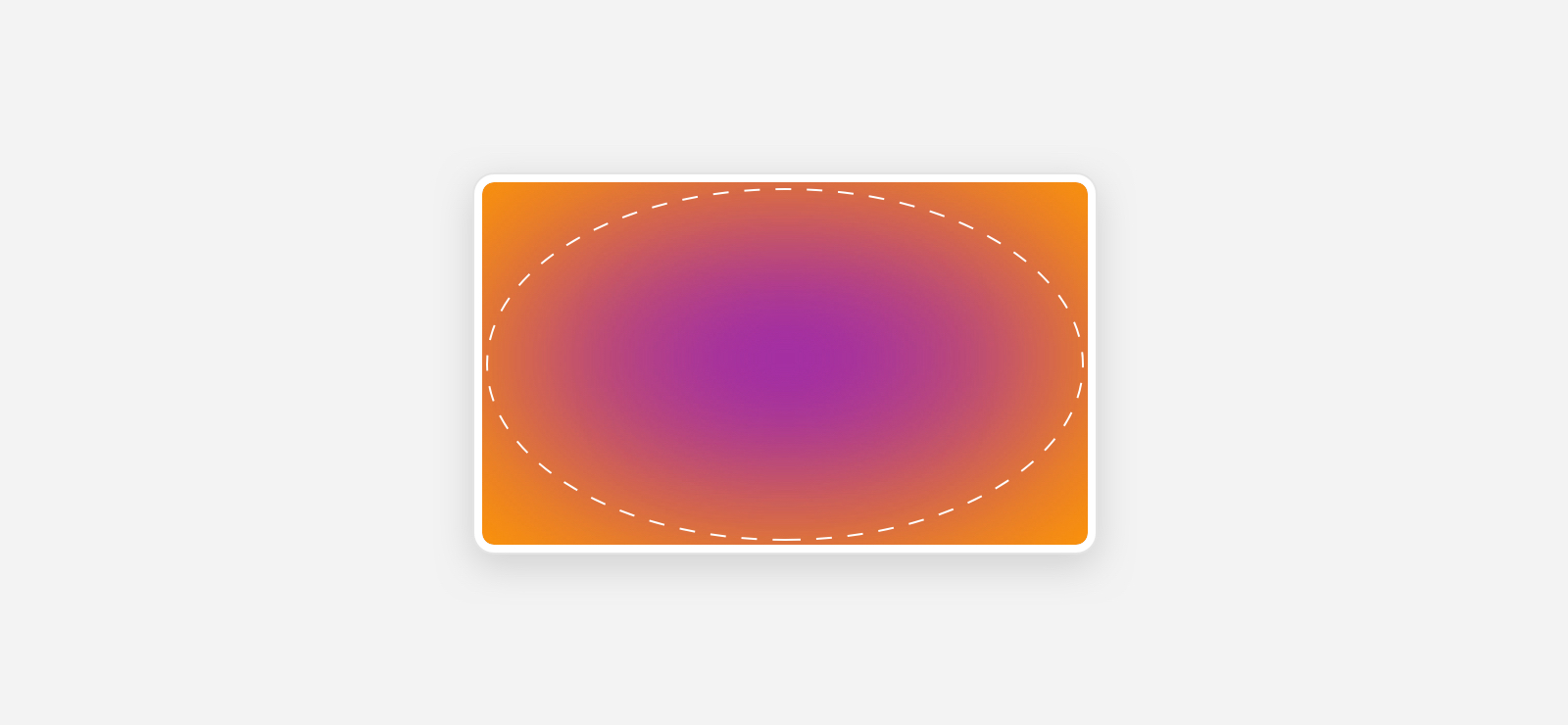
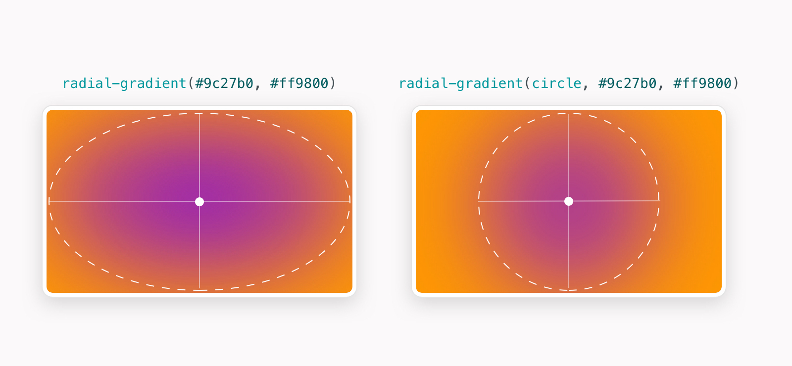
The default shape is an ellipse unless you specify otherwise. This happens when no explicit shape keyword is given or when two size values (width and height) are provided. The color transitions are computed as starting at 0% and ending at 100%, creating a smooth blur from the center outward.
.element {
    background: radial-gradient(#9c27b0, #ff9800);
}
.element {
    background: radial-gradient(#9c27b0 0%, #ff9800 100%);
}
Controlling Shape and Position
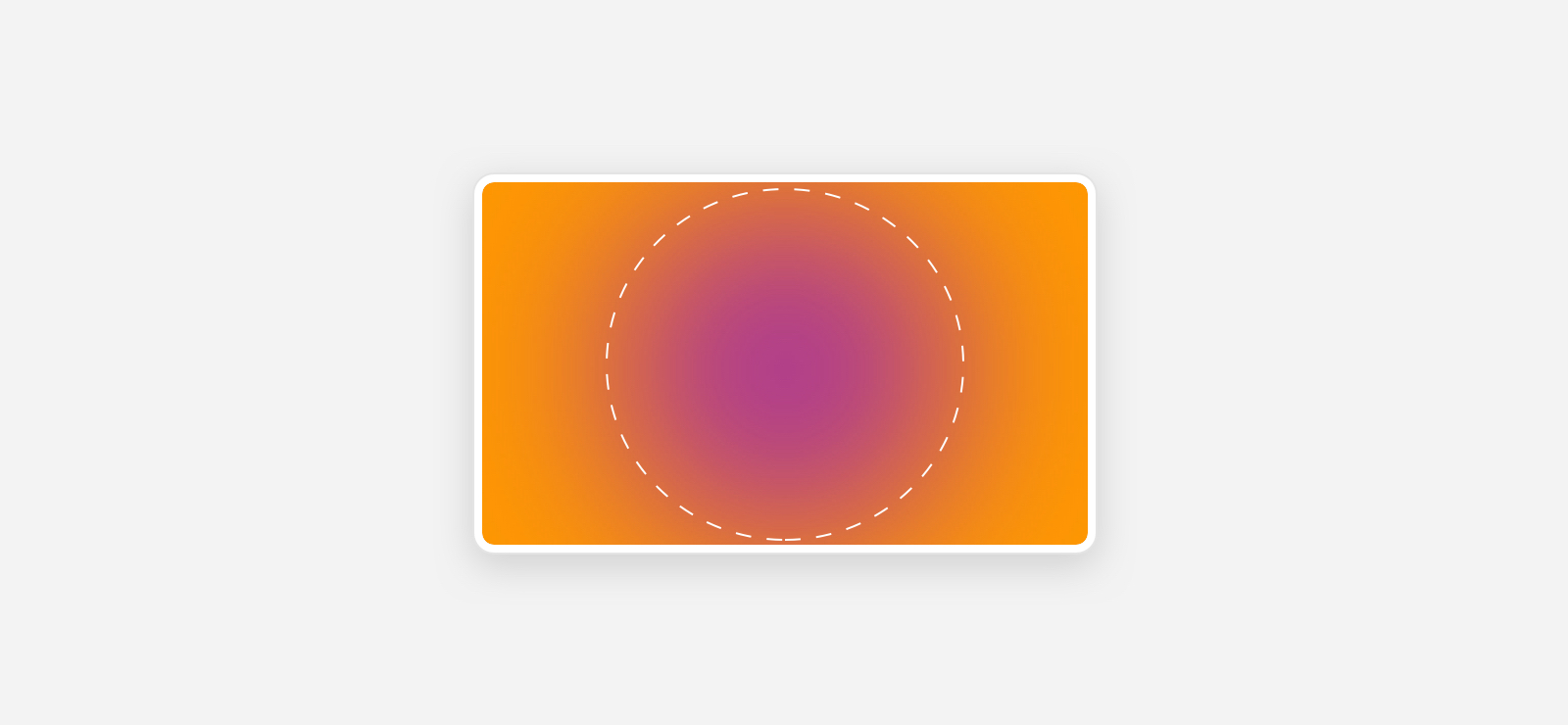
Adding the circle keyword before the first color stop forces a perfect circle instead. Both circles and ellipses are centered at 50% 50% of the container by default.
.element {
    background: radial-gradient(circle, #9c27b0, #ff9800);
}
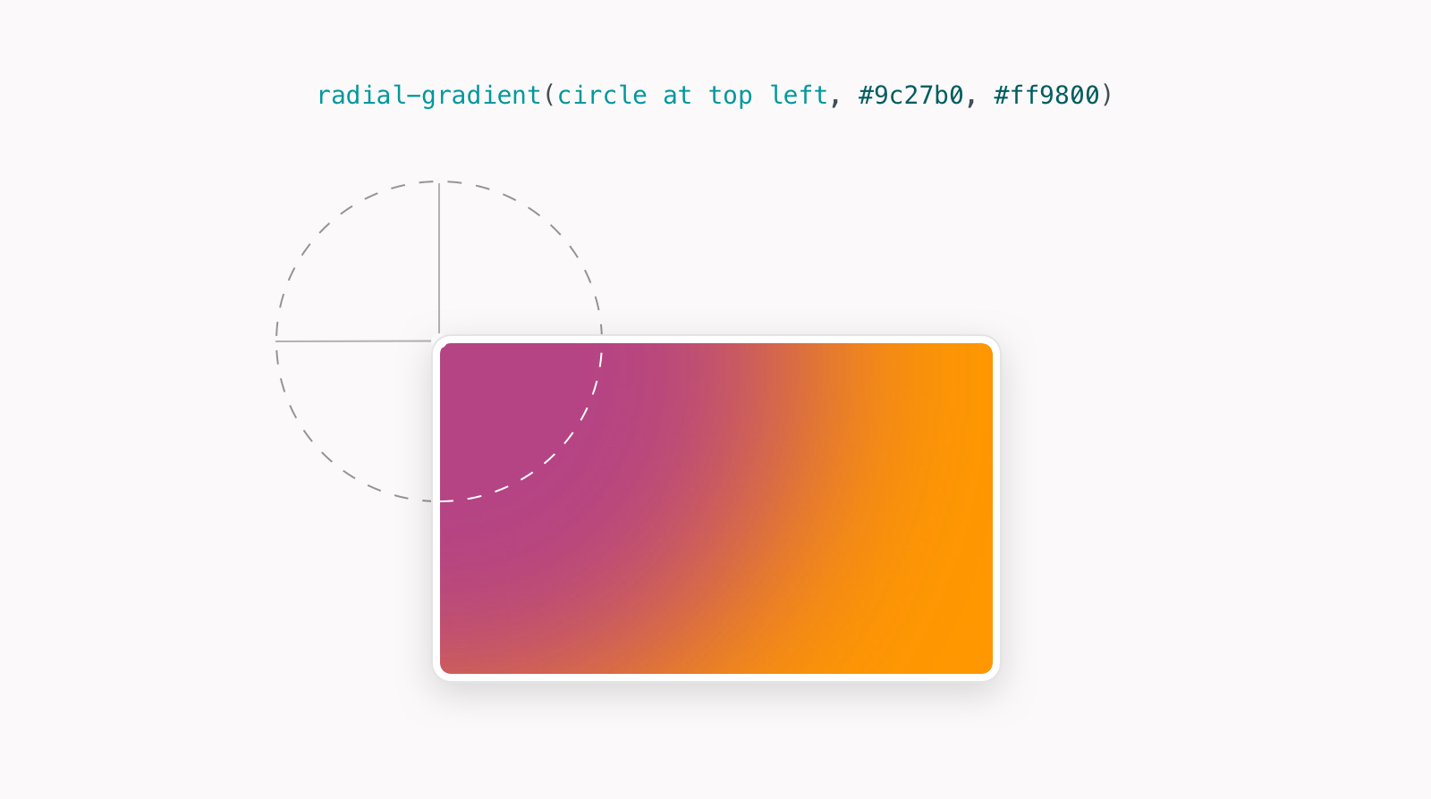
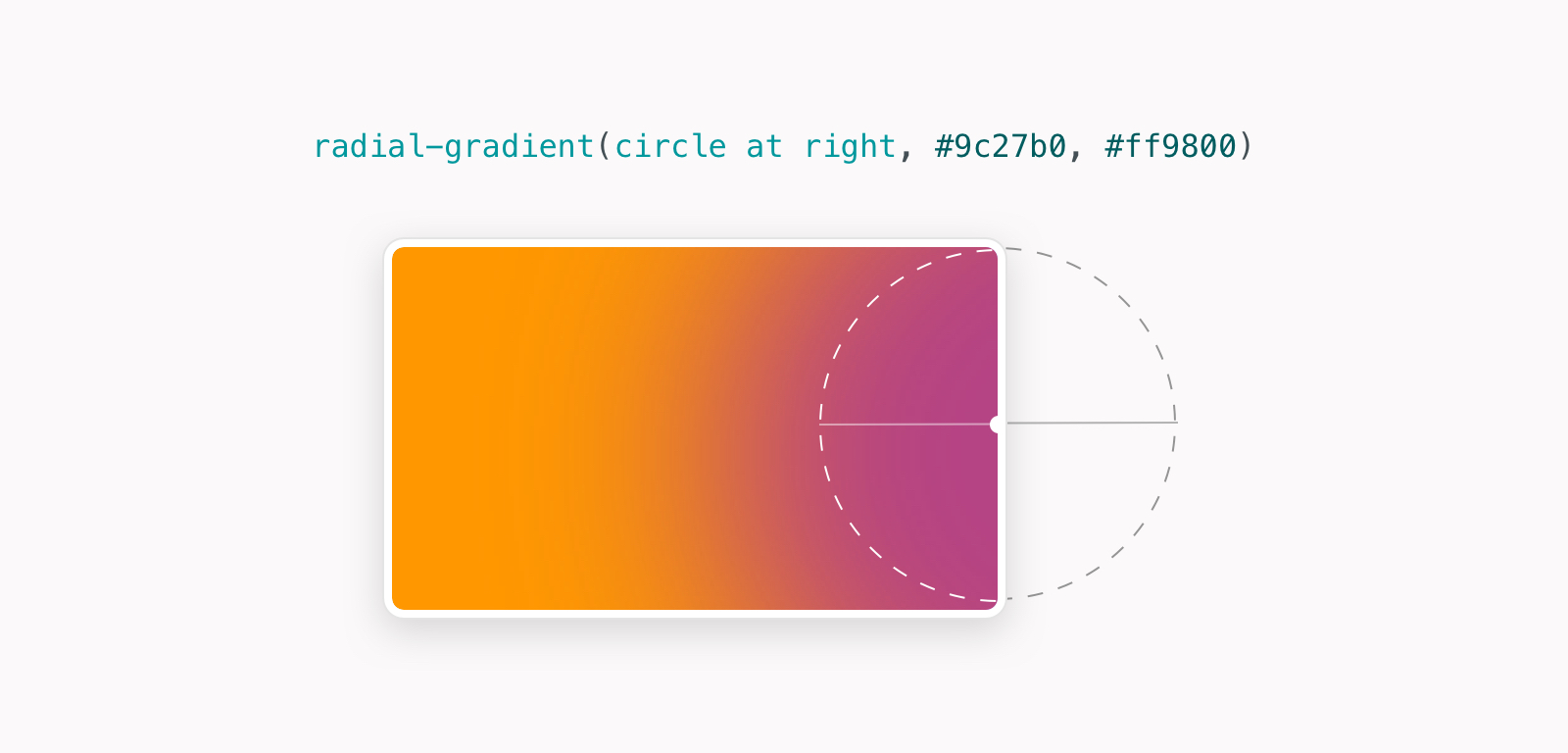
Positioning works from the center of the shape, not its edges. So when you position a circle at the top left, it's the center point of that circle that gets placed there.
.element {
    background: radial-gradient(circle at top left, #9c27b0, #ff9800);
}
.element {
    background: radial-gradient(circle at right, #9c27b0, #ff9800);
}
How Conic Gradients Work
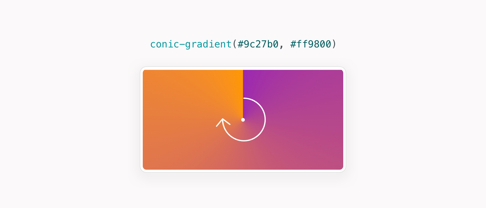
Unlike radial gradients, conic gradients rotate around the center of the element in a full circle. By default, the sweep goes from 0deg to 360deg.
.element {
    background: conic-gradient(#9c27b0, #ff9800);
}
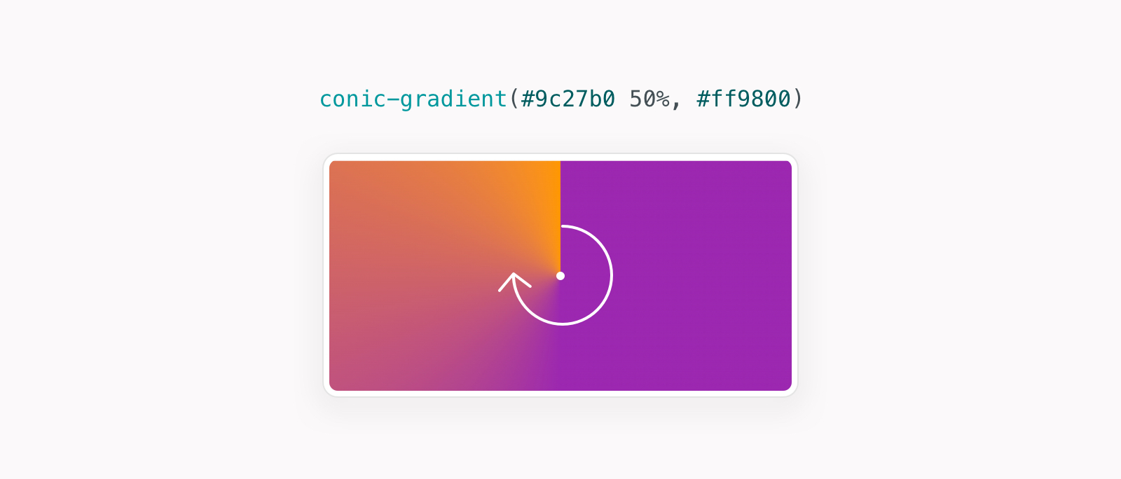
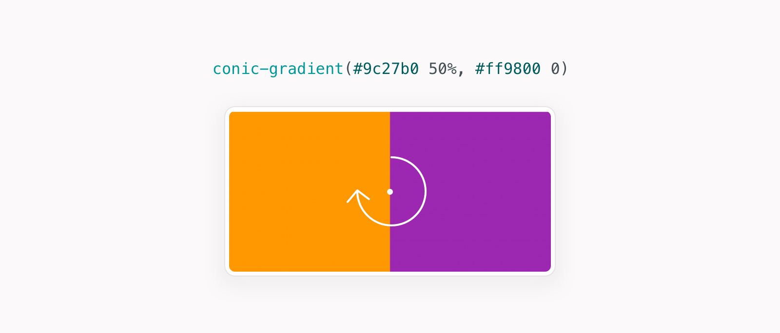
The key insight with conic gradients is how you control the color stops. A hard stop value for the first color (for example, 50%) makes that color fill half the element, while the next color gradually blends in from that point to the end. Applying hard stops to all colors creates distinct segment boundaries.
.element {
    background: conic-gradient(#9c27b0 50%, #ff9800);
}
.element {
    background: conic-gradient(#9c27b0 50%, #ff9800 0);
}
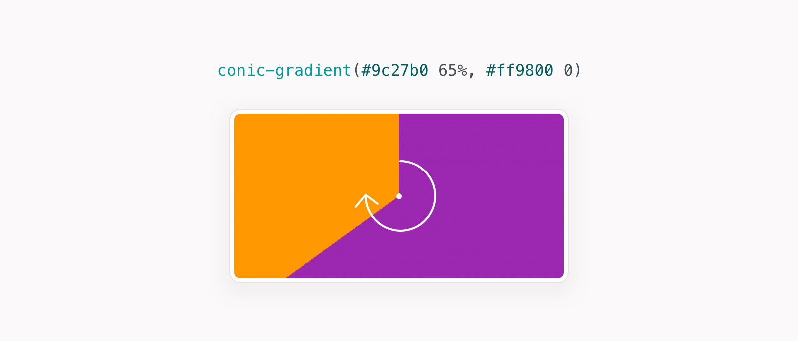
Varying the color stop values changes the shape of the transitions. Increasing the first stop value, for example, creates a sharper angled fill rather than a smooth gradient.
.element {
    background: conic-gradient(#9c27b0 65%, #ff9800 0);
}
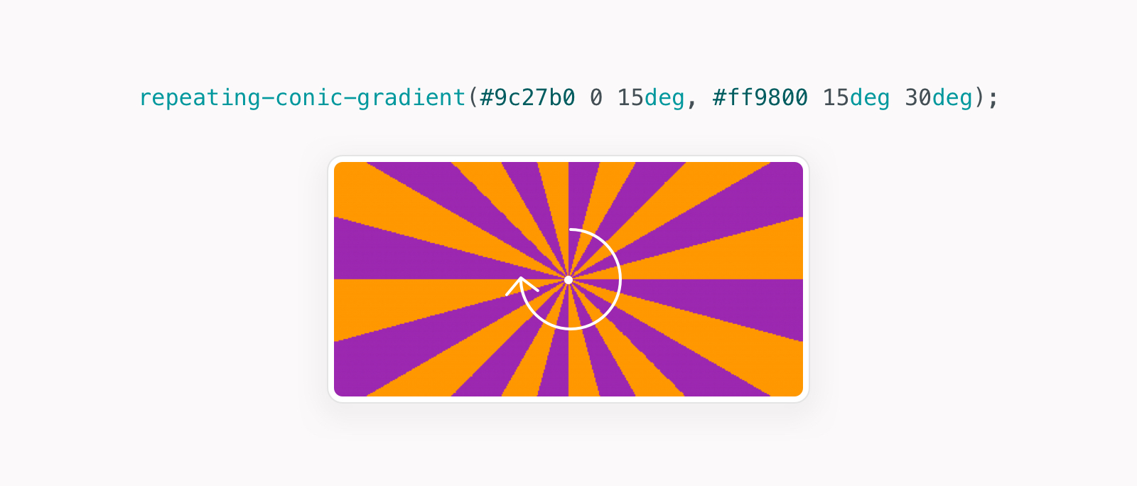
For repeating patterns, the repeating-conic-gradient() function provides the same capability as its radial counterpart. It allows you to define a segment that repeats around the circle, as shown when one color fills from 0deg to 15deg and a second from 15deg to 30deg, then the pattern loops.
.element {
    background: repeating-conic-gradient(
    #9c27b0 0 15deg,
    #ff9800 15deg 30deg
    );
}
Practical Uses for Radial Gradients
Radial gradients excel at drawing attention to content or creating textures. A common use case is in hero sections where a busy background image could interfere with readability.
Improving Content Readability
When a headline or secondary text is placed over a complex illustration, an ellipse gradient using the background's color can help isolate the content. This creates a smoother transition from the text area to the surrounding pattern, making it easier for the reader to focus.


.hero {
    background-color: #fbfafa;
    background-image: radial-gradient(#fbfafa, rgba(0,0,0,0) center/70% 70% no-repeat, url("hero-bg.svg");
    background-position: center;
    background-size: 70% 70%, cover;
    background-repeat: no-repeat;
}
Dotted Pattern Generation
By defining a small circle and leaving the rest transparent, you can create a dotted pattern. Since gradients tile by default, a properly sized gradient will repeat seamlessly. The trick is to specify the gradient's width and height so the pattern tiles as expected.


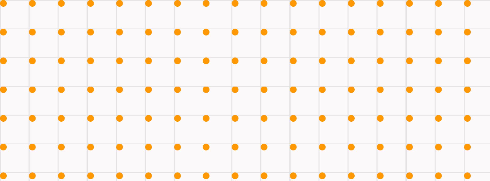
.dot-pattern {
  --color-1: #9c27b0;
  --color-2: rgba(0,0,0,0);
  background-image: radial-gradient(circle at 2px 2px, var(--color-1) 1px, var(--color-2) 0);
  background-size: 15px 15px;
}
Blending With Images
Pairing a radial gradient with mix-blend-mode opens up creative possibilities for image effects. Positioning the gradient in a specific corner, for instance, lets you control where the blend effect appears.

.thumb:after {
    content: "";
    position: absolute;
    inset: 0;
    background: radial-gradient(circle at top left, #9c27b0, #ff9800);
    mix-blend-mode: hard-light;
    opacity: 0.4;
}
Conic Gradients in Real Interfaces
Conic gradients shine in scenarios where you need circular progress or angular segmentation. Their ability to rotate smoothly around a center point makes them ideal for several distinct UI patterns.
Building Pie Charts
Creating a simple pie chart has become trivial with conic gradients, fulfilling a long-standing CSS request. You can divide the circle into segments by applying hard color stops at appropriate angles, with no need for SVG or canvas.

.pie-chart {
    width: 100px;
    height: 100px;
    background: conic-gradient(from 0deg, #b2daf9 128deg, #2096f3 0);
    border-radius: 50%;
}
Creating Checkerboard and Angular Patterns
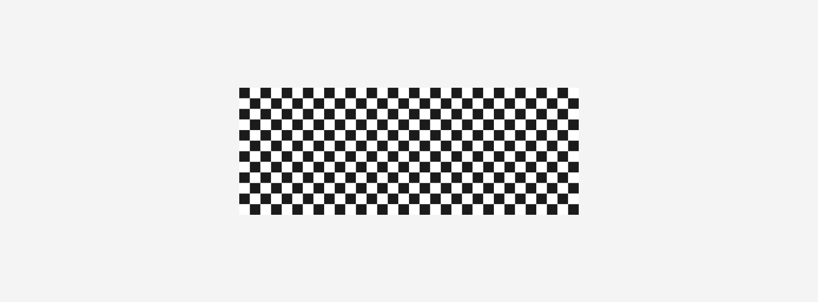
Patterns are another strong area for conic gradients. A checkerboard effect is achievable by specifying four color segments of 90deg each, then controlling the repetition with background-size. Rotating the angle values within the pattern produces variations that resemble different woven or tiled textures.

conic-gradient(). (Large preview).checkerboard {
--size: 25px;
width: 200px;
height: 100px;
background-image: conic-gradient(#fff 90deg, #000 0 180deg, #fff 0 270deg, #000 0);
background-size: var(--size) var(--size);
}
.element {
    background-image: conic-gradient(#fff 90deg, #000 0 136deg, #fff 0 313deg, #000 0);
}
Generating Random UI Patterns
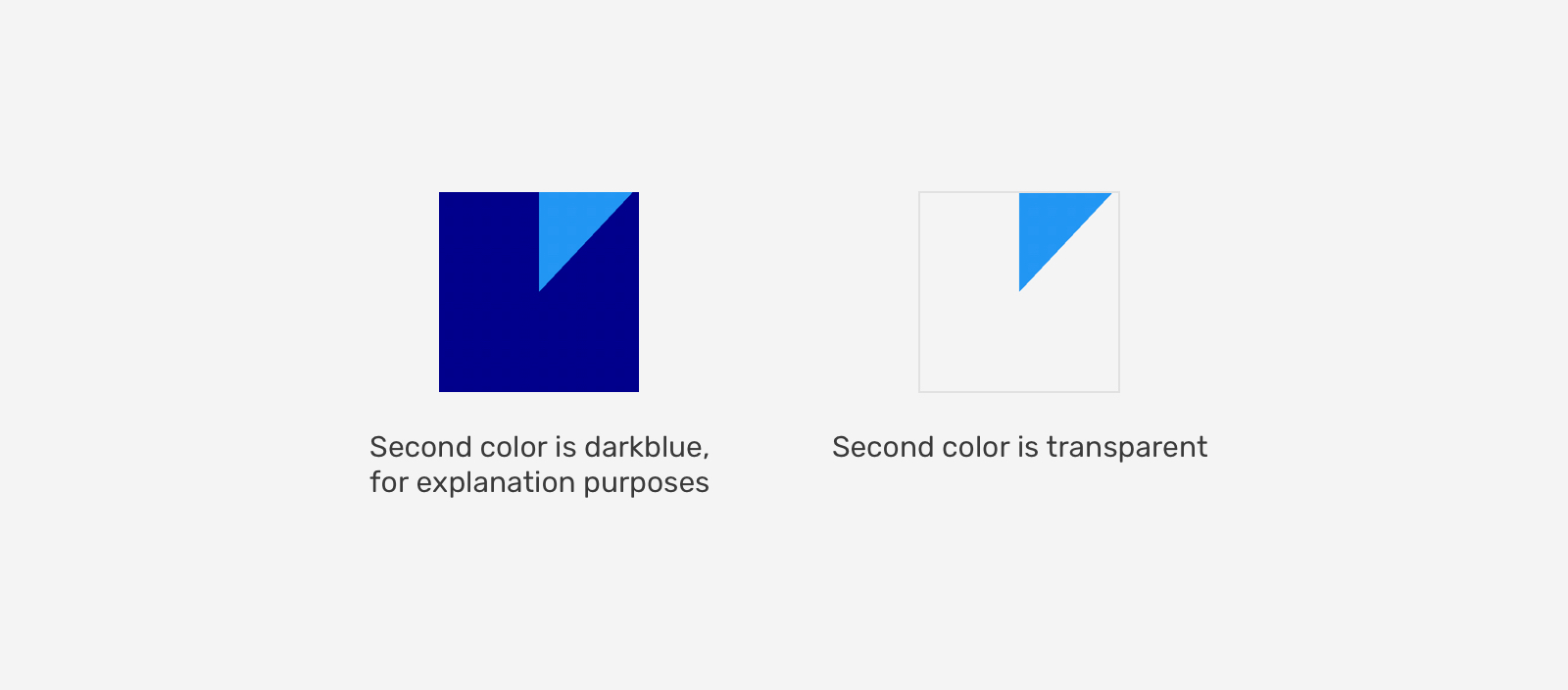
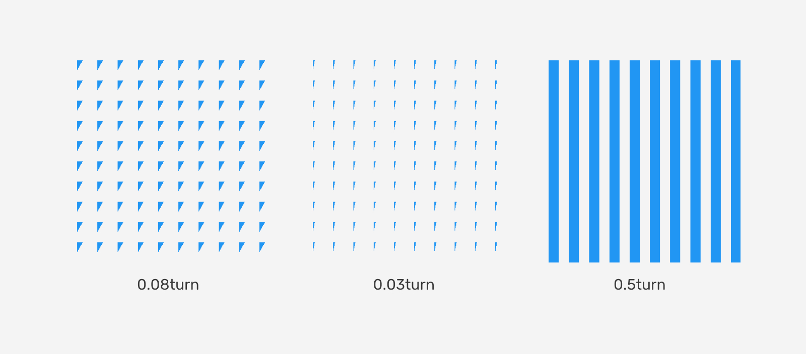
You can create unpredictable-looking shapes by combining conic gradients with small background tiles. For an element with a set width and height, setting background-size to repeated tiles allows each tile to contain its own gradient. Making one of the stop colors transparent turns the gradient into a triangle. Changing the gradient angle on different tiles produces varied and interesting composite effects.
.element {
    --size: 20px;
    width: 200px;
    height: 200px;
    background-size: var(--size) var(--size);
}
.element {
    --size: 20px;
    width: 200px;
    height: 200px;
    background: conic-gradient(#2296F3 0.13turn, rgba(255,255,255,0) 0);
    background-size: var(--size) var(--size);
}

Animating With the @property Rule
Animating conic gradients requires registering a custom property via the @property rule. This notifies the browser that the property is animatable, allowing smooth transitions between gradient states that would otherwise fail to interpolate.
@property --conic-mask {
    syntax: '<percentage>';
    inherits: false;
    initial-value: 0%;
}

.conic-mask {
    --conic-mask: 0%;
    -webkit-mask: conic-gradient(from 0deg at 50% 50%, #000 var(--conic-mask), #0000);
    transition: --conic-mask 1s ease-out;
}

.conic-mask: hover {
    --conic-mask: 100%;
}conic-gradient.Custom Masks for Cut Corners
Conic gradients also work well as mask layers. One demonstrated technique uses a conic gradient in a mask to create cut-corner effects on elements, simulating a style normally handled by clip-path or SVG shapes.
See the Pen [Cut corners with custom shape [forked]](https://codepen.io/smashingmag/pen/jOGKjxQ) by Temani Afif.
Subtle Color Effects
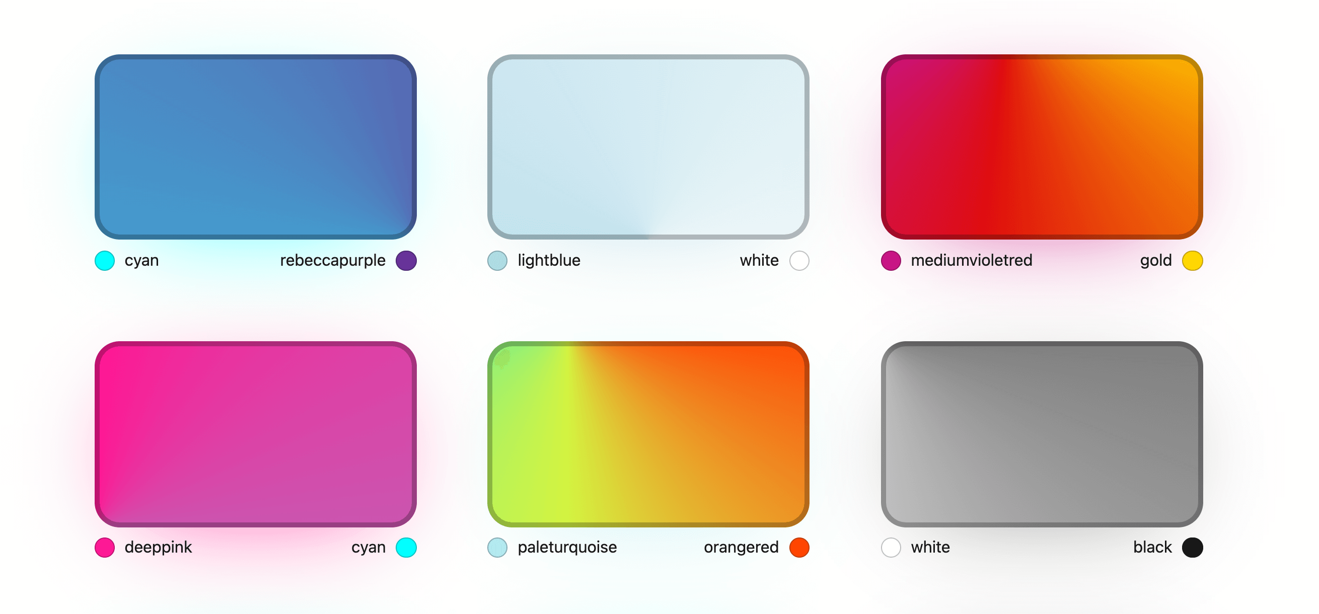
Several small libraries and demos show how conic gradients give subtle color variety to UI elements. This can mean producing corners that are slightly darker or lighter in tone, giving surfaces a more dimensional feel with minimal code.
Section Backgrounds With Smooth Transitions
A notable pattern uses a conic gradient to add color to a page section, like a footer, making it appear as if the color is partially wrapping around the content in a smooth, elegant way.
.footer {
    background: conic-gradient(from 0.25turn at 25% 0%, #FFD9CE, rgba(#FFD9CE, 0) 50%);
}
The choice between radial and conic gradients isn't always clear-cut. Radial gradients are ideal for fading outward from a focal point, while conic gradients are built for angular sweeps and segmentation. In practice, the specific design need dictates which function to use.



