

Grid Layouts for Shopify Collection Pages
Collection pages are natural candidates for CSS Grid. Products are repeatable, homogeneous items, and a grid framework gives you clean row-and-column alignment without the overhead of a heavier layout system. Shopify themes support CSS Grid well, and the main difference from working with a custom section is that you don't assign classes to individual products manually — the collection for loop handles that for you.
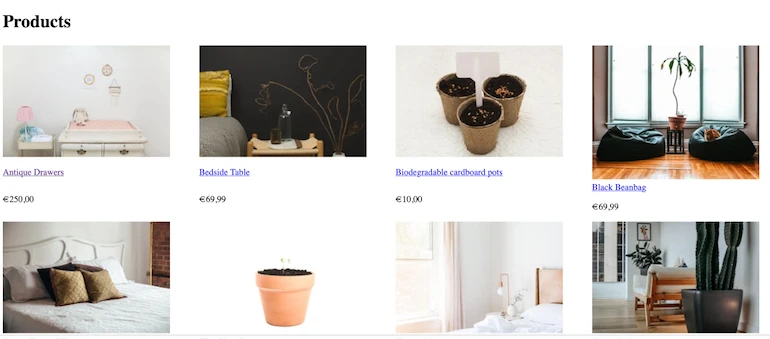
A bare collection page template typically outputs the collection title and, for each product, the image, name, and price. Without styling, products stack vertically. The image size comes from the img_url Liquid filter, which you set to a pixel value like 300.
To move those products into a grid, wrap the collection loop in a parent container and give each product its own child container:
<h1>{{ collection.title }}</h1>
  {% for product in collection.products %}
    <a href="{{ product.url | within: collection }}">
      <img src="{{ product.featured_image.src | img_url: '300x' }}" alt="{{ product.featured_image.alt | escape }}">
    </a>
    <a href="{{ product.url | within: collection }}">{{ product.title }}</a>
      <p>{{ product.price | money }}</p>
  {% unless product.available %}<br><strong>sold out</strong>{% endunless %}
  {% endfor %}
With those wrappers in place, the key CSS rule is:
.grid-collection {
  display: grid;
  grid-template-columns: repeat(auto-fit, minmax(300px, 1fr));
}

.grid-product {
  display: grid;
}
The grid-template-columns value uses repeat(auto-fit, minmax(300px, 1fr)) for fluid behavior: auto-fit places as many items on each line as the viewport allows, and minmax sets a minimum cell width of 300 pixels with a maximum of one fraction of the container. Those minimum pixels should match or exceed the img_url size defined in Liquid; if the cell is smaller than the image, the image gets cut off.
Once the basic grid renders, add spacing and centering with properties like gap, which sets both row and column gaps in one declaration. The full stylesheet for a responsive grid is compact:
.grid-collection {
  display: grid;
  grid-template-columns: repeat(auto-fit, minmax(300px, 1fr));
  gap: 1px;
  margin: 1em;
  background-color: white;
}

.grid-product {
  display: grid;
  justify-content: center;
  padding: 10px;
  color: white;
  line-height: 1;
  border-radius: 5px;
}
Merchant-Controlled Columns
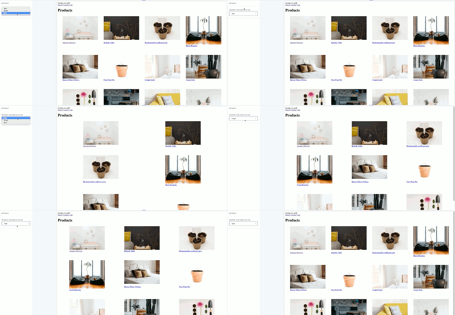
The fluid grid above adapts automatically, but clients often want explicit control over how many products appear per row. If your collection markup lives in a section file, you can expose that choice through section settings in the theme editor.
A select setting with a label like "Number of products per row" provides options such as two, three, or four. The setting's id becomes the reference point for Liquid. You append the section object to your grid container's class name, so the class changes based on the selected value:
<div class="grid-collection-{{ section.settings.product_number }}">
For instance, choosing "three" from the dropdown outputs a class of collection-grid-three in the rendered markup. In the stylesheet, define a separate rule for each class, each with a different grid-template-columns count:
.grid-collection-two {
  display: grid;
  grid-template-columns: repeat(2, 1fr);
  gap: 1px;
  margin: 1em;
  background-color: white;
}

.grid-collection-three {
  display: grid;
  grid-template-columns: repeat(3, 1fr);
  gap: 1px;
  margin: 1em;
  background-color: white;
}

.grid-collection-four {
  display: grid;
  grid-template-columns: repeat(4, 1fr);
  gap: 1px;
  margin: 1em;
  background-color: white;
}
This pattern gives the merchant a straightforward editor control that maps directly to layout behavior.
Responsive Breakpoints
Fixed column counts break down on narrow screens — three or four columns of minimum 300-pixel cells will overflow a phone viewport. Add media queries so that each collection-grid-* variation drops to two columns, and then to one, at appropriate breakpoints:
@media screen and (max-width: 992px) {
  .grid-collection-two {
    grid-template-columns: repeat(2, 1fr);
  }
}

@media screen and (max-width: 600px) {
  .grid-collection-two {
    grid-template-columns: repeat(1, 1fr);
  }
}

@media screen and (max-width: 992px) {
  .grid-collection-three {
    grid-template-columns: repeat(2, 1fr);
  }
}

@media screen and (max-width: 600px) {
  .grid-collection-three {
    grid-template-columns: repeat(1, 1fr);
  }
}

@media screen and (max-width: 992px) {
  .grid-collection-four {
    grid-template-columns: repeat(2, 1fr);
  }
}

@media screen and (max-width: 600px) {
  .grid-collection-four {
    grid-template-columns: repeat(1, 1fr);
  }
}
You may need to adjust the minimum pixel sizes and the img_url value to match the imagery your client supplies. The template below serves as a baseline for any custom theme build:
<h1>{{ collection.title }}</h1>
  <div class="grid-collection">
    {% for product in collection.products %}
      <div class="grid-product">
        <a href="{{ product.url }}">
          <img src="{{ product.featured_image.src | img_url: '300x' }}" alt="{{ product.featured_image.alt | escape }}">
        </a>
        <a href="{{ product.url }}">{{ product.title }}</a>
          <p>{{ product.price | money }}</p>
          {% unless product.available %}<br><strong>sold out</strong>{% endunless %}
      </div>
    {% endfor %}
  </div>
{% schema %}

{
    "name": "Collection",
    "settings": [
  {
    "type": "select",
    "id":  "product_number",
    "label": "Number of products per row",
    "options": [
        {
        "value": "two",
        "label": "two"
        },
        {
        "value": "three",
        "label": "three"
        },
        {
        "value": "four",
        "label": "four"
        }
      ]
    }
  ]
}

{% endschema %}
<div class="grid-collection-three">
Where Grid Fits Next
Once collection pages run on Grid, the same approach can extend to other theme areas — image galleries, for example, where you might introduce irregular cell shapes for visual variety. Each grid implementation on Shopify is an opportunity to simplify the layout rules across a theme project.


