
Faking layered text without extra elements
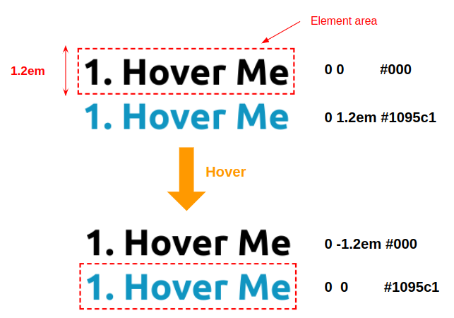
No HTML text is duplicated in these examples, and no content: "text" rule is used. Every extra text layer is produced by text-shadow, even though the result does not look like a shadow at all. The core maneuver: set the real text color to transparent (via #0000) so it disappears, then draw sharp copies with text-shadow. Supplying only two length values per shadow means there is no blur radius, which yields a crisp duplicate in whatever color is specified. Hiding overflow then keeps the duplicates out of sight until they are moved on hover, so the original text appears to be swapped for new text.
Height and offset values repeat heavily — 1.2em in the first example — so they can be lifted into a custom property like --h, and calc() can reduce the whole effect to a single text-shadow declaration. One naming note: the underscore in internal variables such as --_t is purely a convention separating user-facing controls (like --h) from optimization-only values; it carries no special meaning.
Effect 1: sliding duplicates
.hover-1 {
  line-height: 1.2em;
  color: #0000;
  text-shadow:
    0 0 #000,
    0 1.2em #1095c1;
  overflow: hidden;
  transition: .3s;
}
.hover-1:hover {
  text-shadow:
    0 -1.2em #000,
    0 0 #1095c1;
}
The two text layers move on hover; with overflow hidden, the movement makes the original content look replaced.
.hover-1 {
  --h: 1.2em;

  line-height: var(--h);
  color: #0000;
  text-shadow:
    0 0 #000,
    0 var(--h) #1095c1;
  overflow: hidden;
  transition: .3s;
}
.hover-1:hover {
  text-shadow:
    0 calc(-1 * var(--h)) #000,
    0 0 #1095c1;
}
.hover-1 {
--h: 1.2em;
line-height: var(--h);
color: #0000;
text-shadow:
0 calc(-1*var(--_t, 0em)) #000,
0 calc(var(--h) - var(--_t, 0em)) #1095c1;
overflow: hidden;
transition: .3s;
}
.hover-1:hover {
--_t: var(--h);
}Flipping the direction requires only a small edit to the text-shadow value — the duplicated text can slide in from the top instead, with nothing else touched.
Effect 2: combining text-shadow and background
Here two properties animate together. As in the first effect there are two layers, but only one moves; the other has its color made transparent during the swap. On hover the white layer travels to the top while the second goes transparent, and a gradient is animated with background-size. Adding overflow: hidden confines the animation to the element's boundaries.
.hover-2 {
  /* the height */
  --h: 1.2em;

  line-height: var(--h);
  color: #0000;
  text-shadow:
    0 var(--_t, var(--h)) #fff,
    0 0 var(--_c, #000);
  transition: 0.3s;
}
.hover-2:hover {
  --_t: 0;
  --_c: #0000;
}
.hover-2 {
/* the height */
--h: 1.2em;
line-height: var(--h);
color: #0000;
text-shadow:
0 var(--_t,var(--h)) #fff,
0 0 var(--_c, #000);
background:
linear-gradient(#1095c1 0 0)
bottom/100% var(--_d, 0) no-repeat;
overflow: hidden;
transition: 0.3s;
}
.hover-2:hover {
--_d: 100%;
--_t: 0;
--_c: #0000;
}The same effect can be driven by a single custom property that merely switches values on hover, using the DRY switching technique:
.hover-2 {
  /* the height */
  --h: 1.2em;

  line-height: var(--h);
  color: #0000;
  text-shadow:
    0 var(--_i, var(--h)) #fff,
    0 0 rgb(0 0 0 / calc(var(--_i, 1) * 100%) );
  background:
    linear-gradient(#1095c1 0 0)
    bottom/100% calc(100% - var(--_i, 1) * 100%) no-repeat;
  overflow: hidden;
  transition: 0.3s;
}
.hover-2:hover {
  --_i: 0;
}
Effect 3: stacking two simpler effects
This one simply combines the second hover effect from the earlier background-properties article with the first effect above; the only work is copying the two and adjusting variable names. Code can again be trimmed with the DRY switching variable, building on the earlier optimizations.
.hover-3 {
  /* the color  */
  --c: #1095c1;
  /* the height */
  --h: 1.2em;

  /* The first hover effect in this article */
  line-height: var(--h);
  color: #0000;
  overflow: hidden;
  text-shadow:
    0 calc(-1 * var(--_t, 0em)) var(--c),
    0 calc(var(--h) - var(--_t, 0em)) #fff;
  /* The second hover effect from the previous article */
  background:
    linear-gradient(var(--c) 0 0) no-repeat
    calc(200% - var(--_p, 0%)) 100% / 200% var(--_p, .08em);
  transition: .3s var(--_s, 0s), background-position .3s calc(.3s - var(--_s, 0s));
}
.hover-3:hover {
  --_t: var(--h);
  --_p: 100%;
  --_s: .3s
}
.hover-3 {
/* the color */
--c: #1095c1;
/* the height */
--h: 1.2em;
line-height: var(--h);
color: #0000;
overflow: hidden;
text-shadow:
0 calc(-1 * var(--h) * var(--_i, 0)) var(--c),
0 calc(var(--h) * (1 - var(--_i, 0))) #fff;
background:
linear-gradient(var(--c) 0 0) no-repeat
calc(200% - var(--_i, 0) * 100%) 100% / 200% calc(100% * var(--_i, 0) + .08em);
transition: .3s calc(var(--_i, 0) * .3s), background-position .3s calc(.3s - calc(var(--_i, 0) * .3s));
}
.hover-3:hover {
--_i: 1;
}Effect 4: revealing a layer with clip-path
Starting from the second effect, a clip-path animation reveals one text layer before it moves. Leaving the value at inset(0 0 0 0) behaves like overflow: hidden: only the actual text shows. On hover the third value — the bottom offset — is set to a negative value equal to the height, exposing the layer positioned at the bottom.
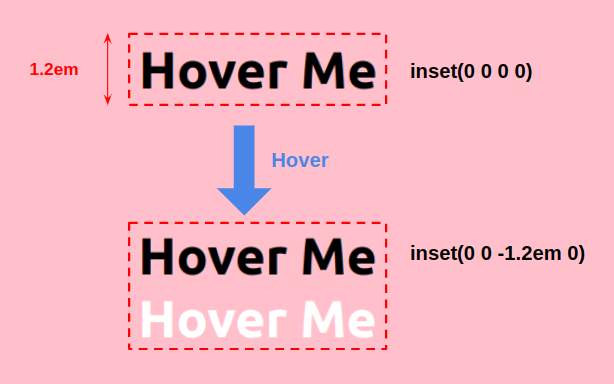
Merging this with effect 2 requires sequencing: the clip-path animation must finish before the rest runs, so every hovered property except clip-path gets a delay. On mouse out the reverse delay is applied.
transition: 0.4s 0.4s, clip-path 0.4s;transition: 0.4s, clip-path 0.4s 0.4s;The blue rectangle's slide needs a box-shadow rather than background, since backgrounds are clipped to the content area by default while box-shadow can extend beyond it. Its values match those of the white text layer inside text-shadow because both travel together: they slide up, then the box-shadow ends up behind the element while the text-shadow sits on top.
.hover-4 {
  /* the color  */
  --c: #1095c1;
  /* the height */
  --h: 1.2em;

  line-height: var(--h);
  color: #0000;
  text-shadow:
    0 var(--_t, var(--h)) #fff,
    0 0 var(--_c, #000);
  box-shadow: 0 var(--_t, var(--h)) var(--c);
  clip-path: inset(0 0 0 0);
  background: linear-gradient(var(--c) 0 0) 0 var(--_t, var(--h)) no-repeat;
  transition: 0.4s, clip-path 0.4s 0.4s;
}
.hover-4:hover {
  --_t: 0;
  --_c: #0000;
  clip-path: inset(0 0 calc(-1 * var(--h)) 0);
  transition: 0.4s 0.4s, clip-path 0.4s;
}
The background syntax here differs from effect 2 but achieves the same visual result: instead of animating size from 0% to 100%, the position animates from 0 var(--h) to 0 0. With no size specified, a gradient fills the full width and height, so knowing the element height (--h) is enough to produce the slide.
.hover-4 {
  /* ... */
  background: linear-gradient(var(--c) 0 0) 0 var(--_t, var(--h)) no-repeat;
}
.hover-4:hover {
  --_t: 0;
}
Two small implementation details worth flagging: inset(0 0 1px 0) appears in the demos to remove a stray line at the bottom, and reducing this final effect to a single switching variable is left as an exercise.
Takeaways
- Transparent text plus blur-free
text-shadowyields arbitrary colored copies of a string with no duplicated markup and no pseudo-elements. - Hiding overflow turns moved layers into a text-swap illusion.
- Custom properties, with or without
calc(), collapse repetitive offsets into one declaration and enable single-variable DRY switching. - Combining effects —
clip-pathreveals, delayed transitions,box-shadowslides — composes complex-looking motion from small pieces.




