
Getting Oriented Before Digging In
Exploratory data analysis (EDA) is the process of visualizing data and identifying significant patterns like correlated features, missing values, and outliers. It also helps generate hypotheses about why those patterns exist. Before you write any plotting code, it pays to understand the broader context. Talk to leadership and product teams to clarify whether this is a prediction task or pure exploration, since that will direct where you focus your attention.
With that context, assess the dataset's basic dimensions. Knowing the number of samples (rows) and features (columns) helps you anticipate computational bottlenecks. Computing a correlation matrix on very large datasets, for instance, can be slow. If the data won't work comfortably in a Jupyter notebook, subsample it into something representative that you can actually work with.

Once your data is loaded, look at the first couple of rows and clarify what each feature means and what unique identifier each row carries. In the sample dataset of merchant behaviour above, the features relate to sales activity, which are defined as follows:
- Shop Cohort: the month and year a merchant joined Shopify
- GMV (Gross Merchandise Volume): total value of merchandise sold.
- AOV (Average Order Value): the average value of customers' orders since their first order.
- Conversion Rate: the percentage of sessions that resulted in a purchase.
- Sessions: the total number of sessions on your online store.
- Fulfilled Orders: the number of orders that have been packaged and shipped.
- Delivered Orders: the number of orders that have been received by the customer.
Determine what uniquely identifies each row. In this case, rows are uniquely defined by a "Snapshot Date" and "Shop ID" pair, giving one row per shop per day. Understanding this structure early on improves your ability to effectively reference and analyze rows later.
Step 1: Scan for Missing Data
Checking for missing values is usually the first direct look you take at the data. For each feature, count values that are missing and rank the features from worst to best. Doing this one feature at a time with respect to your analysis context is wise when there are many features.

The important question isn't just whether data is missing, but why it's missing. Take the example of a feature with 70 percent of its values missing. Driven by numbers alone, you might be tempted to drop it outright. However, if that feature reflects an optional survey question, many people may have simply left it blank. Removing that feature now would introduce bias. Rather, the missing behavior is itself meaningful information and can be coded as a "Not Answered" category to preserve the nuance.
Understanding the cause dictates the treatment. Imputation—a dedicated field of statistics—offers several solutions. For time series data without seasonality or trend, replacing missing values with the mean or median might suffice. With a trend but no seasonality, linear interpolation works well; with both, you need to adjust for seasonality before interpolating.
Step 2: Describe the Sample and Features
Now that missing values are flagged, get to know the features themselves. A useful categorization divides data into three types:
- Continuous: A feature that can assume an infinite number of values within a range (e.g., GMV).
- Discrete: A numeric feature with a countable number of values (e.g., Sessions).
- Categorical: A feature with a finite number of values (e.g., a merchant's Shopify plan type).
This classification drives your choices about what visualizations to make and what statistical methods you can apply, since many tools won't work across all data types.
| GMV | AOV | Conversion Rate |
| 62894.85 | 628.95 | 0.17 |
| NaN | 1390.86 | 0.07 |
| 25890.06 | 258.90 | 0.04 |
| 6446.36 | 64.46 | 0.20 |
| 47432.44 | 258.90 | 0.10 |
For continuous features, note characteristics such as the range between minimum and maximum values. For discrete features, do the same. For categorical features, check the number of unique values and how often each one occurs. In this sample, there are 3 continuous features, 4 discrete features, and 4 categorical features. GMV spans $12.07 to $814468.03; interestingly, data is missing for a single day, suggesting a possible data collection error. The plan feature takes four values: "Basic Shopify", "Shopify", "Advanced Shopify", and "Plus". At 450 merchants, "Advanced Shopify" is well represented vs 255 "Basic Shopify" users, which may warrant a sanity check.
Step 3: Understand the Data's Shape
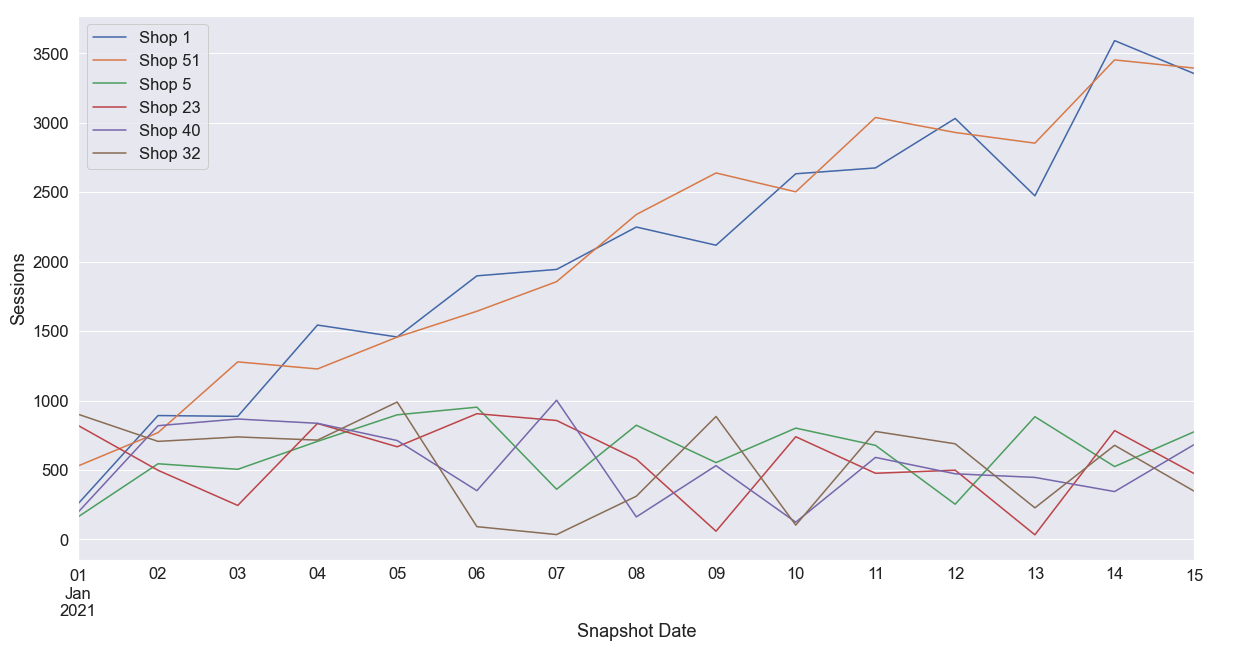
The shape of a feature—its distribution and how it behaves over time—reveals a great deal. Plot features over time if you have a time series to inspect for trends and seasonality.

In the visual example, AOV and Sessions exhibit positive linear trends, while Sessions also shows a seasonality. In this case, the recurring pattern you observe isn't a function of time alone, but of the mix of shops in the data: two specific shops (Shop 1 and Shop 51) have far more daily sessions and a faster growth rate than their peers, a clue that warrants further investigation into whether these shops have higher GMV or AOV.
Next, compute the mean and variance of each feature. Do some features barely change at all? Are others constantly in flux? Skewness is a common outcome worth noting. When data behaves consistently, a low variance may make it less interesting; a very high variance requires deeper inspection.
Use Probability Density Functions (PDFs) for continuous features and Probability Mass Functions (PMFs) for discrete ones to explore these shapes. Among the things PDFs and PMFs help you spot:
- Skewness: asymmetry of the data, which may deter you from using the mean as the sole measure of central tendency.
- Heterogeneity: whether a feature is bimodal or multimodal in nature.
- Disconnection: gaps in the PDF hinting that a feature may be disjointed.
- Bounds: whether values are bounded or unbounded on either end.

In this sample data, GMV, AOV, Sessions, and Conversion Rate are all heavily skewed. Skewed data often calls for the median rather than the mean as a central-tendency measure, albeit at additional computational cost. Noting these observations systematically helps you move toward a more informed analysis stage:
- AOV: continuous, ranging $38.69–$8994.58, with 8% missing; large skewness and a positive linear trend across samples.
- Sessions: discrete and non-negative count data, ranging 2–2257; 7.7% missing; highly skewed with a positive linear trend; dominated in recent periods by Shops 1 and 51.
- Conversion Rate: continuous, bounded between 0.0 and 0.86, with 7.7% missing; large skewness.
For each feature, forming a hypothesis about observed variance, missing values, or unusually high activity helps you make the most of the exploration phase, preparing you for deeper statistical analysis and modelling.
Measuring Relationships Between Features
Correlation quantifies how two variables move together. For two continuous features, a scatter plot is the quickest way to see the relationship. Plotting Delivered Orders against Fulfilled Orders shows the expected positive association, where higher fulfillment counts align with more delivered orders.

With many features, individual scatter plots become impractical. The Pearson correlation matrix solves this by computing a linear correlation score between every feature pair, ranging from -1 to 1. Positive scores indicate a positive relationship, negative scores an inverse one, and the magnitude reflects strength.

The matrix often reveals meaningful patterns worth hypotheses. In the typical dataset, you might see a strong positive relationship between Fulfilled Orders and Delivered Orders, and another between GMV and AOV. Even a slight positive correlation between Sessions, GMV, and AOV can be significant — noting these links helps later modeling steps.
Because the underlying data is a time series, autocorrelation also matters. Autocorrelation measures the relationship between a signal's current value and its own past values — for instance, whether a shop's GMV today correlates with its GMV a week ago. Time series analysis is a broad topic, but understanding these dependencies is important for forecasting and identifying seasonality patterns like weekend shopping spikes.
| Shop Cohort | 2019-01 | 2019-02 | 2019-03 | 2019-04 | 2019-05 | 2019-06 |
| Plan | ||||||
| Adv. Shopify | 71 | 102 | 27 | 71 | 87 | 73 |
| Basic Shopify | 45 | 44 | 42 | 59 | 0 | 57 |
| Plus | 29 | 55 | 69 | 44 | 71 | 86 |
| Shopify | 53 | 72 | 108 | 72 | 60 | 28 |
For categorical features, the Pearson approach does not apply. One workable option is the Pearson chi-square test. You build a contingency table from pairs of discrete features, where each cell shows observation frequency. Under the null hypothesis, the categorical variables are independent and unrelated. A hypothesis test against the chi-square distribution at your chosen significance level tells you whether the variables are independent or dependent.
Identifying Outliers
Outliers are samples that deviate significantly from the rest of the data. They can distort statistical results, so spotting them is an essential part of EDA. Some outliers come from measurement errors; many others occur naturally in the real world.

A box plot makes outliers easy to see. Points plotted far from the main body of data stand out immediately, and the same visualization reveals that nearly every feature contains at least some unusual observations.
For a systematic approach across many features, percentile thresholds work well. Compute the 1st and 99th percentiles for each feature and flag any data point below the first or above the last. Then count the outliers per feature and rank them. Features with the most outliers deserve the closest scrutiny — understanding why they behave this way is more valuable than simply removing the offending rows.
Percentiles require ordering, so this trick does not apply to discrete features. There, an outlier might mean something else — a rare category value appearing in only one percent of samples, for example. More advanced anomaly detection methods exist for categorical data, but the basic principle remains the same: know what is unusual and why.
Finishing the Review
A complete EDA boils down to a handful of habits worth carrying forward:
- Missing values never go away on their own. Know why they exist and how you will handle them.
- Describe and categorize your features early. This choice drives both visualizations and statistical techniques.
- Visualize every distribution. You cannot predict what shapes or surprises the data will show.
- Document feature relationships. Correlations discovered now will be useful in later modeling.
- Treat outliers as known quantities. Hidden outliers are the dangerous ones.
With the EDA complete, the next steps depend entirely on the business problem. A clear summary of findings helps leadership and product teams decide what to build. The work might feed a regression model, a classification task, or a KPI dashboard. The path forward is not fixed, but it is much clearer with a thorough understanding of the data in hand.


