
A visualization you have to endure
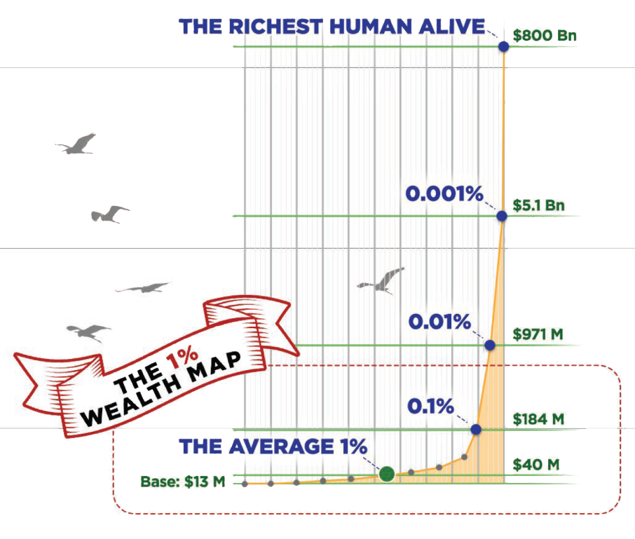
A website presents wealth inequality as a single scrollable graph: climbing from the bottom of the income scale to the richest American takes real time and physical effort. The author reports doing it in 12 minutes and 51 seconds — with the option to stop at any moment via an I quit button on screen.
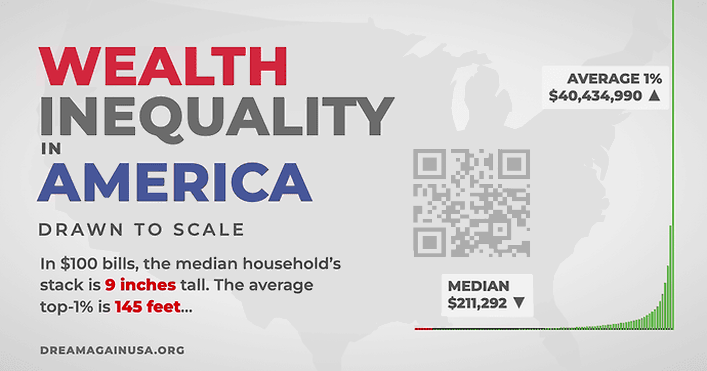
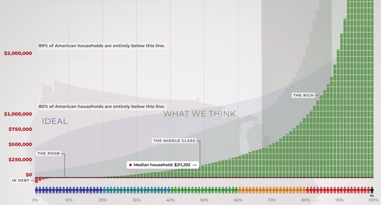
That exit is the point of contrast the site is built around: Americans living at the bottom of the same graph have no equivalent button. The project, dreamagainusa.org, was built by Geoff Dalgas, a friend of the author who also helped build Stack Overflow and handled all the technical work.

Deliberately inconvenient by design
The author describes initially dismissing "walking simulators" — games offering no real choices, only an experience — but argues the graph is not a game because it represents people's actual lives. The experience models endurance: surviving day to day with almost nothing for as long as possible without pressing "I Quit."
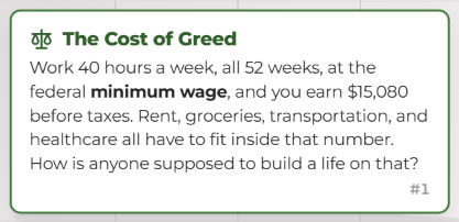
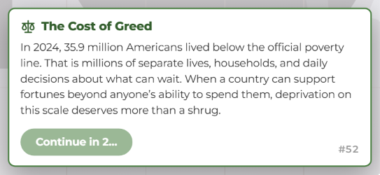
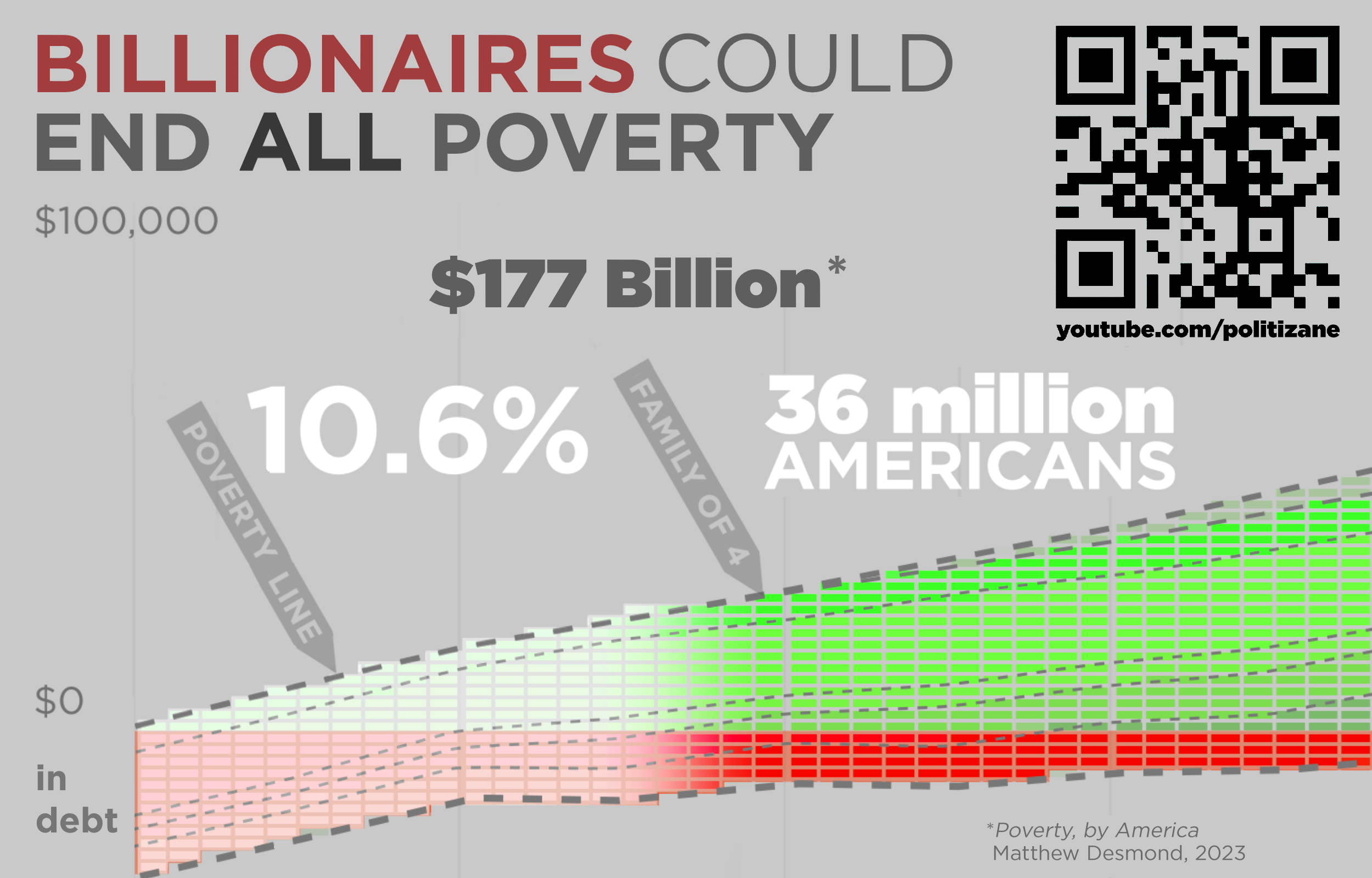
Early versions of the site scrolled automatically or jumped rapidly; both were rejected. Users must perform the physical action of scrolling the full distance themselves, and the site halts scrolling at certain milestones. Those forced stops exist so that no one scrolls blindly past the 36 million Americans living in poverty — while, in the same country, all poverty could be eliminated for $177 billion.
The author, whose career has centered on software usability, frames the choice to punish the user as intentional: "the data itself is the pain." A linear scale is presented as the only honest way to represent the numbers, however much length it requires.
The print version
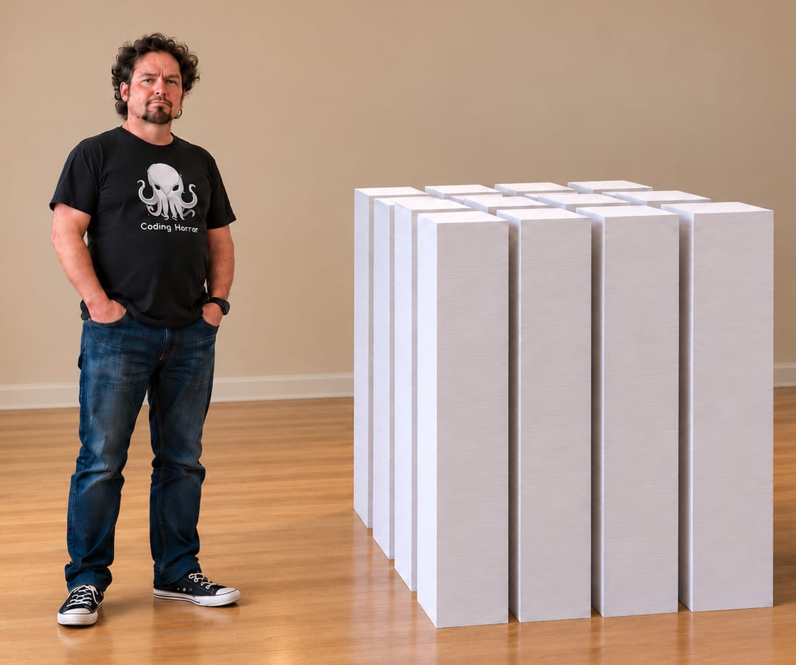
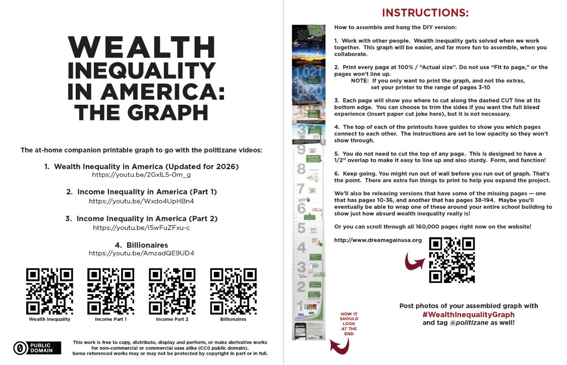
An 8-page foldable version of the graph is available for download, sized at 6 feet 6 inches — the average height of an NBA player — to make the scale relatable in physical form.
Published material connected to the project comes with sources and methodology attached. The author states that Politizane, The Onion and Garbage Day retained full control over their work, with no instructions given on what to make or how to say it, and that the project belongs not to any person or organization but to the public.
The invitation is to climb as far as you want. For anyone who reaches the so-called "top," the site has one question: Was it worth it?