
Icons do useful work in UI elements: they label controls, reinforce intent, and add visual texture. Yet they are routinely misaligned in the wild, and even a well-placed icon tends to break down as soon as the typographic styles around it change. Two real-world examples illustrate the problem and a calculation-based fix.
Case one: a messaging callout
A messaging pattern found on a popular media site looks fine at its default size, but adjusting font-size or line-height exposes three flaws:
- The SVG icon is
absolutely positioned from the left edge inremunits. - Removing the icon from flow forces a larger
padding-lefton the parent, so spacing is no longer uniform — it should look right whether or not an icon is present. - Sizing the icon in
rems means it cannot scale in step with a change to its parent'sfont-size.
Aligning to the top edge
The goal is for the icon's top edge to sit at the top of the text box (the blue dashed line in the diagram below), but it commonly lands lower, at the red line.
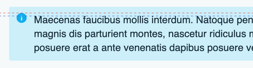
The usual patch is a nudge like position: relative; top: 0.2em. It can work, but any future change to typographic styles can knock the icon out of place. A more durable approach derives the offset from the element's baseline distance — the space from one line's baseline to the next.
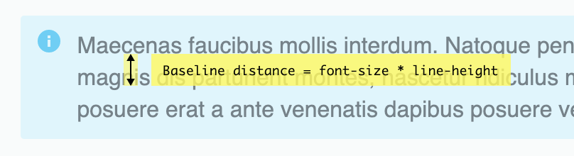
Baseline distance is font-size × line-height, and it can be kept in a custom property:
--baselineDistance: calc(var(--fontSize) * var(--lineHeight));The downward shift then follows (baseline distance − font size) / 2:
--iconOffset: calc((var(--baselineDistance) - var(--fontSize)) / 2);With a font-size of 1rem (16px) and line-height of 1.5, that yields a 4-pixel offset: 16px × 1.5 = 24px, then (24px − 16px) / 2 = 4px.
Case two: list markers
The second example is an unordered list whose icon comes from a web font (Font Awesome) applied through a ::before pseudo-element. Web fonts can align quite well depending on the glyph. The problems lie elsewhere:
- There is no
absolutepositioning. Pseudo-elements rarely get the flexbox treatment used in the first example, and absolute positioning suits them well. - Layout relies on a mix of
paddingand negativetext-indent, which is hard to keep working once text wraps to multiple lines and the icon must scale.
Centering against the first line
Because the fix still uses a pseudo-element, absolute positioning is a natural fit. In this case the icon is about twice the size of the adjacent copy, so the formula changes: the icon's center should line up with the center of the first line. Start with the same baseline distance:
--baselineDistance: calc(var(--fontSize) * var(--lineHeight));Then shift down by (baseline distance − icon size) / 2:
--iconOffset: calc((var(--baselineDistance) - var(--iconSize)) / 2);At a font-size of 1rem (16px), line-height of 1.6, and an icon twice the copy size (32px), the result is a top of −3.2 pixels: 16px × 1.6 = 25.6px, then (25.6px − 32px) / 2 = -3.2px.
Scale up to 2rem (32px) with a line-height of 1.2 and a 64px icon, and the value becomes −12.8 pixels: 32px × 1.2 = 38.4px, then (38.4px − 64px) / 2 = -12.8px.
Takeaway
Icons in interfaces can be SVGs, web fonts, static images, ::marker, list-style-type, or even background-colors combined with clip-paths. Whatever the medium, a few simple calculations tied to baseline distance go a long way toward making icon alignment and scaling hold up as typographic styles change.