Browsers render <sup> and <sub> with a static font-size: smaller, roughly a 0.83x scale factor. That default was reasonable for simple documents, but it breaks down in responsive layouts. At small font sizes the result is often too small to read; at large sizes it is disproportionately big. Fluid typography, where text scales smoothly between extremes, makes the mismatch worse because the child elements do not track the parent's scale in a natural way.
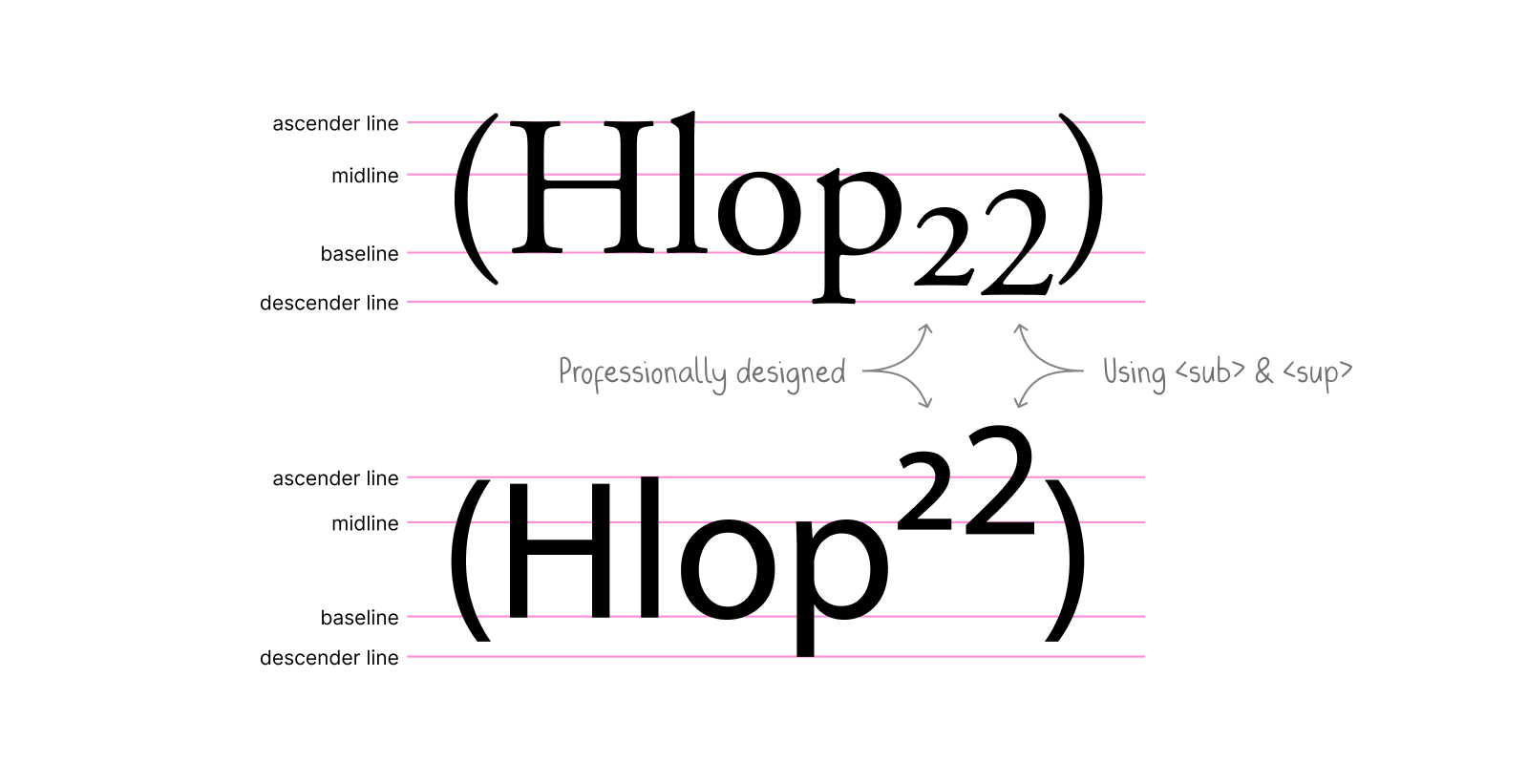
A comparison against professionally designed glyphs shows the gap. Techniques that combine a fixed component with a proportional one can close it using nothing but CSS, keeping superscripts and subscripts legible at small sizes and correctly proportioned at large ones without context-specific overrides.
The core recipe uses a combination of em and px:
sup, sub {
  font-size: calc(0.5em + 4px);
  vertical-align: baseline;
  position: relative;
  top: calc(-0.5 * 0.83 * 2 * (1em - 4px));
  /* Simplified top: calc(-0.83em + 3.32px) */
}

sub {
  top: calc(0.25 * 0.83 * 2 * (1em - 4px));
  /* Simplified top: calc(0.42em - 1.66px) */
}
Two properties of this approach matter:
- Degressive scaling: the mix of fixed and proportional units keeps superscripts and subscripts proportional at every font size.
- Line-height stability:
vertical-align: baselineplus relative positioning stops the elements from altering line height and gives explicit control over the offset.
How the formulas are derived
The font size
The fixed 4px term dominates at small text sizes, while the proportional 0.5em term dominates at large ones. The blend produces natural scaling across the range. The exact factor derives from an analysis of superscript Unicode characters in common fonts, and both terms can be tuned to a design's needs. A larger scale uses different coefficients; a smaller scale uses yet another pair:
sup, sub {
  font-size: calc(0.6em + 3px);
  /* adjust offset calculations accordingly */
}
sup, sub {
font-size: calc(0.4em + 5px);
/* adjust offset calculations accordingly */
}sup, sub {
font-size: calc(0.5em + 4px);
/* ... */
}
sub {
/* ... */
}Recovering the parent size
Inside the <sup> and <sub> elements the parent's font size must be reconstructed. Since the fluid size is calc(0.5em + 4px), compensating for the 0.5em means solving 0.5em * x = 1em, so x = 2. Here 1em refers to the font size of the <sup> and <sub> elements themselves. The fixed 4px is subtracted before multiplying.
sup, sub {
  font-size: calc(0.5em + 4px);
  top: calc(2 * (1em - 4px));
}

sub {
  top: calc(2 * (1em + 4px));
}
The vertical offset
The offset formula starts from common positioning defaults and recalibrates them for the fluid size. 0.5em for superscripts and 0.25em for subscripts are the standard vertical offsets, as used in frameworks including Tailwind CSS and Bootstrap. Multiplying by 0.83 accounts for the browser's default font-size: smaller factor. The result preserves the familiar vertical placement users expect from browser rendering while scaling more smoothly.
sup, sub {
  font-size: calc(0.5em + 4px);
  top: calc(-0.5 * 0.83 * 2 * (1em - 4px));
}

sub {
  top: calc(0.25 * 0.83 * 2 * (1em - 4px));
}
Compatibility and testing
To support older browsers, the whole set of rules can be wrapped in a @supports block. An interactive demo lets you compare fluid options against the browser's static scaling and fine-tune vertical positioning for a particular case.
@supports (font-size: calc(1em + 1px)) {
  sup, sub {
    ...
  }
}