
Prioritization Is Only as Good as Its Criteria
Feature prioritization gets treated like an exercise in democratic voting, but it frequently produces outcomes that don't survive contact with reality. Teams employ all the familiar rituals — dot voting, value-versus-feasibility canvases, the Kano model — and are puzzled when stakeholders reverse their decisions soon after. Whether a prioritization session succeeds or fails almost always comes down to one thing: the selection criteria used to judge the ideas. Solving problems with the technique itself misses the point; the fix is in how you define and weigh what matters.
Every Vote Counts Equally, Which Is the Problem
The common thread of collaborative prioritization techniques is that participants rate or rank features on a shared canvas. In an ideal workshop, everyone is a genuine expert — people who know the domain deeply enough to make informed trade-offs. Danish physicist Niels Bohr described such an expert as someone who has "made all the mistakes that can be made in a very narrow field." When every participant fits that description, the resulting distribution of votes genuinely reflects the best ideas.
Workshops rarely work this way. They tend to include high-power stakeholders with limited interest in the product, as well as people whose presence is politically motivated rather than technically relevant. The result is that informed decision-making often rests with only two or three participants in the room, but their votes carry no more weight than anyone else’s. "Popular" and "best" are not the same thing.
Rationality Is Not the Default Operating Mode
Even when the room is full of qualified people, they bring their own domains, experience, and — unavoidably — around 180 documented cognitive biases to the table. What happens right before a workshop primes how a person will behave during it, a phenomenon known as the priming effect. Preferences and moods can distort choices just as much as genuine expertise, and the reasoning behind a particular vote is nearly impossible to reverse-engineer after the session ends.
This matters because difficult product decisions should be based on data and business logic, not on how strongly a stakeholder feels about an idea at the moment. In many sessions, a heartfelt "I love this idea" carries as much weight as a data-backed argument that an idea will grow the company. If you don't structure the process to force rational thinking up front, you'll end up with decisions driven by taste.
Vague Units of Measure Are a Hidden Trap
Prioritization exercises rely on various measurement systems: numeric scales from 1 to 5, Fibonacci sequences, dots or smileys, relative metaphors, t-shirt sizes like S-M-L-XL, or simply the position of a sticky note on an axis.
These units are supposed to make opinion balancing fair, but they ignore how differently people perceive the same term. Cultural context alone can change everything: if a US client says something was "good," that is often a sign of dissatisfaction, whereas in much of Europe, "good" is respectable praise. A t-shirt size of S means one thing to an in-house senior back-end engineer and something entirely different to a marketing consultant.
To compound the problem, a significant number of participants are now fluent in design-thinking language and know exactly how to exploit vague measurement units to steer the group toward their own idea. If disagreements escalate, the debate tends to end in one of two ways: a complete waste of facilitator and team time, or a forced consensus around whatever the most influential stakeholder in the room wants.
Giving Scores Real Meaning
Abstract numeric scales are a common source of friction in prioritization. When someone is asked to rate a feature between 1 and 5, they are left to interpret what each number represents. A “3” for one person might mean “moderately useful” while for another it could mean “important but not urgent.” To combat this, teams can attach concrete, real-world descriptions to each mark on the scale.
In one complex project involving technology, business processes, and hundreds of stakeholders, the evaluation couldn't be tied to simple end-user satisfaction. The team identified five distinct stakeholder types and built a descriptive scale that weighed both stakeholder coverage and the significance of the tasks the feature would enable.
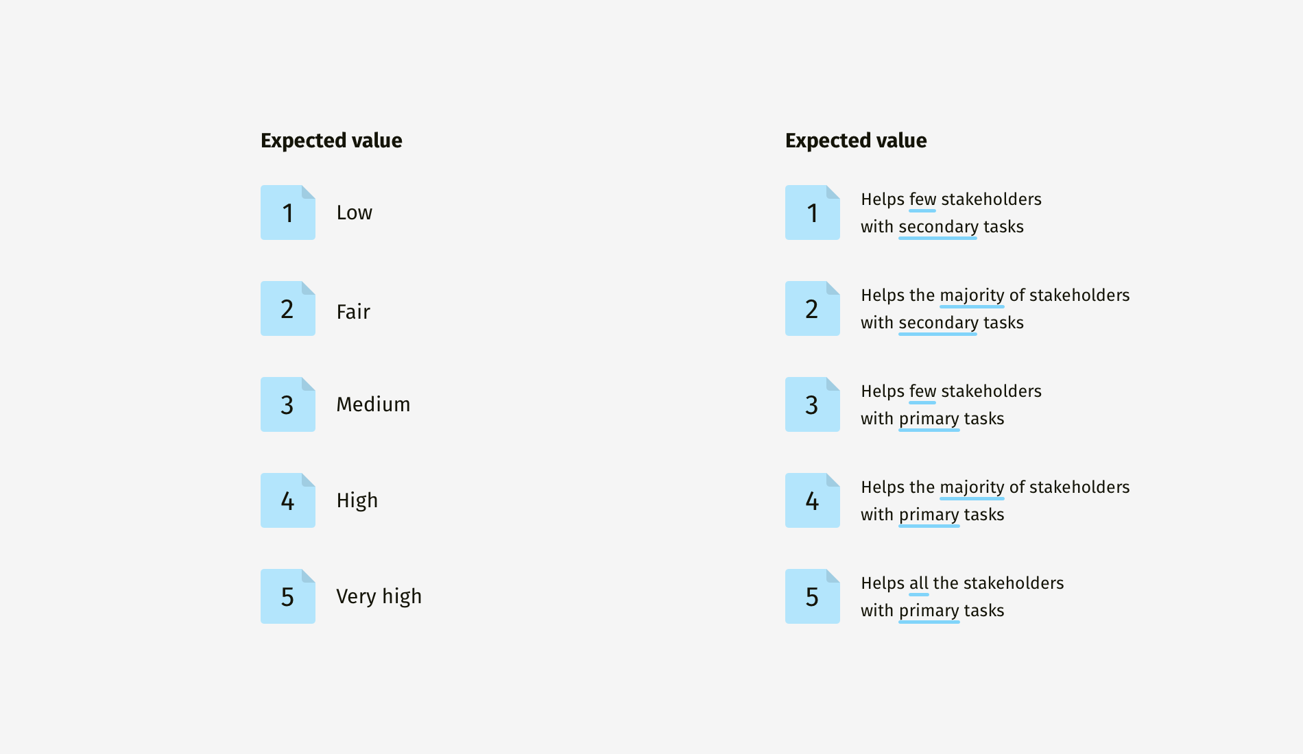
Using a plain 1-to-5 scale would have been easier to construct, but it wouldn't offer any clarity about what a feature's value truly means in practice. Evaluating items in a vacuum is inherently difficult; without descriptors, people will inevitably ask: “Low” relative to what? The same logic applies to effort estimation. Abstract terms like “low,” “medium,” and “high” were replaced with descriptions based on whether the work could be done internally or would require a third party, tying the effort directly to workforce and budget constraints.
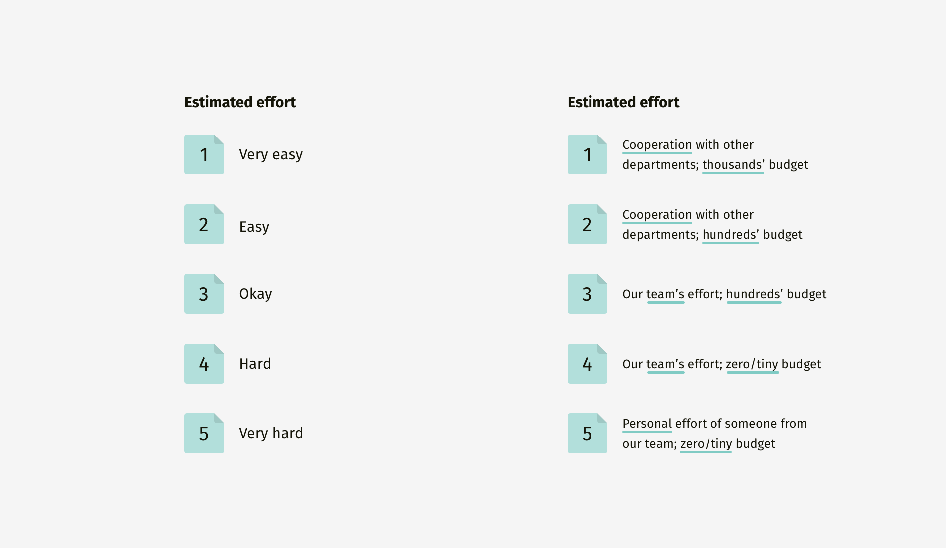
With these anchored descriptions, the numbers finally carried meaning. The team then developed a more detailed matrix that combined multiple characteristics — feasibility, desirability, and profitability — to check whether a feature could be built, would satisfy customers, and would generate revenue.
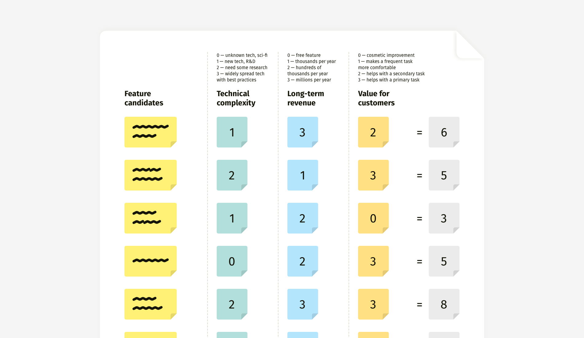
The specific criteria will change from project to project. One initiative might call for evaluating revenue potential and implementation effort, another might prioritize ease of adoption, deployment effort, or maintenance costs. The process itself stays constant: define the essential criteria, build a meaningful scale, and evaluate.
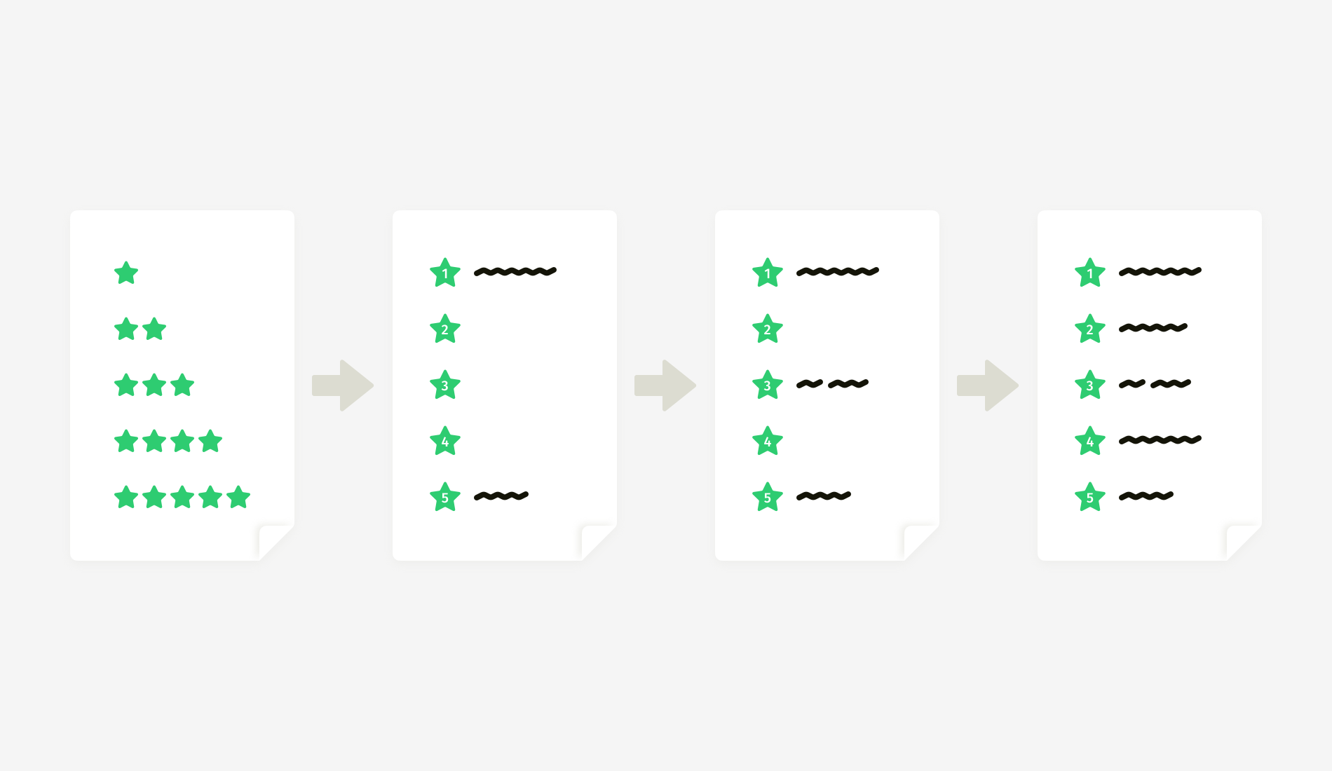
To build the scale, start with the endpoints. What does the minimum mark (say, 1) mean? What does the maximum mark (say, 5) indicate? Once those are set, write a description for the middle value (3) and then fill in the remaining entries (2 and 4) with those boundaries in mind, helping to keep the increments between each mark roughly equal.
Bringing Descriptions to a Canvas
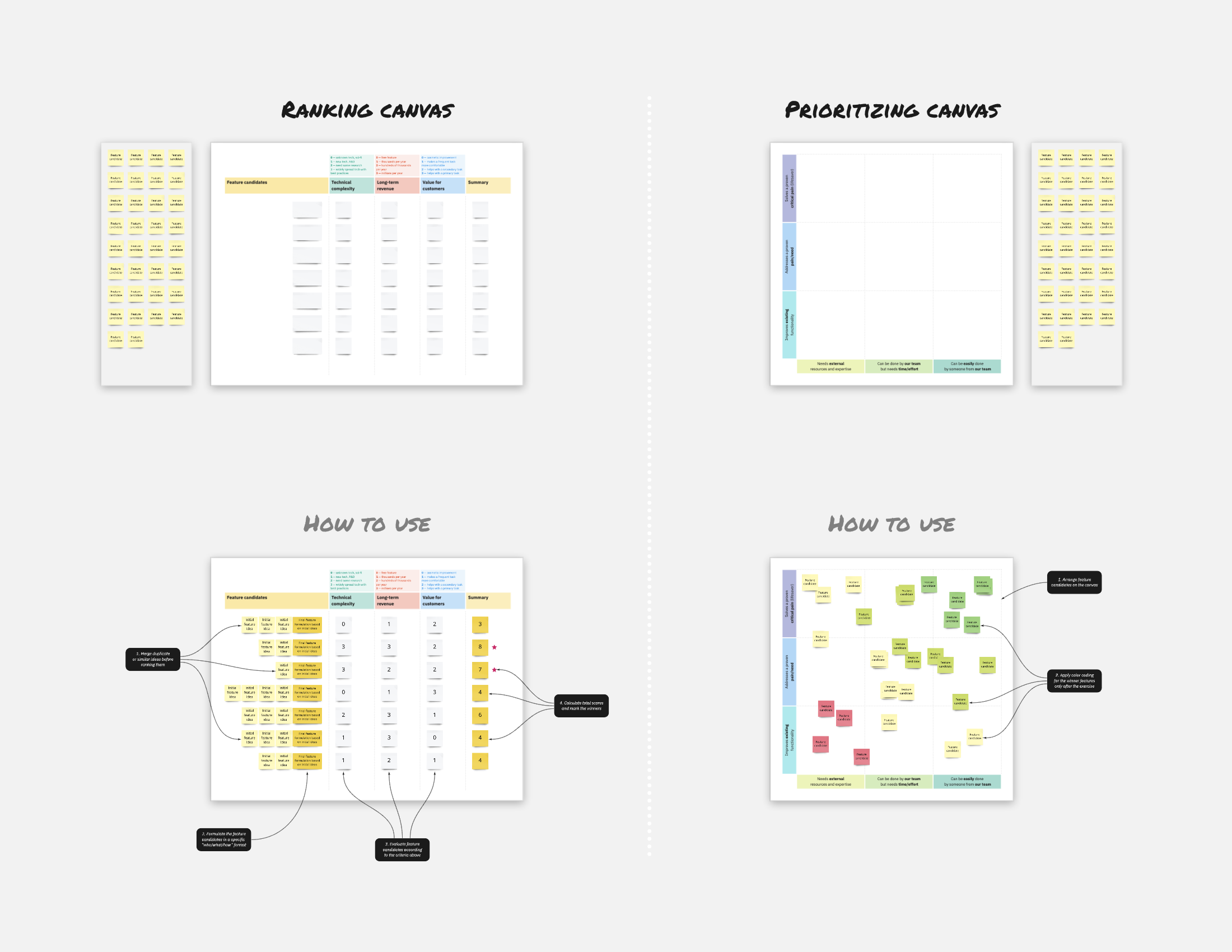
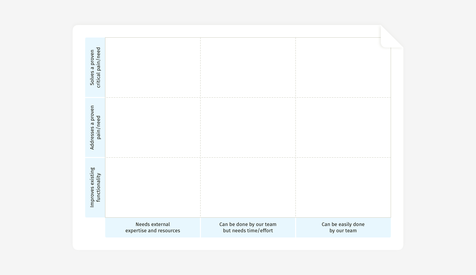
The same principle of adding context works when criteria are mapped on a two-dimensional canvas instead of a table. A canvas allows for more flexible positioning and often surfaces clearer winners. The risk is that without carefully written descriptions for the axes, the exercise falls apart.
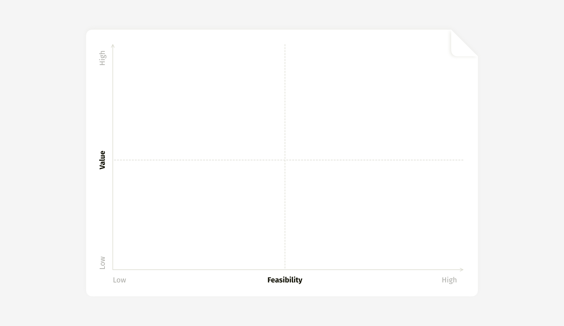
The categorical nature of low-to-high scales is a major weakness. No one will admit their idea is low value, so participants will argue to keep their sticky notes out of the low-low corner. There's also a tendency for ideas from less influential stakeholders to be pushed to the margins. Descriptions like “Needs external expertise and resources” are much more effective than the vague label “Difficult.” Similarly, “Solves a proven critical pain” anchors discussions in evidence, such as user research or support tickets, and discourages pushing forward unvalidated ideas.
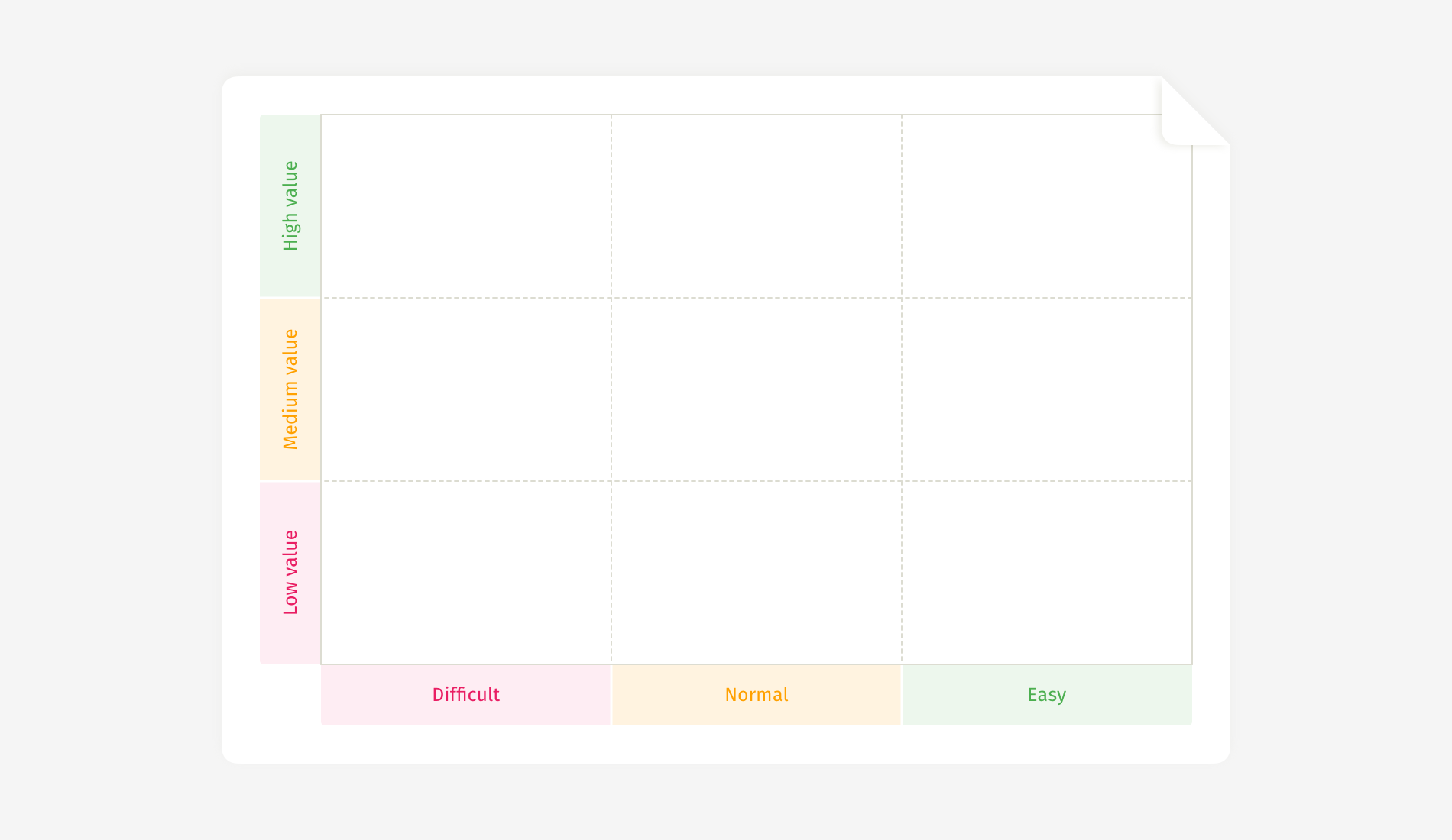
This approach streamlines the session but costs time in preparation — especially in writing concise descriptions for each section of the canvas.
A caution for facilitators: avoid using traffic-light colors (red, yellow, green) on the canvas during the workshop. The color coding increases bias, as participants will shy away from placing their vote in the red zone, even if that is where it logically belongs. Save this style for the final presentation.
Adding a Second Dimension to Voting
Dot voting is a straightforward way to establish consensus, especially with anonymous ballots, as it gives all voices equal weight and reduces hierarchical posturing. But it has limitations: the reasoning behind individual votes remains opaque, and voters are forced to mentally juggle multiple criteria in one quick decision.
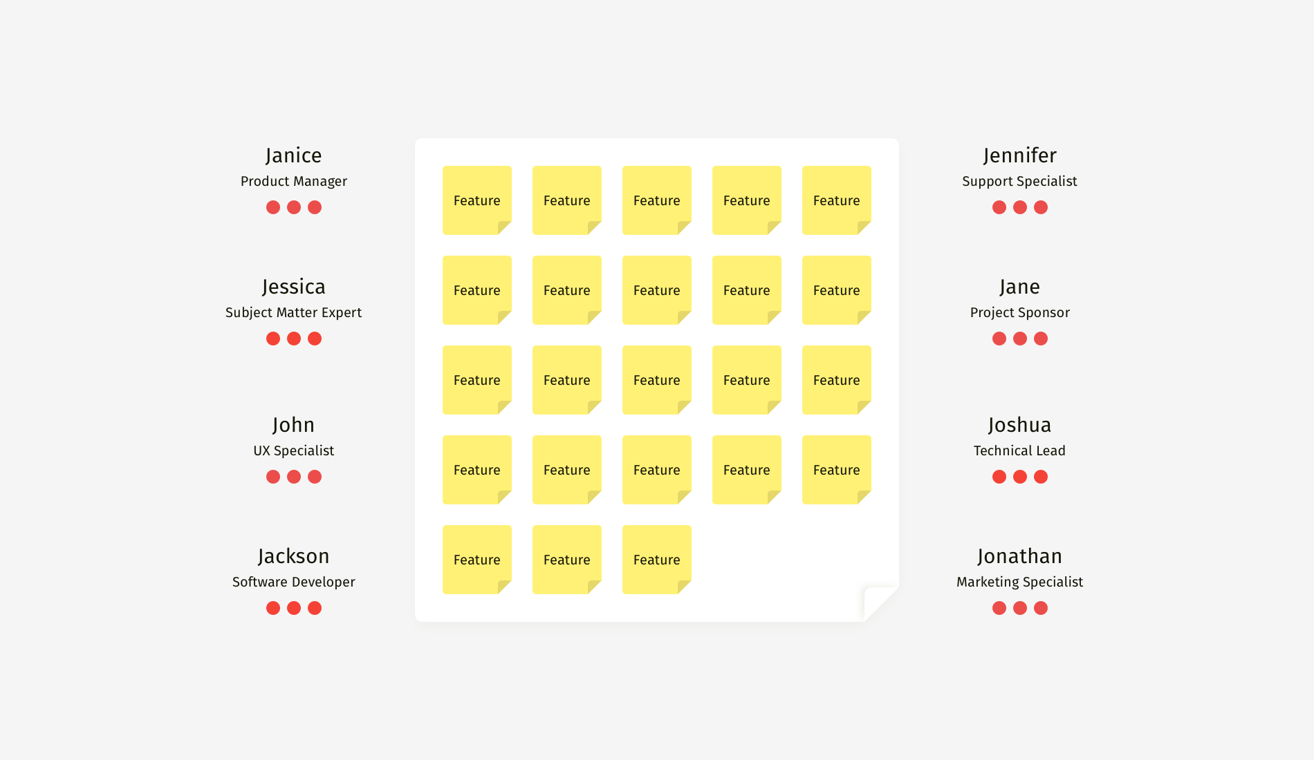
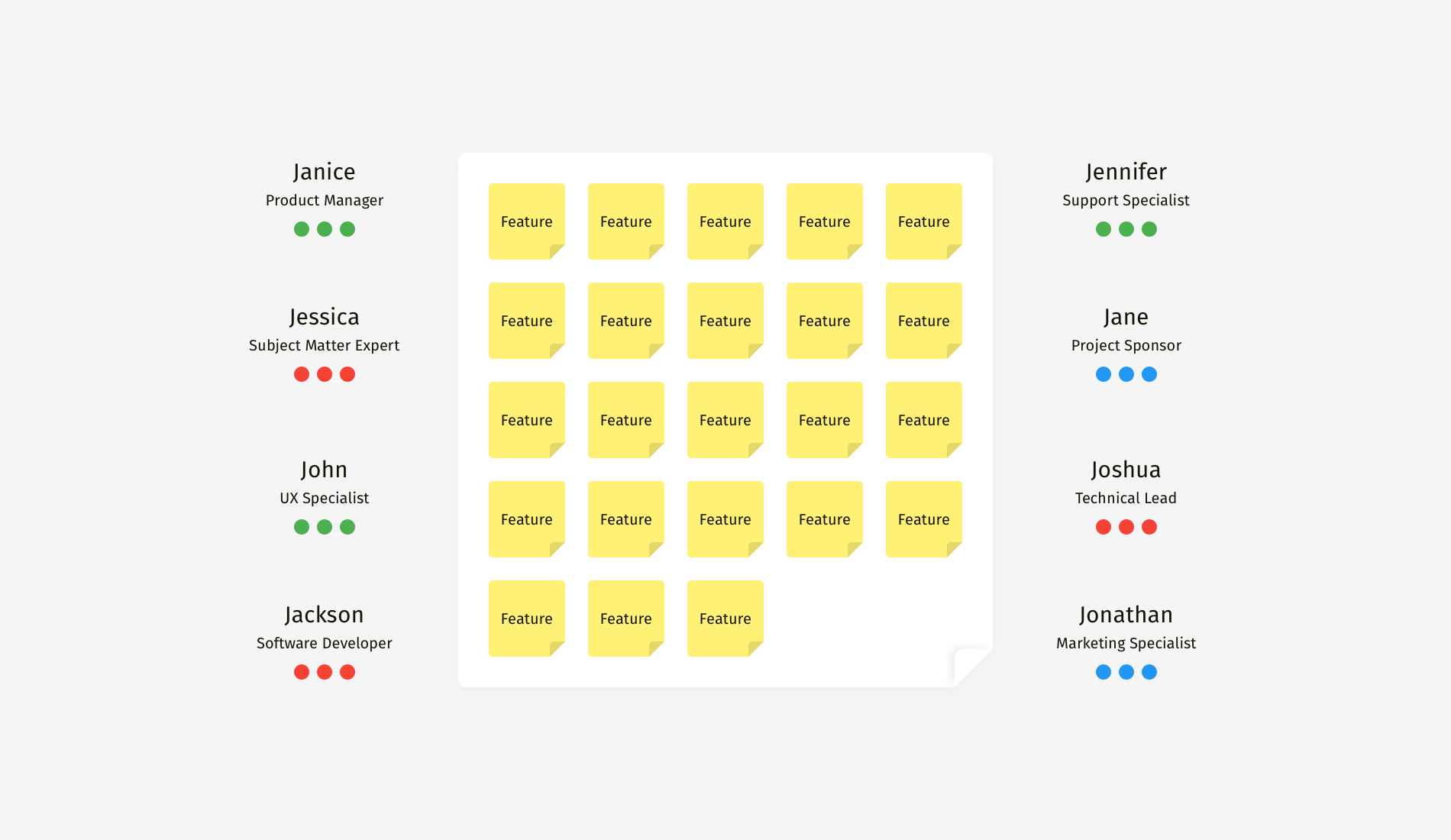
In practice, undiversified dot voting often leads to decisions that are revisited and reversed — a double waste of time. One solution is to introduce color-coded dots based on areas of expertise. In a session where this was tried, green dots marked those acting as the voice of the customer, blue dots came from people focused on financial impact, and red dots went to technical specialists assessing feasibility.
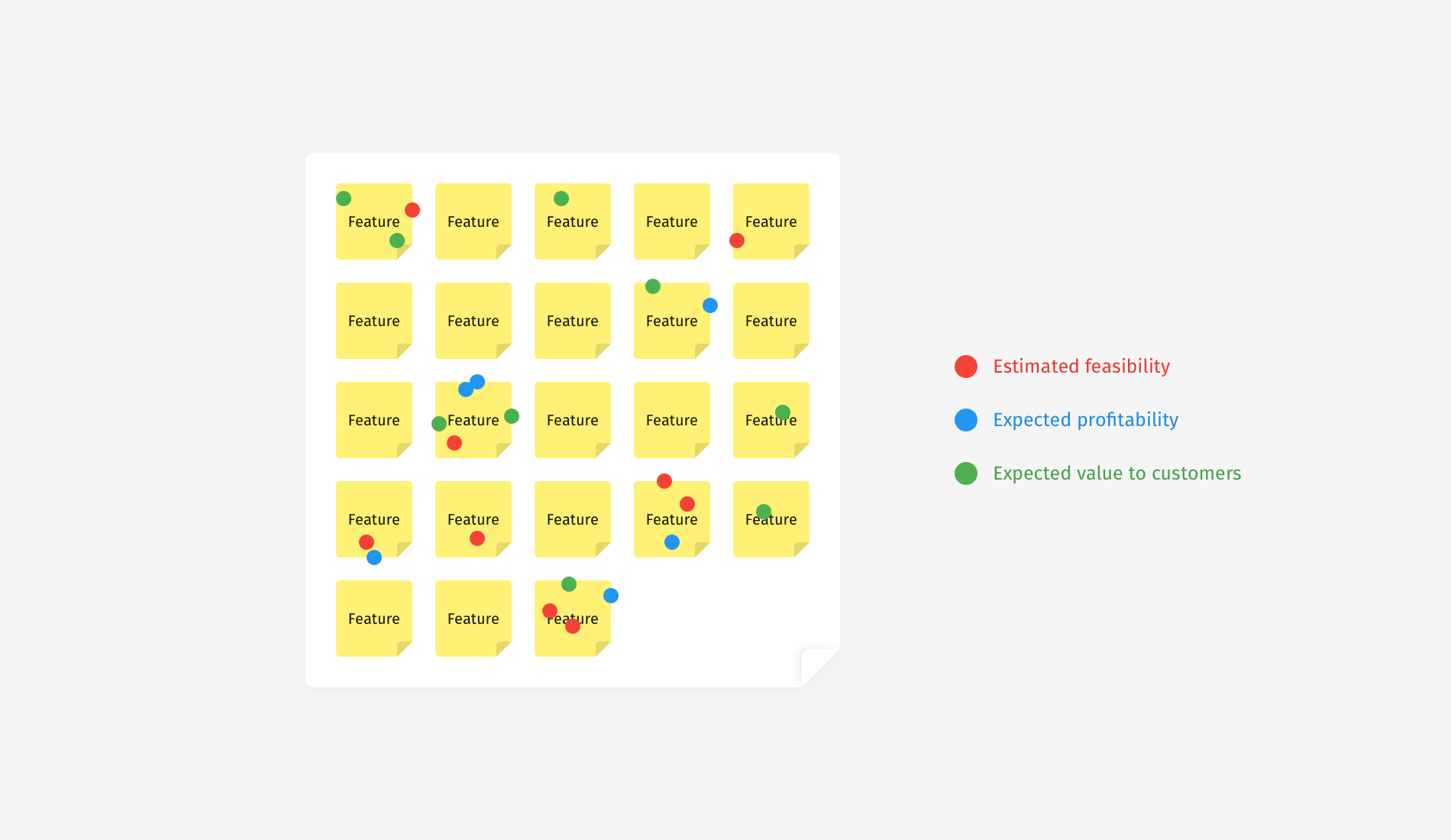
This simple change had two effects. First, the colors revealed a silent layer of consensus: you could see where a vote was coming from and speculate on the reasoning behind it. Second, the method dramatically narrowed the set of winners. Whereas standard voting found five to seven finalists, the colored approach revealed only two or three ideas that had earned votes from all three categories — features that were simultaneously viewed as profitable, feasible, and valuable to customers.
The outcome was a sharper focus. Ideas that promised only one-sided benefits were left behind in favor of those that were truly balanced.
The Language of the Room
Even the best-designed exercise can be undermined by a single prompt. Telling participants to “vote for the features you like the most” or “choose your favorite ideas” invites pure speculation. The phrasing immediately throws the process into the realm of subjective preference rather than reasoning.
What to avoid saying:
- “Stick the dots on the features you like the most.”
- “Now, please vote for the best features.”
- “Choose the most valuable features and vote for them.”
- “What are your favorite ideas on the whiteboard?”
Better phrasing steers participants back to data and past experience.
Alternatives to use instead:
- “Based on your knowledge and on precedents from your practice, which of the feature ideas would pay off the soonest?”
- “Please recall a recent development project — specifically, how long it took and what slowed or blocked the work. Now, which of the feature ideas on the board would be easiest to implement?”
- “In a minute, we’ll vote on the expected value for customers. Let’s recall what they complained about in support tickets, what they requested in interviews, and what they used the most according to our analytics. So, which of the features presented on the whiteboard address the most critical needs?”
- “Recall your conversations with end users and recent user-research results. Which features address their most acute pains?”
Putting the Brakes on Bias
Subjectivity will never fully disappear — it is an inherent part of how people decide. Facilitators can’t control the thought process of each expert, but they can create an environment that favors rationale over instinct. To achieve smoother, more defensible prioritization, hold onto these two fundamentals: give the team clear, meaningful criteria and reinforce them over the course of the session, and mentor participants to draw on prior professional experience and data rather than their own preference.
If you’re looking for a starting point, the Miro templates for prioritization exercises built for this workflow are available to use.