Bar loaders look like a large family of effects, but they share one skeleton. Every one of the 20 examples covered here is built on the same markup and style structure, with only a few values swapped between variations. That means the useful output isn't a single loader — it's a set of techniques for producing as many as you need from one code pattern.
Drawing the bars
The element starts with a width (or height) and aspect-ratio to keep proportions:
.bars {
  width: 45px;
  aspect-ratio: 1;
}
Three bars are then faked with a linear-gradient background, much the way the dot loaders in Part 2 were built:
.bars {
  width: 45px;
  aspect-ratio: 1;
  --c: no-repeat linear-gradient(#000 0 0); /* we define the color here */
  background:
    var(--c) 0%   50%,
    var(--c) 50%  50%,
    var(--c) 100% 50%;
  background-size: 20% 100%; /* 20% * (3 bars + 2 spaces) = 100% */
}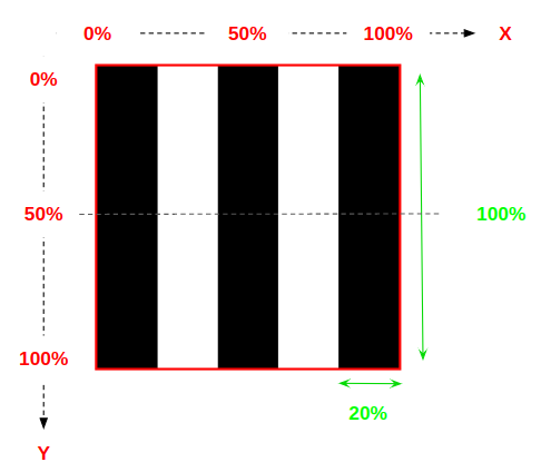
As with the other installments, most of the work happens inside background. Readers who find the gradient reasoning too compressed can refer to the detailed Stack Overflow explanation (stackoverflow.com/a/51734530/8620333) linked from the original piece.
Two levers: size and position
The animation manipulates either the element's size or its position. Animating size starts with keyframes like these:
@keyframes load {
  0%   { background-size: 20% 100%, 20% 100%, 20% 100%; }  /* 1 */
  33%  { background-size: 20% 10% , 20% 100%, 20% 100%; }  /* 2 */
  50%  { background-size: 20% 100%, 20% 10% , 20% 100%; }  /* 3 */
  66%  { background-size: 20% 100%, 20% 100%, 20% 10%;  }  /* 4 */
  100% { background-size: 20% 100%, 20% 100%, 20% 100%; }  /* 5 */
}
Between the 0% and 100% stops, the animation changes the background-size of the background gradient, and each keyframe sets three background sizes — one per gradient:

Hold the size at 20% 50% and animate background-position instead, and you get a different loader from the same foundation:
.loader {
  width: 45px;
  aspect-ratio: .75;
  --c: no-repeat linear-gradient(#000 0 0);
  background:
    var(--c),
    var(--c),
    var(--c);
  background-size: 20% 50%;
  animation: load 1s infinite linear;
}
@keyframes load {
  0%   { background-position: 0% 100%, 50% 100%, 100% 100%; } /* 1 */
  20%  { background-position: 0% 50% , 50% 100%, 100% 100%; } /* 2 */
  40%  { background-position: 0% 0%  , 50% 50% , 100% 100%; } /* 3 */
  60%  { background-position: 0% 100%, 50% 0%  , 100% 50%;  } /* 4 */
  80%  { background-position: 0% 100%, 50% 100%, 100% 0%;   } /* 5 */
  100% { background-position: 0% 100%, 50% 100%, 100% 100%; } /* 6 */
}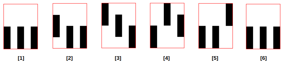
The general recipe is to sketch a timeline and convert it into keyframes. Animating size, position, or both yields effectively infinite variants. Once that feels natural, a more complex gradient pushes the range further still. Apart from the last two examples in the demo, every bar loader shown uses the same underlying markup and styles with different animation combinations; reading the code frame by frame makes clear how easily dozens — or hundreds — of variations follow.
Masking for color
The mask technique from the dot loaders applies unchanged. Put the same logic in the mask property rather than background, and any background configuration can inject color into the loader. One demo was converted simply by replacing every background-* property with its mask-* counterpart and adding a gradient coloration.
Dots and bars therefore differ only in what is drawn. Both rest on the same three ingredients:
- Gradients to create the shapes — dots, bars, or something else
- Animated
background-sizeand/orbackground-positionto drive the motion - A mask to add color
Rounded bars from pseudo-elements
Rounding the bar edges needs a different drawing method: one element plus its ::before and ::after pseudos define three identical bars, with no linear gradient required:
.loader {
  --s: 100px; /* control the size */

  display: grid;
  place-items: center;
  place-content: center;
  margin: 0 calc(var(--s) / 2); /* 50px */
}
.loader::before,
.loader::after {
  content: "";
  grid-area: 1/1;
}
.loader,
.loader::before,
.loader::after {
  height: var(--s);
  width: calc(var(--s) / 5); /* 20px */
  border-radius: var(--s);
  transform: translate(calc(var(--_i, 0) * 200%));
}
.loader::before { --_i: -1; }
.loader::after { --_i:  1; }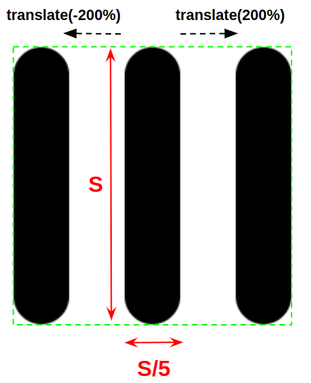
Filling those bars with a continuous-looking gradient takes some care. The area the loader covers should match the gradient's size, which works out to background-size: var(--s) var(--s). Because the three elements are placed separately, each one's gradient position must be adjusted so all of them line up and read as a single continuous gradient. The center element keeps its background centered:
.loader {
  /* etc. */
  background: linear-gradient() 50% / var(--s) var(--s);
}
The left pseudo places its background to the left:
.loader::before {
  /* etc. */
  background: linear-gradient() 0% / var(--s) var(--s);
}
The right pseudo places its background to the right:
.loader::after {
  background: linear-gradient() 100% / var(--s) var(--s);
}
Using the same --_i variable that drives the translate, the three declarations collapse into one shared form:
.loader {
  --s: 100px; /* control the size */
  --c: linear-gradient(/* etc. */); /* control the coloration */

  display: grid;
  place-items: center;
  place-content: center;
}
.loader::before,
.loader::after{
  content: "";
  grid-area: 1/1;
}
.loader,
.loader::before,
.loader::after{
  height: var(--s);
  width: calc(var(--s) / 5);
  border-radius: var(--s);
  background: var(--c) calc(50% + var(--_i, 0) * 50%) / var(--s) var(--s);
  transform: translate(calc(var(--_i, 0) * 200%));
}
.loader::before { --_i: -1; }
.loader::after  { --_i:  1; }
From there, animating the height with staggered delays produces the loaders; the remaining examples differ only in color and size.
The takeaway
A single element, gradients or pseudos to draw the bars, and keyframes to move things around are enough to generate an open-ended supply of animations. The original demo also closes with a collection mixing the dots and the bars together.