The Platform Landscape
TV hardware typically trails phones and computers by several generations. Components are selected for lightweight, viewing-optimized systems that prioritize energy efficiency and longevity. Within these limits, though, platforms diverge noticeably in performance, conventions, and price.
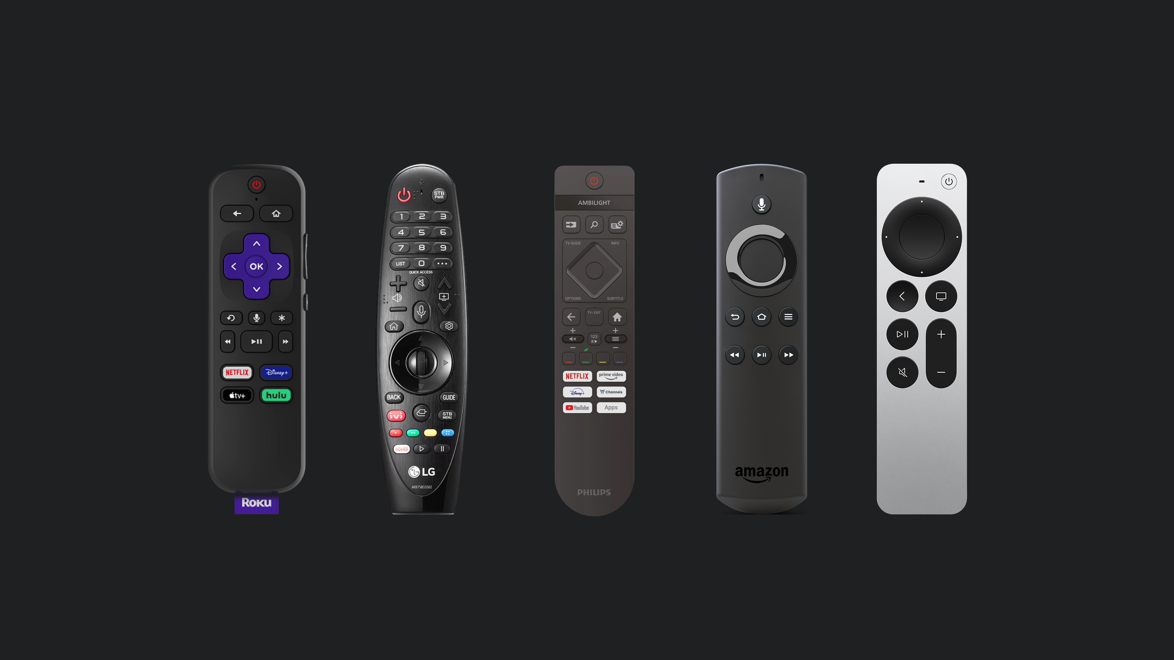
- Roku: The most affordable and widely adopted, but constrained by weak hardware.
- WebOS: Common on LG devices, built on web standards, and runs acceptably on modest specs.
- Android TV: Flexible and customizable, but comparatively demanding on hardware.
- Amazon Fire: Android-based with its own ecosystem. Smooth performance, yet more limited than stock Android.
- tvOS: Apple’s high-end offering with a matching price tag and minimal customizability.
These platforms differ significantly in architecture and ecosystem, yet each leans on the same interaction model: the remote control. Strip any of them down to the D-pad, OK, and BACK buttons, and every TV interface remains fully navigable. That shared control scheme is what makes a platform-agnostic approach viable, with guidelines that hold regardless of the manufacturer.
Screen And Layout Fundamentals
Working Within The Frame
TV design discussions frequently surface overscan, a relic from cathode ray tube (CRT) displays when inconsistent production standards led sets to crop image edges. Broadcasters responded with guidelines that kept critical content inside safe zones.

Overscan, however, now belongs firmly to the past. Modern panels render content with far greater precision, making the old title- and action-safe areas unnecessary. The practical modern equivalent is simply defining sensible margins for your content.

Platform guidance reflects that shift. Google recommends layouts with 5% margins; Apple’s guidelines suggest 60 points top and bottom and 80 on the sides. Neither standard is absolute — the takeaway is to reserve breathing room between the screen edge and content just as you would in any thoughtful layout.
The Grid And The Shelf
Streaming apps define the mental model for TV interfaces: extensive content collections arranged in a straightforward grid.
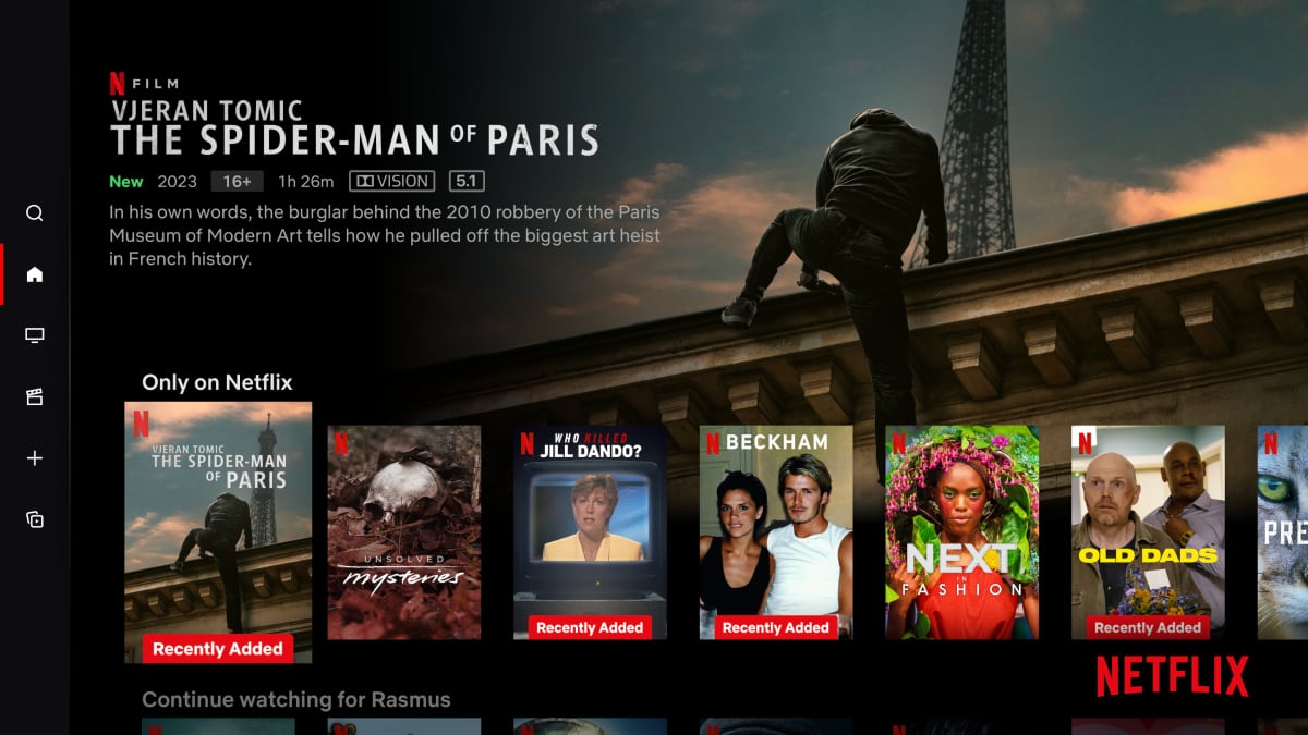
Interfaces commonly group content into horizontally scrolling rows — colloquially, “shelves.” A shelf typically holds dozens of items that don’t fit within the initial viewport, so the last visible item partially peeks from the edge. That subtle partial reveal signals that more content is available if the viewer keeps scrolling.
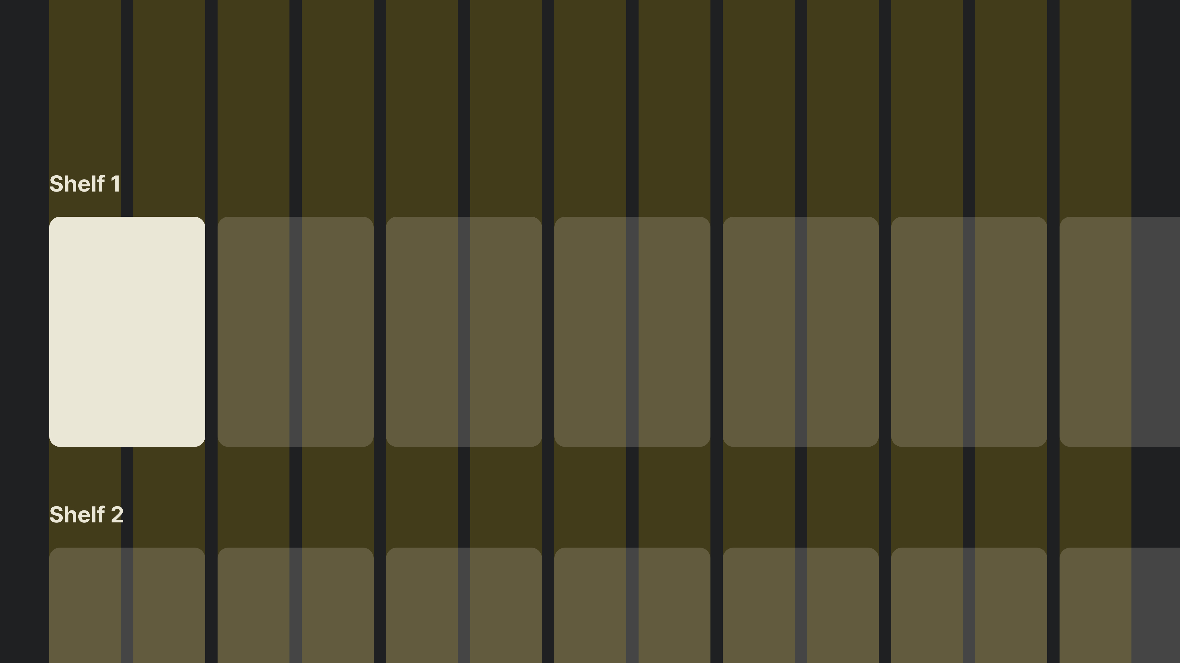
Mapping that pattern onto a standard 12-column layout grid with items two columns wide produces a clear structure.
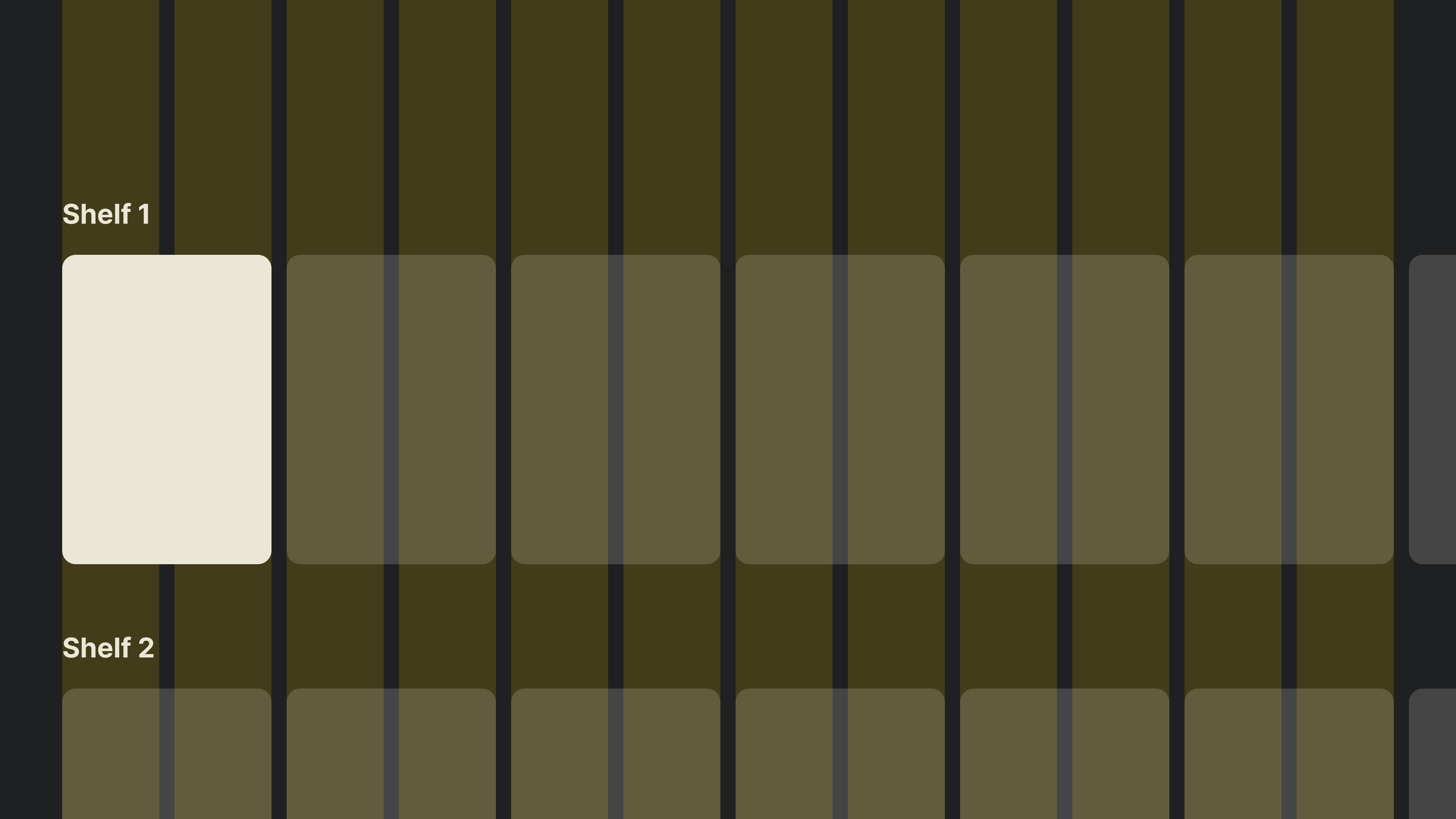
Note that the final item falls outside the defined safe zone.
Tip: An odd number of columns lets the last item end inside your margins, making it more prominent while barely affecting the overall composition. Overscan may be outdated, but an extra column cleanly sidesteps any lingering concerns.
Typography And Color At A Distance
Type That Carries
TV work rewards restraint, and typography demonstrates why. Standard web baseline text at 16–18px simply disappears from the couch; 24px is a reasonable starting point, with the rest of the type scale increasing proportionally. When the viewer sits three meters away, ambiguity is a liability.
“Typography can become especially tricky in 10-ft experiences. When in doubt, go larger.” — Molly Lafferty, Marvel Blog
Rather than reproducing a full web-scale system, begin with a compact 5–6 size scale, then adjust. A TV experience can and should be simple — a small type scale, correctly sized, handles the required hierarchy without sprawl.
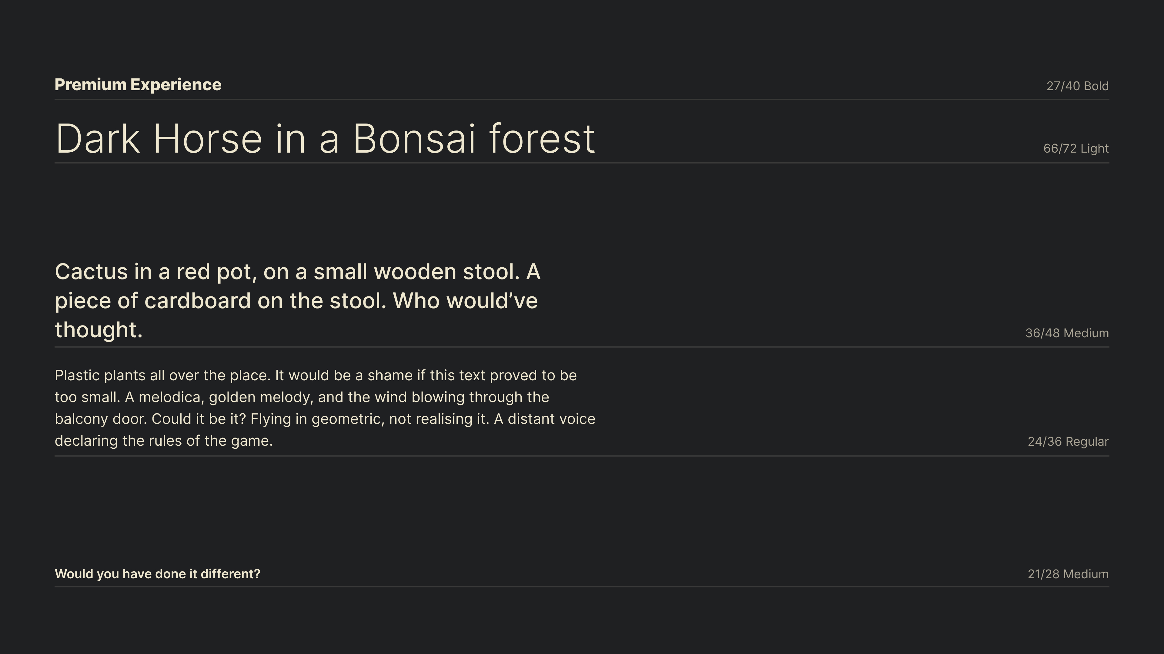
The reduced scale above condenses guidance from Google and Apple typography guidelines, with minor size adjustments. Keep ranges that fit your own needs as tightly as this does.
Color In Dim Rooms
Consider the typical viewing environment: the room is dark, and the display is the only light source. Open the app drawer, pick a streaming service, and a bright splash screen drowns the viewer in luminance. That scenario defines the central constraint for TV color choices.
Devices built for cinematic, dimly lit settings suit darker, more subdued interfaces. Pure white (#ffffff) pushes maximum luminance and strains the eyes. Muted palettes, with bright elements tinted toward the brand color or undertones of yellow to mimic natural light, produce far less jarring results.
Since TVs lack cursor and touch input, the interface must clearly designate what is interactive. Reserve the most vivid colors to highlight states with high contrast rather than using them across static backdrops.
Focus: The Primary Interactive Language
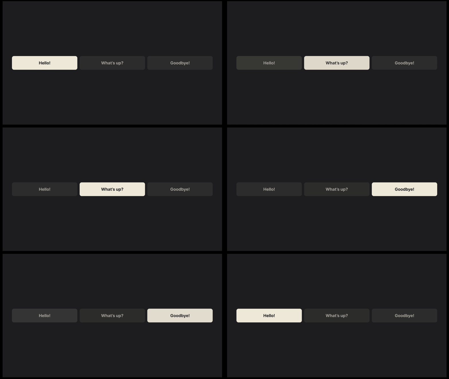
Remote-based interaction separates the viewer from the UI. Filling that gap is the focus state, which visually accents elements to anchor the gaze and map subsequent movement. Anyone familiar with web development has used the :focus CSS pseudo-class — on the web it is an accessibility feature; on TV, it is the core interaction mechanism, with two additional spatial directions thanks to the D-pad.
Styling The Focused State
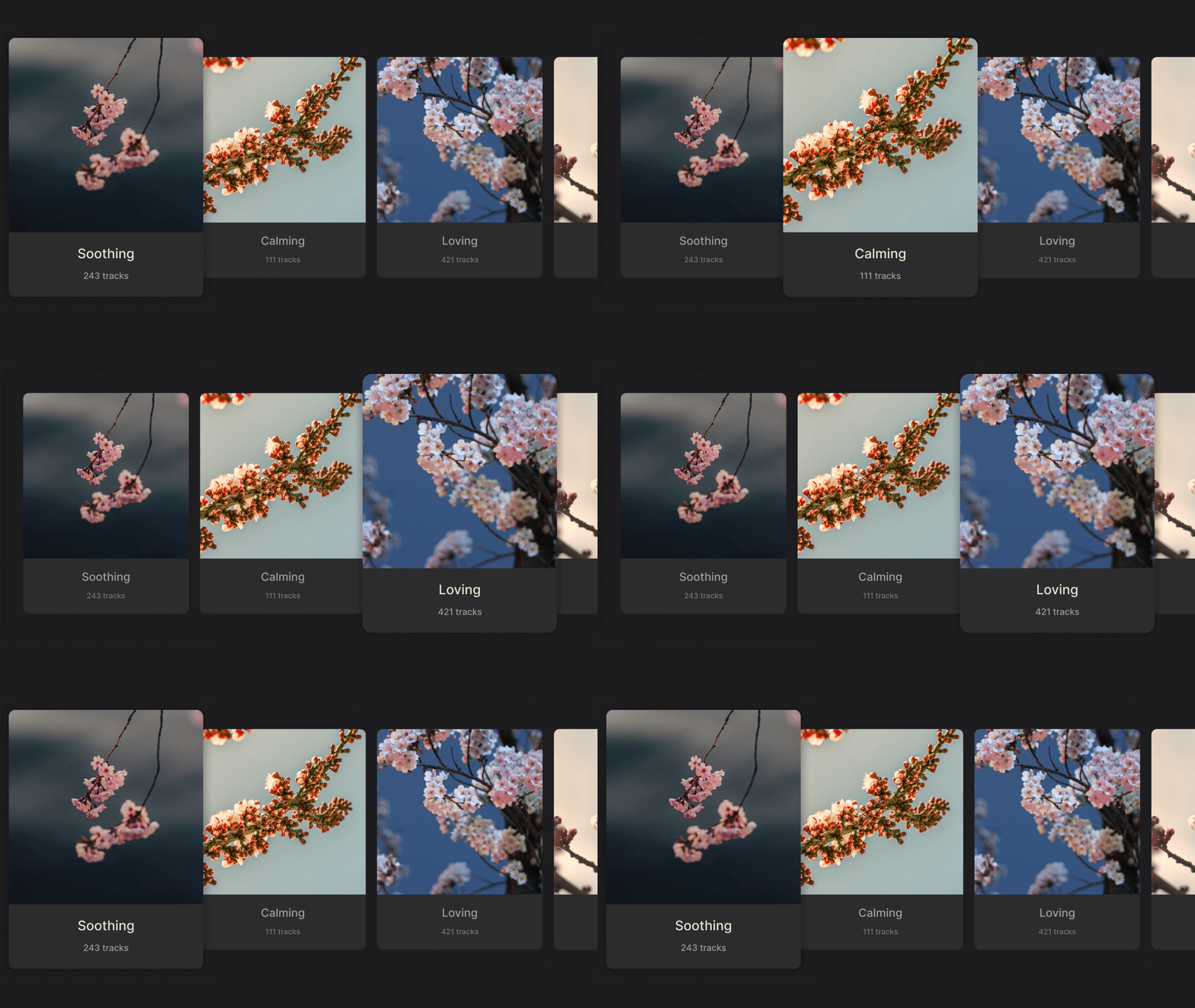
Three standard techniques dominate TV focus design. Scaling enlarges the element, creating depth by pulling it toward the viewer.
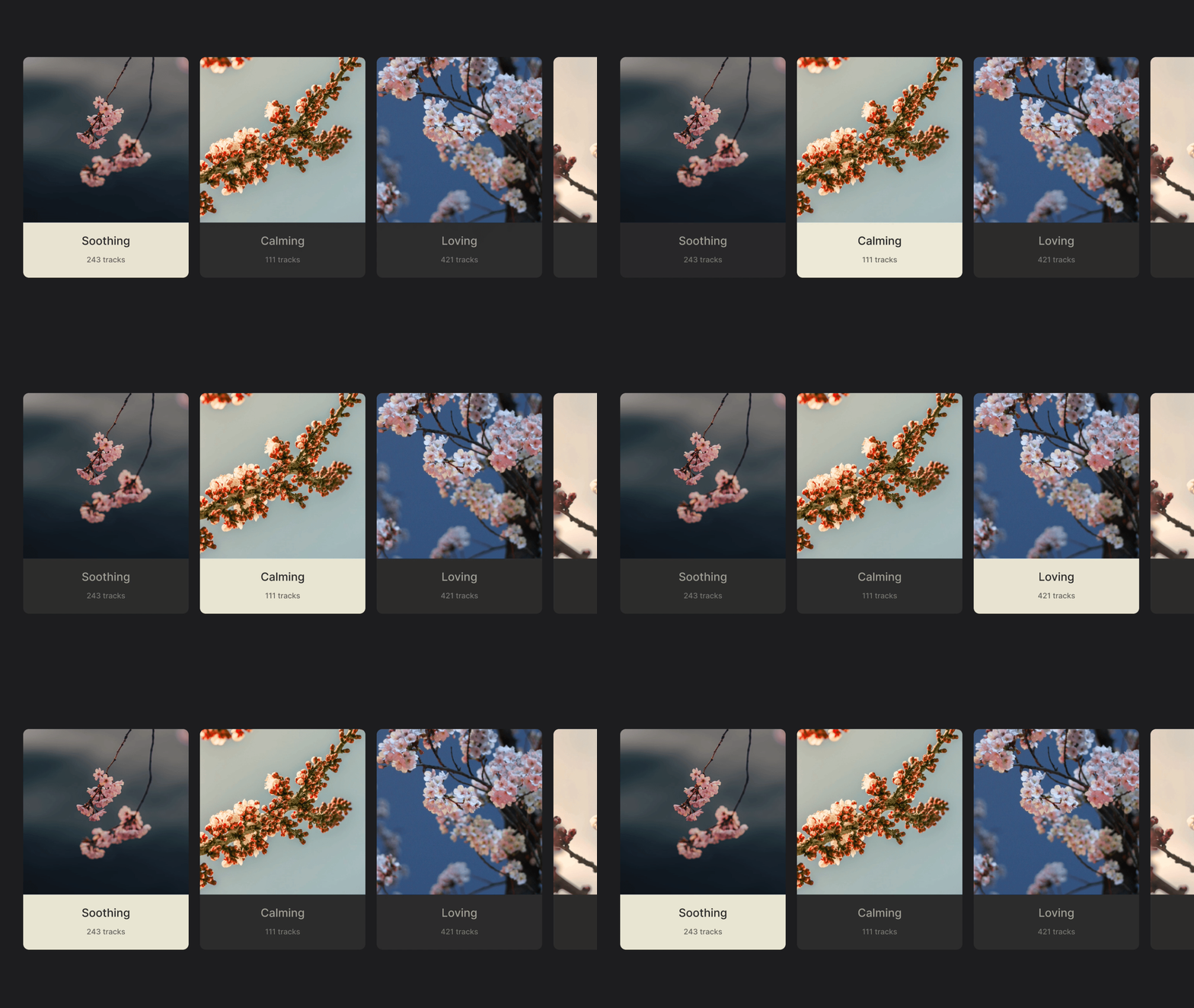
Color inversion swaps background and text tones.
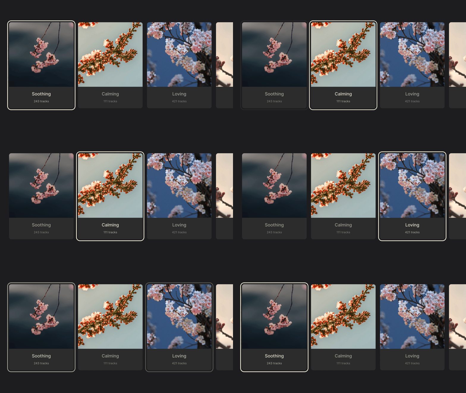
A border can be drawn around the selected element.
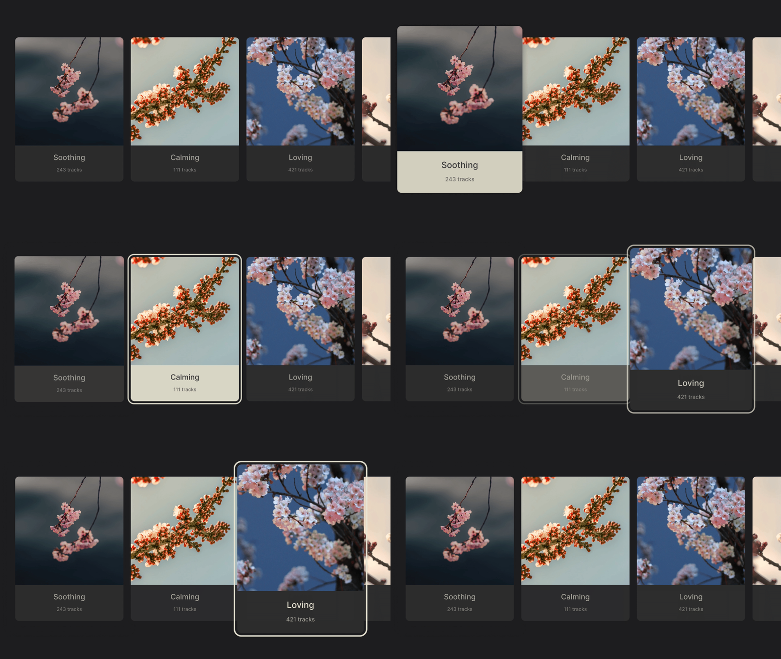
These techniques are used independently or combined across every TV platform. System constraints shape execution, but the goal is constant: feedback must remain legible from across the room.
With interaction, layout, and movement established, the next chapter covers the standard UI elements of TV interfaces — their variations and practical navigation patterns.
UI Building Blocks For The 10-Foot Experience
The typical TV user journey is short: browse a library, search for something specific, or settle in to play content. Those three activities drive most of the screens in a TV app — the home/library screen, the search view, and the player screen. The components used to build them are mostly familiar from other platforms, but the 10-foot context changes how they behave.
Menus: Top Bar Versus Sidebar
Menus are horizontal bars along the top edge or vertical sidebars. The orientation tends to follow the platform's conventions, though side menus appear more frequently in TV interfaces. Both approaches have a common weakness: the deeper the user dives into content, the more button presses are needed to reach the menu again. Back buttons usually provide a shortcut to restore menu focus, but that issue emerges much sooner on top menus, which often means a persistent sidebar is the more consistent choice.
Posters, Shelves, And Cards
Content browsing relies on horizontally scrolling shelves populated with posters in three common aspect ratios:
- 2:3 posters are the pick for movie and show apps. The vertical orientation recalls traditional movie posters, the narrow shape fits more items per row, and titles are usually baked into the artwork, keeping the shelf clean.
- 16:9 posters follow the same pattern horizontally. They frequently carry text labels, which effectively turns them into cards — the style you see on YouTube. When no dedicated artwork exists, they use stills or playback frames that match the media's own aspect ratio.
- 1:1 posters show up in music apps like Spotify, echoing album art and vinyl sleeves. They also serve well for channel links or profile tiles, which adds visual variety to a shelf.
The ratios are not mutually exclusive — mixing them within one app breaks up an otherwise uniform library.
Spotlights
Spotlights span the full screen width and exist to promote a feature or piece of media. In a row of uniform shelves they add needed visual punctuation. Depending on the design, a spotlight can be a single focusable element or expose multiple actions across its generous surface. Varying spotlight sizes also allows several to sit side by side in one row without breaking the established browsing rhythm.
Search And Text Entry On TV
Browsing can find content, but searching is quicker — yet D-pad-driven keyboards make it arduous. An example from the source: typing "hey there" takes 9 keystrokes on a mobile keyboard versus roughly 38 on a TV, due to traveling between characters and selecting each one.
System keyboards traditionally come in two arrangements: the grid layout used on most platforms and a horizontal layout on tvOS that supports touch and gesture controls. Swiping across characters is far faster, but the pattern can only be improved, not eliminated — keyboards remain a necessary fallback despite autocomplete, voice control, device pairing, and remotes with physical keyboards. Designers still need to account for worst-case text entry.
The Player Screen And Its Controls
The player is where form takes a back seat. It is among the rare moments in a TV app when focus disappears and the interface steps out of the way.
Players are often the most complex screen in an app. YouTube's player, for example, folds in browsing, search, comments, reactions, and channel navigation around playback itself. Netflix counterbalances with a much leaner interface guided by its content model.
Whatever the complexity, every player shares a foundation built on the progress bar. Interaction focus sits not on the bar itself but on a movable "scrubber" knob; moving it left and right controls playback position. The play and pause glyphs — the triangle and two vertical bars inherited from tape players — remain as essential as the D-pad in modern interfaces. The presence of a scrubber is itself a content signal: video on demand offers full playback controls, while live streams (without DVR) do away with scrubbing entirely because rewinding and fast-forwarding are impossible. Earlier designs paired the progress bar with a row of playback buttons, but as users learned the controls, that row often collapsed into the bar and scrubber alone.
Composing Functional TV Interfaces
With the menus, posters, spotlights, search paths, and player controls in place, you have what you need for a working TV app. The same way six core buttons enable remote navigation, these patterns and components give a project its basic direction. More context and use will show when to combine and extend them. And there are a few closing tips and techniques worth carrying into any TV design — details that add polish and depth once the fundamentals are set.
Pushing Past Platform Conventions
TV interfaces are defined by strict constraints, but some of the most effective design ideas come from questioning them. The techniques below show how subtle additions — a held button, a repurposed key, or a transparent image — can expand what feels possible on the big screen without overcrowding it.
Press-and-Hold Gestures
Most modern remotes support press-and-hold gestures, a quiet way to extend functionality, especially on remotes with few buttons. Holding directional buttons during content browsing speeds up scrolling, and holding Left/Right while playing accelerates timeline seeking. Many apps also differentiate a quick OK press, which plays a video, from a longer one, which summons a contextual menu of extra actions.
Press-and-hold is easy to miss because it is not labeled, yet it effectively doubles the job of a single button. Used contextually, it adds depth without making the interface feel busy.
Contextual Key Remapping
Button functions can also change based on what is on screen. Amazon’s Prime Video, for instance, repurposes the Up button to open its X-Ray feature during playback. Directional buttons normally reveal video controls, so reassigning one to a custom action adds interactivity at little cost.
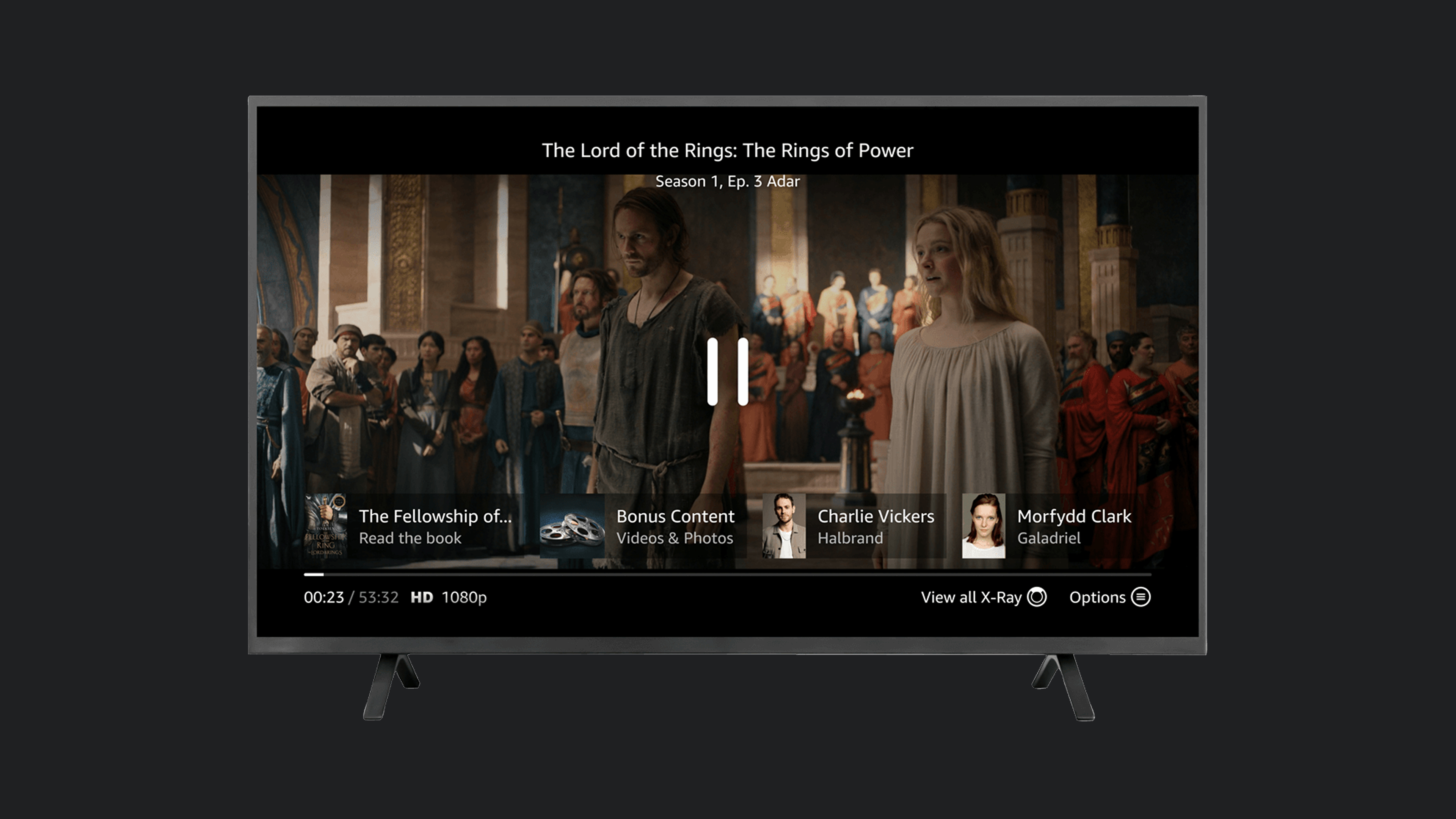
With limited input, context becomes a powerful tool. It not only declutters the interface to allow for more focus on specific tasks, but also enables the same set of buttons to trigger different actions based on the viewer’s location within an app.
YouTube’s scrubber interaction shows the same principle in reverse. Once a viewer moves the scrubber, all other UI elements fade away, narrowing the focus to a single task. In this state — and only in this state — pressing Up again exits scrubbing and enters chapter browsing.
That is an elegant example of adding features only when they are needed. It encourages restraint and shows how limited input can still produce rich interactions.
Axis-Based Navigation Efficiency
Every action on TV costs at least one button press; there is no free cursor movement. The challenge is making each press count. On a typical homescreen, the two movement axes play distinct roles: vertical movement shifts between groups, horizontal movement shifts between items within a group. No matter how deep you are into a group, one vertical press moves you to another row.
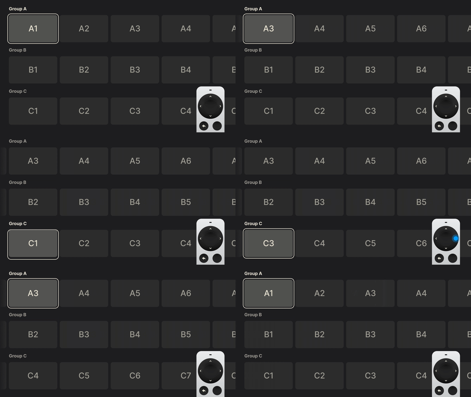
This separation of responsibilities is the most efficient navigation model for TV. The pattern also works if you reverse it — horizontal for groups, vertical for items — as long as each axis has a consistent, well-defined role.
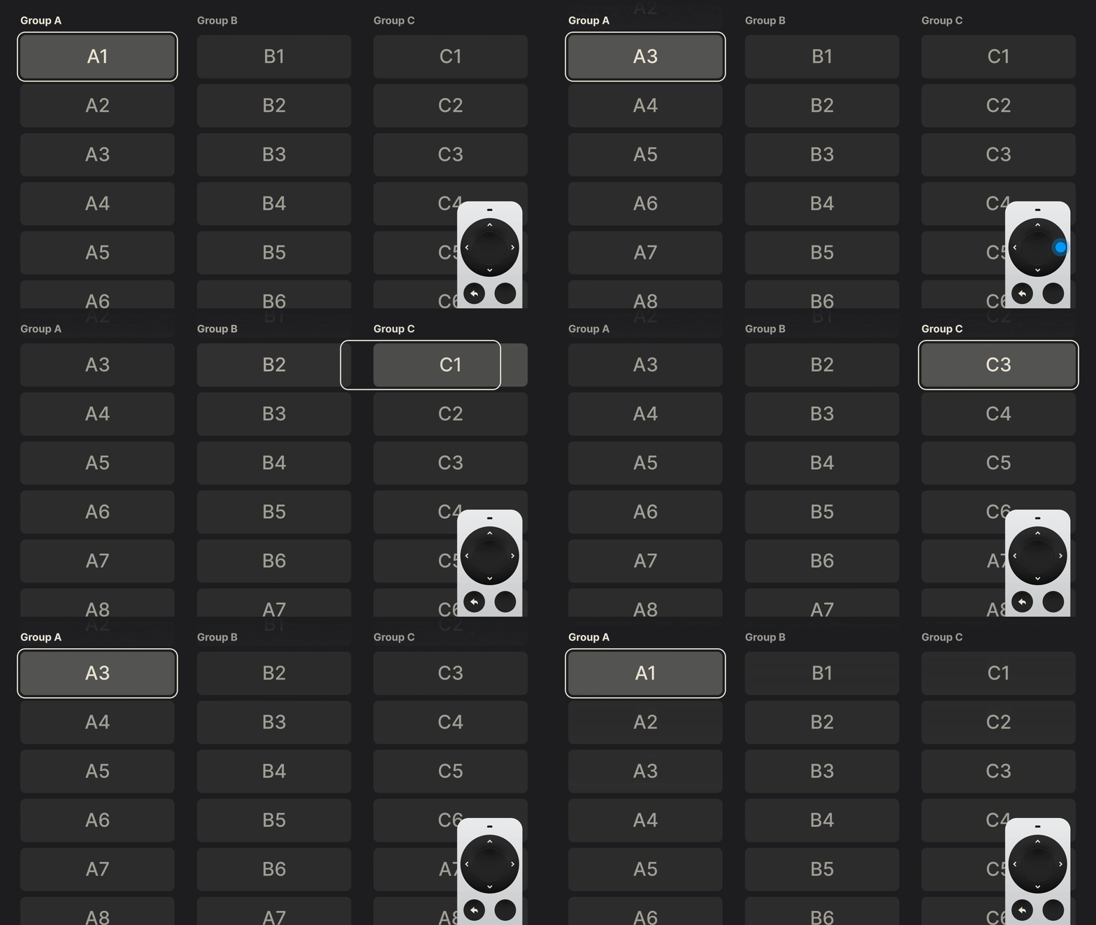
This pattern is easy to overlook because it is everywhere, but it underpins nearly every successful TV interface. Acknowledge it and apply it deliberately.
Visual Flourish Beyond Flat JPGs
Most TV interfaces are walls of cover art, with little room for visual flair. The flat JPG has dominated for years due to small file sizes, though modern alternatives like WebP are slowly gaining ground. Meanwhile, the tried-and-tested PNG remains a useful tool: its transparency support can make rigid layouts feel more polished. Used sparingly, and paired with simple focus effects like background changes, PNGs add subtle moments of delight.
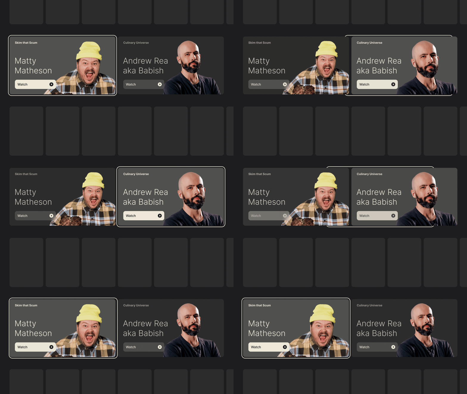
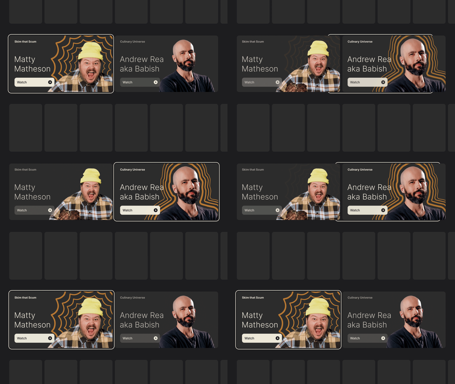
When scaling and rotation are available, layering multiple assets can bring static rectangles to life.
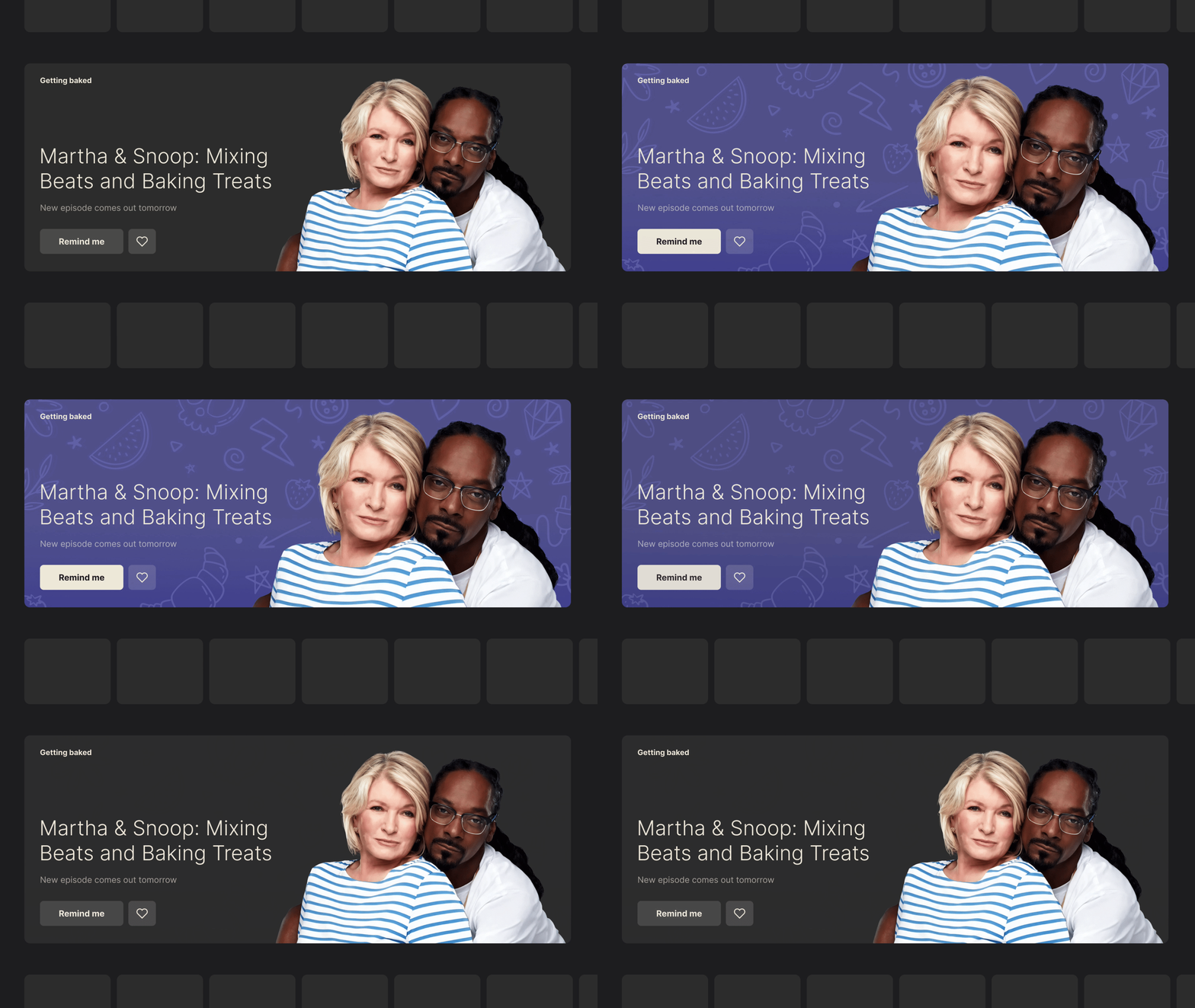
These refinements stay within platform boundaries rather than fighting them. With so few degrees of freedom, learning these small tricks is what makes a TV experience stand out.
Working Within Limits
Legacy systems, a sparse remote, and a shallow navigation tree can make TV design feel cramped. But those limits are better read as guidance than barriers. Accepting the 10-foot interface as it is opens avenues for creative work rather than closing them off.
Designing for TV is not about radical novelty. It is about understanding the platform’s quirks and layering your own contributions on top. The practical patterns and subtle techniques in this series should help you find your footing — and produce work that works as well as it looks.
Further Reading
- Design for TV, Android Developers — Great TV design is all about putting content front and center. It’s about creating an interface that’s easier to use and navigate, even from a distance. It’s about making it easier to find the content you love, and to enjoy it in the best possible quality.
- TV Guidelines: A quick kick-off on designing for Television Experiences, Andrea Pacheco — Just like designing a mobile app, designing a TV application can be a fun and complex thing to do, due to the numerous guidelines and best practices to follow.
- Rethinking User Interface Design for the TV Platform, Pascal Potvin — Designing for television has become part of the continuum of devices that require a rethink of how we approach user interfaces and user experiences.
- Typography for TV, Android Developers — As television screens are typically viewed from a distance, interfaces that use larger typography are more legible and comfortable for users.
- Color on TV, Android Developers — Color on TV design can inspire, set the mood, and even drive users to make decisions. It’s a powerful and tangible element that users notice first.